The Mighty Monarch

Gotham By Midnight contained, hands down, the single greatest car chase I've ever seen in a comic.

3743 2815 94 163
Forum Posts Wiki Points Following Followers

A Year In Review: The New 52 Year Two [In Progress]

I haven't been able to keep up with reviewing all of the New 52 this year, but I've still been keeping up with all of them (Save PLegion of Super-Heroes because it bores me beyond all reason.) I DO plan on going back to fill in the gaps I missed to finally have the claim to fame of 'Reviewed the entire first two years of the New 52,' but for now I've decided to represent my reading of all of them (save two unfortunate series') with this retrospective look at the entire second year of each series, scoring them overall out of 10. Keep in mind this is subject to opinion, and you may or may not agree with some of my stronger praise or hate; I do tend to go a little overboard with the enthusiasm, but these are still solid representative of what series I did or didn't like.

Action Comics 8/10

The second year began incredibly strong, Morrison's epic run concluded with a string of amazing issues, save the weak #14. #13 was definitely a personal favorite, but the last few issues held an incredible sense of scale to the conflict, definitely a Morrison kind of conclusion. After that was the short-lived Andy Diggle/Tony Daniel run which had a so-so ending, but through most of the rest had excellent artwork and perfect character work, especially on the part of Lex Luthor. The new Co-Feature's been much better as well, giving us seldom seen adventures of Jor-El and Lana before they were even married. The main reason this goes down to an 8, however, is the last few issues of the year by Scott Lobdell and Tyler Kirkham. They're certainly earning the name 'Action' comics, but the plotting and pacing was pretty weak. They have one more issue and then Greg Pak takes over, so I'm looking forward to improvement back to at least a 9/10 hopefully.

Adventures of Superman 9/10

Just like Legends of the Dark Knight, Adventures of Superman is made up of 3 10-page stories each issue, some form one big story, others are just short tales; always each story is done by a different author/artist team. We're only a few issues in, but so far we've seen a LOT of excellent short Superman stories. This is the best Superman I've read in the New 52 aside from Morrison's Action Comics

All-Star Western 10/10

Moritat's artwork significantly improved, very suddenly during the Zero Issue, and it's carried on throughout the second year. His art was already a great fit, but now there's more detail and dynamism in it. The stories have also began varying in length, as opposed to the fairly standard 3-issue arcs of the first year. A good chunk of the second year that's carrying over into the third is Jonah's sudden and unwilling time displacement into the present day. While his western stories are excellent with plenty of characters to come back to, there's so much interesting stuff and new psychological areas to explore in the present. All-Star Western continues to be one of the peaks of the New 52.

Ame-Comi Girls 7/10

A very hit-or-miss kind of series, especially in the beginning where each character got a different artist for their issue. Power-Girl's issue was dull to the point of crap, but then Supergirl's was incredible, with the best possible artwork for the series. It's interesting how this series is very much intended to be a fanservice kind of title, yet Gray/Palmiotti have managed to inject tons of great character work and wide-reach plotting. The main problem is the constant artist change, that and the fact that after the first arc it just continued to expand and expand while mostly ignoring all the characters it spent all that time establishing. It just started to feel a bit detached from itself and I think that's why it was ultimately cancelled. Still worth looking into.

Animal Man 9/10

The first year of Animal Man was excellent, with lots of unique elements to it, especially exploring Buddy's family as much as Buddy himself; and that might be partly why Animal Man's part of Rotworld just didn't work as well as Swamp Thing's, or the rest of the series. That, and Steve Pugh's artwork tended to vary in quality, frequently dipping into just bad at times during the crossover. But once he got home, the series went right back to where it started, lots of heavy emotions, creepy imagery, and family drama. If Rotworld was turning you off, I urge you to give it a second chance, it gets right back to the quality it began with almost immediately afterwards.

Aquaman 8.5/10

While I mildly criticized Aquaman's first year for being way too focused on big flashy action while eschewing and avoiding chances to dig for deeper storytelling, I still really enjoyed it aside from a few bad issues. Year 2, Geoff Johns has completely turned things around. Throne of Atlantis had a lot of problems through most of it, especially in terms of far too may characters being far too rash and idiotic; but it ended very strong, and actually justified the crossover with a major impact on both series'. Since then, Aquaman has significantly toned down the action for tons of plot development, character development, and unique politics. Paul Pellitier isn't quite as great an artist as Ivan Reis, but he's grown to be a very good fit for Aquaman. The added depth has put this series much higher on my list, and I can actually respect it in addition to enjoying it.

Batgirl

B

1 Comments

Nerd Cast and Review Hiatus of Sorts

With work and my new show I haven't had half the time to write full reviews, but on Nerd Cast (Laurel) I've got short reviews on my full pull list, getting more reviews done than before, just shorter. I'm going to try to move around my time to keep up my reviews here; but either way I'd appreciate the support over on Nerd Cast.

https://www.facebook.com/NerdCastLaurel?fref=ts

3 Comments

The Mighty Monarch On TV! (Local, but still)

Hey there everybody, just wanted to make a personal announcement. Any viners in the Laurel, MD area should tune in Mondays at 9 for Nerd Cast.

https://www.facebook.com/pages/Nerd-Cast/591987130834515?ref=ts&fref=ts

First episode premieres tonight, and starting next week I'll be hosting a segment myself with weekly comic news and rundowns of the week's new issues; and then I'll be part of whatever roundtable discussion happens in the second half.

Start the Conversation

A Year In Review: The New 52

When the New 52 began, I swore to undertake a monumental task, and review every single comic it produced. That proved much more of a task than I could handle, but followers will note I've been pretty damn close, certainly reviewing far more of them than any other reviewer. I DO plan on going back to fill in the gaps I missed to finally have the claim to fame of 'Reviewed the entire first year of the New 52,' but for now I've decided to represent my reading of all of them (save two unfortunate series') with this retrospective look at the entire first year of each series, scoring them overall out of 10. Keep in mind this is subject to opinion, and you may or may not agree with some of my stronger praise or hate; I do tend to go a little overboard with the enthusiasm, but these are still solid representative of what series I did or didn't like.

Action Comics 10/10

It's Grant Morrison. It may not ALWAYS be the most compelling series, but it's classic Morrison, with the underlying genius that Morrison has done what nobody could before. He's modernized Superman. Rebuilt him with modern materials, but using the same blueprints. Rags Morales art is a stunningly perfect fit, and the only real downside is that the co-features are rarely a hit, and clearly just a money grab.

All-Star Western 9/10

Some of the arcs fall a bit short by the end, but there's no denying this series has quality. The art is VERY stylistic and atmospheric for the setting, and the cast is rife with interesting supporting characters. Not to mention a co-feature that both makes sense, and is rarely a miss, and you've got a damn good series on your hands. Also, it's filled with little nods and references that show how much of the DCU was shaped from the past.

Animal Man 9/10

For the first two arcs, this series was nothing short of godlike. The first issue was my favorite of all the first issue in the New 52. Travel Foreman's artwork was utterly terrifying, and insanely stylized. The writing was on the same level, and really emphasized how unique this was, as a balance between Super-Hero, horror, and family drama. Once Foreman stepped down and Steve Pugh took over, this series lost a little bit of it's soul, but not enough to really do any major harm to the quality. It's missing that spark of 'godlike' but is still excellent.

Aquaman 7/10

Aquaman is cool. REALLY cool. It just isn't much else. Aquaman is not a thinking man's comic book, but it's among the best of those that know it isn't. A really nice mythology is being built with intriguing characters and smooth artwork. It's just that there's a tendency to have missed opportunities to grasp at that higher plane of quality, in favor of more cool action.

Batgirl 5 or 6/10

Gail Simone, bless her heart, is probably the best female comic writer out there. She won my forever love with the brilliant and disturbing Secret Six. She's a master of both strong character work and skin-crawling creep factor. However, her Batgirl run leaves a lot to be desired. The first arc and the latest one stand out, having some very smartly crafted villains and an excellent understand of how to make the fight scenes hit hard; but the series tends to waver around a sense that it just isn't compelling, and occasionally slips into just bad. And of course, there's the fundamental problem that Barbara just doesn't work as Batgirl anymore.
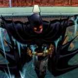
Batman 11/10

The current god king of all Batman runs, Scott Snyder is easily a comic emperor. The Court of Owls dethroned Hush as my favorite Batman arc, and already Death of the Family is poised to claim it instead. Grag Capullo's artwork is INTENSE, and Scott Snyder knows how to make amazingly terrifying villains, and powerfully iconic moments for Batman.

Batman and Robin 7.5/10

Had a shaky start, but it's really come around nicely, though possibly up to it's old tricks. What really seems to hold it back is it's tendency to try too hard to make sure it's fitting in with the rest of the Batman books, forcing plot points, or changing itself to make sure it fits the others at the cost of itself. But it's a substitute for a Robin solo series at times, and this is when it shines brightest, because the character moments it gives to the tragic young Damian are powerful indeed.

Batman Beyond Unlimited 8/10

I have to be honest, this score is due in part to my love of Batman Beyond. But if it was an absolutely terrible Batman Beyond, I'd hate it all the more. Batman Beyond needs better art, but it's doing an amazing job crafting storylines with the world it's been given. But that goes up to eleven and then some for Justice League Beyond. It's taken the world and expanded on it to a cosmic scale, and the artwork is utterly perfect. Even Superman Beyond has really nice fitting artwork, and a fantastic emphasis on the world building and how Superman in that timeline differs from usual Superman.

Batman: The Dark Knight 5/10

David Finch's run is just terrible. His usually cool artwork goes for grotesque and cheesy proportions. White Rabbit is exploitation and objectification personified, and the rest of the story takes Knightfall, one of the greatest, most iconic, and vital Batman stories of all time and wipes it's ass with it. TDK's Night of the Owls issue is excellent, and the subsequent takeover by Gregg Hurwitz has been on par. The Scarecrow story feels like it's dragging a bit, but Finch's art is being used more properly, and there's none of the crappy writing. Plus some pretty skin crawlingly creepy stuff, and a phenomenal #0 issue.

Batman Incorporated 10/10

Grant Morrison is on the final stretch of his 5+ Years Batman Epic. Need I say more, honestly?

Batwing 7.5/10

The first arc drags at the end, but overall the artwork is excellent, supremely atmospheric, and the general tone to distinguish itself from Batman is nice. This series has kind of hit a rut, where it isn't getting bad, really, but it's starting to feel a bit complacent. I kind of know each issue how much to expect, even if I don't predict all the plot elements or twists.

Batwoman 11/10

I just abover declared Batman's current run as the god king of Batman, so it's telling to say that Batwoman is my favorite of the New 52. J.H. Williams III is a god class artist, with a mastery of panel layouts that is matched by no other. AND he's managed to master the style of super detail without losing dynamism. And his writing is such a smooth fit with the artwork… it creates an experience with no equal. Even when Amy Reeder took over for a few issues, the artwork was out of this world, but in a different way; although many did not agree there.

Birds of Prey 3/10

For the first few issues it was a series that was solid, but complacent. Nice artwork, interesting characters, and solid storytelling. Then it suddenly threw a firebomb into the pacing and twisted itself into an inescapable knot of a train wreck. A story arc dragged way too far out into 8 issues, and left itself unresolved before whiplashing into a completely different story for one issue, then whiplashing back again into ANOTHER different story. It actually resolved this third one, and the new artist seems really neat, so it might be ready to start clawing its way back out of the pit it dug for itself.

Blckhawks 7/10

This series was a lot of fun, but frequently frustrating due to the constant artist switching. I actually felt for the characters, but for a series with such a low beginning fanbase, it was building itself far too slowly to survive.

Blue Beetle 10/10

Blue Beetle is channeling the spirit of the mighty Milestone comics. A minority protagonist with such a strong balance between his superhero adventures and his daily life. The artwork is SUPER COOL and it manages to properly juggle a lot of plot elements without causing a slip in quality.

Captain Atom 8/10

The first arc was downright terrible, the art was messy, the direction was vague and strange; and there was a HUGE adjustment from the Pre New 52 military devoted, metallic skinned, nuclear reactor into the Dr. Manhattan clone. And then time travel got introduced, and the series got immensely compelling. It explored all sorts of fantastic philosophical topics but it was too late, the first arc's damage was done; but I would advise giving it a look, try to stomach the first arc in preparation for the glorious second half.

Catwoman 10/10

Amazing artwork, even if it has a tendency to embellish the female form. The story is just so raw, powerful, and emotionally intense. There's a rich depth hidden just below the shallow appearing surface that not many seemed to see.

DC Universe Presents 8/10

This series is, by it's very nature, hit or miss. Fortunately it's thus far been more hit than miss. The Deadman story was intensely metaphysical, definitely a 9 at least. Challengers of the Unknown was a very disappointingly dull take on a sadly obscure team. Maybe a 4. Savage was like Silence of the Lambs with some Elektra Complex mixed in. Another 9. There was a Kid Flash one-off that made me wish Teen Titans was that, and the next arc we have yet to see. The Zero Issue had 0-Issue mini stories for 4/6 of the series' cancelled in the second wave.

Deathstroke #1-8 8/10

Higgins' run is excellent. Badass and rich with character depth. Excellent art and a powerful story for the DCU's greatest assassin.

Deathstroke #9-12 1/10

Seriously. **** Rob Liefeld in the eye sockets with flaming dog ****s.

Demon Knights 9/10

Shining Knight is the best damn character. The artwork is PERFECT for the medieval setting, and the setup reads like a smooth D&D game. The characters are varied and EXTREMELY interesting. The plot is full of huge scale elements and connections to Stormwatch, but what still really drives it is the amazing characters.

Detective Comics 6/10

I mean, I love Tony Daniel, but he's not the best writer. He has some great ideas with his whole set of 'New Wave' villains, but he doesn't totally utilize them very well. His artwork is also testing out a new style I'm not super fond of, especially compared to his genius work on Batman R.I.P.

Dial H 11/10

Absolutely freaking bonkers. There's some powerful psychology going on, but that's just the beginning. Below that, and with some artwork phenomenal for the insanity, is mind-blowingly random heroes, and cosmic scale connections on an inter-dimensional level.

Earth 2 9/10

Some IMMESNELY powerful character work goes on in this series. It does an amazing job at being a series about a whole world, and the reimaining of the Golden Age Justice Society of America is sublime.

The Flash 6/10

I KNOW I'm going to catch some flack for this, but seriously, the first arc is full of some incredibly choppy pacing. Francis Manapul is a damn good artist, but he's new to the writing game. He can craft some amazing scenes, but he's terrible at stringing them together. The art is super pretty, and full of amazing panel layouts; but overall the story leaves a lot to be desired. After an entire year, it's definitely improved and FINALLY built to it's first big climax.

Frankenstein: Agent of S.H.A.D.E. 10/10

In the absence of a Doom Patrol series, it was Frankenstein who filled my 'weird superhero' niche. With a tendency to scale monsters far over-the-top; this series just oozed fun. No holds bared as Frankenstein's monster, taking his creator's name for his own, stoically sliced his way through the weirdest things the New 52 could present. He's such a fantastic character and I'm so glad he's getting meshed into Justice League Dark so we don't lose him when his series is cancelled in January.

The Fury of Firestorm: The Nuclear Men 7/10

This series had an incredible rocky start, with a pretty awful first issue, and took a bit to trot out a genuinely good one. But once it did, it leapt off into a world of it's own in a unique blend of science fiction and global espionage. Splitting up the main duo was a risky move, but one that proved beneficial as we got into some great emotional pockets and a nice sense of duality as each character explored different corners of the Firestorm world.

G.I. Combat 6/10

As much as I like Unknown Soldier, this series will never truly replace Men of War. It takes a much goofier approach to blending war and superhero genres, leaning more towards the latter in contrast to Men of War. The War That Time Forgot was a simplistic story that relied on action sequences with artwork that was stiff as a board.

Green Arrow 2/10

Green Arrow is perhaps the most bafflingly terrible series in the New 52. At this point it's up to it's third creative team change and only one or two issues have managed to be any semblance of good. Ollie's rebooted character is extremely dull and generic, especially compared to his previous incarnation and even the new show. Krul didn't seem like he cared since his previous Green Arrow story got grounded before it could take off, and Dan Jurgens' artwork wasn't dynamic enough to work for Green Arrow. Nocenti actually has good ideas, but seems to have no grasp of the concept of pacing. THANKFULLY DC's finally going to make sure they get GA to WORK come February when they put Jeff Lemire and Andrea Sorrentino on the title.

Green Lantern 8.5/10

Don't get me wrong, I'm a HUGE fan of Geoff Johns' big Green Lantern saga, and I loved the first Sinestro arc, but Secret of the Indigo Tribe and the one issue right before it left a lot to be desired. But overall we've got great art and continued expansion and exploration of the huge Green Lantern mythos Johns has been building for over half a decade. The only concern is that this really isn't for new readers, and I would advise going back through his whole saga to jump on. It's worth it, but really daunting.

Green Lantern Corps 8.5/10

Less appreciated since the relaunch, I've personally found this series to be just as good as before, narrowing its focus a bit, but it's hard for me to complain, personally, because Guy Gardner is hands down my favorite Green Lantern. Lots of intense things are going on with Guy and John, and it's a great companion to Johns' Green Lantern. At the same time, this is probably the most accessible of the Lantern titles.

Green Lantern: New Guardians 8.5/10

Like Corps, a great companion to the main Green Lantern series. This one is a great exploration of the far reaches of the Lantern cosmos, with members from all the various Corps. While Corps is the most accessible, New Guardians is probably the least. It relies on knowledge of all the corps, though conversely it could be seen as a good introduction to them. The art is a inconsistent, but overall there's a lot of nice stuff for Green Lantern fans.

Grifter 7/10

A pretty good series for the first 8 issues, it was solid, but rarely reaching for greater heights. It has such frantic high octane energy, like a primetime drama with a big budget. It wasn't particularly deep, but it was so damn much fun it was hard to truly care. It was odd though, because I always enjoyed the series more in retrospect than in individual reviews, but it was a lot of fun. And then Rob Liefeld took over...

Hawk and Dove 1/10

I really like the characters, but Rob Liefeld..... ugh. Not only did everyone have utterly stupid bodies and 1 to 2 facial expressions, details were not consistent, sometimes not even in the same page!

I, Vampire 11/10

My third favorite out of the entire New 52, I, Vampire is an intense experience like no other. Don't let the first few covers fool you, this is ab.out as far from Twilight as vampires can get. Andrea Sorrentino is an amazing artist, and a very unique one. The artwork is just so raw and intense, and the writing matches up to it. It's perhaps the most amazingly unique title in the New 52, and I'm incredibly happy to see it's outlasted some series' I thought were safer. But it still needs all the readers it can get. Seriously, it's amazing.

Justice League 4/10

Geoff Johns can write Green Lantern, that goes without saying. Geoff Johns cannot, however, write Justice League. The rebooted origin has Batman revealing his identity to Green Lantern within an hour or two of meeting him, piss poor societal reactions, terrible team dynamic.... unbalanced character spotlighting; it's just..... Some issues are great, but most range between terrible and 'meh.' The biggest redeeming factor it has is SHAZAM, because BIlly Batson's new origin story is incredibly emotional and intriguing. It infuriates me to no end that Dr. Sivana was turned into Hipster Lex Luthor, but whatever.

Justice League Dark 8/10

This is pretty much not a 10/10 ONLY because I have to include a judgement of Milligan's run, which was still damn fine and intriguing and compelling and whatnot, but there was just some kind of spark missing. I still have no idea what it was, but Jeff Lemire damn well BROUGHT it. Jeff Lemire rocketed this series into pretty much perfection. It's full of Vertigo leftovers and the obscure magic corners of the DCU.

Justice League International 7.5/10

This one definitely channeled a good deal of energy from the original JLI, with Aaron Lopresti as a great chose for an artist with a style good for a wide range of heroes. Booster Gold was great, and some of the B-Listers from the days of old, no longer B-Listers due to the old JLI, were replaced with new ones in that category. I grew to love the characters, and the character interaction was where this series shined. But the first arc had an odd villain, and the second arc, seeded in the first, really dragged out. Still a shame to see this one cancelled, but the Annual is worth a look because it sets up a lot of threads for stuff coming up in New 52 Year 2.

Legion Lost 8/10

This is one of the most amazing scores on this list, because I have such a seething hatred for the Legion of Super-Heroes. I find them to be SO UTTERLY BORING with their confusing space politics, handful of lame characters and even lame names with all the 'Lads' and 'Lass's', and the fact that there's just too damn many of them. It's impossible to flow right because it seems like every writer is determined to use every single one all the damn time. It's insane. But this series proved that it's the concept holding LoSH back (in my mind of course) because it removed ALL the negative elements; stuck them in the present so there's no space politics, only took in interesting characters, and only took a handful; and it's been one of my higher ranking series' ever since. Tom DeFalco hasn't done as good a job as Fabian Nicieza, but I'm still really bummed to see an end come to the only Legion of Super-Heroes series I EVER liked.

Legion of Super-Heroes 2/10

Pretty much just see above.

Men of War 8/10

A really under appreciated series, this was a heavy modern war comic set in the fantastic world of the DCU. It was fascinated in the elegant way it depicted the supernatural elements through the eyes of soldiers. There wasn't superhero nonsense happening all the time, in fact many times it was something barely involved with them. It was such a unique style with some very pretty artwork in a dark way. Even better was the final issue with Frankenstein in WWII.

Mister Terrific 3/10

The first few issues were pretty good. Well, the first... two? The third issue was an utter train wreck saved only by the artwork, and the series just kind of spiraled the drain until it's timely early demise.

Nightwing 6.5/10

This series has fluctuated pretty weirdly. The first few issues opened up a serious can of worms, but then proceeded to juggle it around and head towards a conclusion that seemed to have no escape from cliche; and then at the last minute demonstrated exactly what the twist was on the cliches, delivering an epic conclusion. And the artwork always has such a great sense of acrobatics, dizzying arcs and circles and flips. But then it's Night of the Owls tie-in had a twist to Dick's name that I found pretty forced, and since then it's just not really grabbed me. Death of the Family MIGHT be able to reignite it, but right now it's probably one of the weakest in the Batman Family.

O.M.A.C. 7/10

This series got a TON of undeserved hatred. I'm not always a fan of Keith Giffen's artwork, but I felt this was one time where it worked. O.M.A.C. was also accused of being a Hulk clone. Sure they're both muscled men with limited control and a penchant for smashing, but they wrestled with far different issues. Hulk struggles with controlling his rage, while O.M.A.C. struggled with BEING controlled by a superpowerful A.I. It wasn't super deep, but it was a ton of fun and Brother I and Maxwell Lord.

The Ravagers 6/10

This series started out with a lot of potential, and a good vent to diffuse some of the overload in Teen Titans, but it's kind of wallowed and stagnated in a mess of over dramatic angst and an inconsistent artist schedule. It's not exactly bad at this point, but it's hard to be excited about it. The writer is changing, and Ig Guara, one of my favorite artists fresh off of Blue Beetle, is taking over the art duties; so maybe they'll reignite the spark this series began with.

Red Hood and the Outlaws 8/10

This is definitely a flashy high energy kind of series, but it rocks it well and isn't ashamed. Kenneth Rocafort's artwork is GORGEOUS and had so much fun playing around with the layouts. It tends to scrape the edge of depth before edging away, but it's such a damn fun ride that I consistently enjoy.

Red Lanterns 4/10

This series had a good bit of potential, but frequently squanders it. It spent the entire first year stretching out a story far beyond its limits, contorting into a grotesque shade of its former self. Ed Benes handled the art for most of the first year, and the man cannot draw Bleez without oversexing the hell out of her. And the few interesting bits of story got thrown in tiny bits in favor of the groaningly back and forth stretched bits of the rest of the mess. And then the Star Sapphires showed up for some of the last few issues of the first year and got reduced to some awful female stereotypes.

Resurrection Man 8.5/10

I REALLY loved the concept for this series, I'm a sucker for a well written 'immortal protagonist' series, and this one had all sorts of intriguing hooks. But after the first few issues it kind of lost touch with itself, but rekindled it in #7; but overall it always seemed like it was missing a little something. I think Abnett/Lanning were playing it a bit too safe, but I'm still really sorry to see this end. But I would probably recommend the original series over this one. It lasted much longer, and went a little deeper. But this one was an interesting reinvention of the old one.

The Savage Hawkman 6/10

I'll be honest, this is one of the two series I've fallen behind on, but this one just got unlucky as opposed to Legion of Super-Heroes which I loathe. I LOVE Philip Tan's artwork, but Tony Daniel's writing wasn't quite up to par. Still, there was some pretty badass stuff going on, and what I've seen of Joe Bennett's artwork looks like a good fit, though I know Rob Liefeld was writing for a few issues...

Stormwatch 7/10

This series always feels like it should be a lot better than it is. The characters are super interesting, but no writer thus far seems to be capable of properly handling all of them. Paul Cornell had a surprising tendency to overuse exposition, but his story had drive and direction. Peter Milligan has been floundering about in one issue arcs that take a neat idea and let it fizzle, while slowly giving bits and pieces of the main story far too distant in between. There's still a lot of nice stuff, but this fuzzy direction and inconsistent art schedule; not to mention Apollo and Midnighter getting ALL the spotlight with Jack Hawksmoor getting ABSOLUTELY NONE OF IT; has really taken a toll on this series.

Suicide Squad 2/10

This series had some damn good issues here and there, and screw all the haters, the new Harley Quinn is the same Harley we know and love; and that costume is totally in character for her. Throwing herself at Deadshot however, is not. King Shark is great though, but not as much as in Secret Six. And the art's very inconsistent. But the REAL kicker is the complete and utter decimation of one of the absolute best characters of the DCU, Amanda Waller. I've ranted about this plenty, go to almost any of my SS reviews, but basically they turned a powerful confident imposing figure, cold as ice and the biggest badass the world had ever seen; into a skinny empathetic so-so stereotypical action girl. Just.... so much rage. Not to mention this Basilisk thing has been dragged out utterly painfully, and the one interesting thing they had going on ended up with the most insanely predictable result.

Superboy 5.5/10

Superboy has been WAY too stuck tying itself to Teen Titans, without taking time to explore its own identity as a solo series. It many times feels like it's just a vessel to dump what can't fit in Teen Titans. Even once it started to free itself, it got muddled in a confusing mess of a supporting cast with sub-par stories and a weird sense of direction.

Supergirl 9/10

I hadn't expected a whole lot from this series, but it's proven to be one of the best of the Superman family. Supergirl's self exploration on a worl where she doesn't understand the language has been an almost adorable journey of innocence and loss. The artwork is always smooth and satisfying, even if a few issues don't quite measure up to par.

Superman 3/10

Grant Morrison's been taking all the Superman quality or something because his self titled series has been an utter train wreck. It's an interesting parallel to Batman being amazing and Detective Comics being just so-so. But Detective Comics was at least decent. George Perez's arc was utterly atrocious, chock full of far too much dialogue, much of it horrendously forced and redundant, and the story was a terrible exploration of Superman's effect crammed down your throat. Then Dan Jurgens took over and the series took a rise, and then fell again back into, not quite as awful, but just pretty bland. Scott Lobdell and Kenneth Rocafort delivered a solid Zero issue, so I'm looking forward to them hopefully invigorating this series finally.

Static Shock 6/10

I'm usually a defender of Scott McDaniel's artwork, but he just wasn't a good fit for Static, and his writing was cliche and cheesy. John Rozum TRIED to keep things held together, and pushed the rest of Milestone in, but his ideas were frequently ignored and he left the series to die off under McDaniel's so-so direction. It's not exactly terrible, but not worth it for casual Static fans, though there are a few hidden gems for Milestone alumni.

Swamp Thing 10/10

Scott Snyder deals us a second masterpiece in addition to Batman. While this isn't QUITE as good, it's NOT something to be overlook. With a strong tie to Animal Man, Swamp Thing has built a masterful sense of dark tone and powerful character work. The new love being built between Abigail Arcane and the true Alec Holland is immensely heartwarming, and the way it plays around with the continuity from Moore's run is surprisingly not restricting to new readers. Yannick Paquette's artwork is beautiful even when grotesque, and Marco Rudy is a MASTER of inventive panel layouts. And the two artists have the ONLY inconsistent schedule I've ever seen work; and actually it works to the series' advantage.

Teen Titans 6/10

This Teen Titans incarnation is always playing it risky, drastically reinventing the characters and elements. Wonder Girl just annoys the hell out of me, where previously Cassie won me over Pre-New 52. And the romance between her and Superboy is horrendously forced where it doesn't work between the radically different versions of these characters from before. There's an interesting supporting cast of new characters, but they tend to get ignored. This is the forefront for the N.O.W.H.E.R.E. story, but it's rarely the best. Brett Booth also has a style that I just don't enjoy, but can't say is genuinely bad.

Voodoo 5/10

The first four issues, under Ron Marz's scripting, were an absolute MASTERPIECE. Amazing levels of subtlety, suspense, minimalism in internalizing the main character, moral grayness and uncertainty. And then they kicked him off and Josh Williamson radically shifted the direction of the series, shoving in hard sci-fi in way over-the-top doses, and a dizzying overdose of one massive plot twist after another; with most of the major ones making absolutely no sense and contradicting Marz's issues. Eventually it settled out of the rut of pissing me off for stomping Marz's run into the ground, but at that point is was never anything more than so-so.

Wonder Woman 10/10

Brian Azzarello has made me so interested in a character I was apathetic to for YEARS. Wonder Woman is near the top of my list, because the storytelling is so compelling, with brilliant interpretations of the Greek Pantheon, and a great sense of a dysfunctional rich family using shady interfamilial politics in a fight for the throne in the absence of the king. And Wonder Woman's place in all this is one of pure compassion for the unwilling caught up. She's an amazing badass, but such a deep character. And Cliff Chiang's art is excellent, and Tony Akins is even coming around.

Worlds' Finest 4/10

Power Girl and Huntress are returned to their Earth 2 origins, but this series seems to rely on you being a fan of the characters. I'm not, but I was hoping to be won over. But nothing's done to try and endear you to the characters, and the first arc has a story that starts out ok, but starts to drown in utter dullness. I'm also not really a fan of George Perez's artwork, I think his style is very stiff and stale. Kevin Maguire does the flashback art, which is weird because his style is more modern and dynamic. And they got rid of Power Girl's boob window, but her clothes get torn off like every issue! The zero issue was surprisingly emotionally potent, but otherwise this series is pretty much just bland and boring.

17 Comments

Celebrating 1K

I'm nearing 1,000 reviews here on the vine, lately I've been pretty busy, and I'm still working my way out of a hole with over 10 issues from the past 3 weeks alone I haven't been able to even read yet. And since my favorite series' are at the bottom of the pile, it's mostly my favorites from the past few weeks that've built up at the bottom of my pile. Batwoman, I, Vampire, Morning Glories, etc.

But, I've reached 993 reviews, and if I just finish my pile, I'll pass the 1K mark without thinking about it, and boy do I not want to do that. I really want to pick a special comic to review for NUMBER 1,000! I was hoping Umbrella Academy: Hotel Oblivion would FINALLY be starting because the first issue of THAT would be perfect. But that didn't happen, so I'm in a pickle.

What should I review for glorious review number 1,000?

I could go with one of the ones on my current set; Morning Glories #21, with an epic cover mirroring the first but with a whole slew of unknown characters?

I, Vampire #12, wrapping up the first year of such an intense atmospheric series I utterly adore?

Recently acquired Robin #126, the debut of Stephanie Brown as Robin?

Umbrella Academy: Dallas, follow up to one of my other landmark reviews with such an incredible sequel?

FINALLY get to defending the, imo, INCREDIBLY unfairly hated Rise of Arsenal?

Gush my love of the CSA with JLA: Earth 2?

I could go with a classic, Batman and the Outsiders #1

Madame Xanadu #1, Sebastion O #1, Chase #1?

We3?

Arkham Asylum: A Serious House on Serious Earth

Batman: A Death In the Family

See now I feel like I'm just throwing ideas out randomly.... Anybody have any ideas of things that would seem to be on my to-read list (or actually on it as in my earlier blog post) or just something monumental?

Maybe I should finally read Crisis On Infinite Earths...

Help?

3 Comments

Scoping Out Solicits: Events Horizon [In Progress]

It seems like we've got a lot of events culminating around this month, bigger than before; because The New 52 has only begun to scratch the surface of events; but that's mostly been a good thing, only the truly deserving storylines become events, and they're not nearly close to being exhausting. We'll have to see about Trinity War though.

ACTION COMICS #14

No Caption Provided

Superman looks just as baffled as I am. Don't get me wrong, the composition is damn excellent, but seriously, what the hell is going on HERE? Last issue had that bondage dog collar thing, suddenly there's angels? But the weirdest part about this is the fact that the solicit mentions The Multitude that Brainiac alluded to, and the conflict will be happening on Mars; and then the cover has an army of angels in a blue sky? Grant Morrison, what crazy drugs have you been taking this time?

ALL-STAR WESTERN #14

No Caption Provided

Ok, this has a similar sense as the previous one, but ends up far goofier. The grins just seem to give people hilarious faces instead of creepy uncanny ones. And Jonah Hex just doesn't look at all like Jonah Hex, I barely recognized him. The story sounds REALLY interesting, but I'm wondering why there's no description of what the co-feature will be, but it says there will still be one.

ANIMAL MAN #14

No Caption Provided

BLACK ORCHID! DON'T LEAVE ME BEHIND! I ALREADY LOST HAWKMAN!

They're dragging me away to where I really belong, IN SWAMP THING!

BUT HE'S ALREADY GOT POISON IVY AND DEADMAN! I NEED ALL THE HELP I CAN GET!

AQUAMAN #14

No Caption Provided

All right, this is a solid cover. Not an artistic masterpiece, but good poster fodder. Introduction of Ocean Master getting a simple cover like this works fine, especially for Geoff Johns... It'll be interesting to see Pete Woods doing a guest art issue, his work on Legion Lost has been solid, and his run with Paul Cornell on Action Comics was excellent. Also, apparently the conclusion to The Others is connected to this, and that intrigues me.... though now that I'm typing it out I realize that's a very 'Geoff Johns' move.

BATGIRL #14

No Caption Provided

Hmmm, Ed Benes' work actually looks good here. He managed to resist the urge to highlight Batgirl's boobs and ass together. And he's made the Joker look deliciously creepy. It's amazing that what makes this work is something that is generally the opposite of Benes' m.o., and that's subtlety and minimalism. There's no background behind The Joker, and it makes him really stand out with the glare of the spotlight. He looks like such an amazing fusion of gentelmanly and psychotic. It looks like he'd just finished dancing a tango with her, and we have no idea if he stabbed her before or after the dance, he's just that insane and chaotic. And the valentine's candy really ties it all together with a beautiful bloody bow.

BATMAN #14

No Caption Provided

THIS. IS. FANTASTIC. It's so goofy on a level that genuinely works. Joker's just watching his hastily stacked monitors dressed as a utility worker. The whole makeshift headquarters is just so damn Joker. Everything about this cover is unexpected, and pretty much the opposite of the previous cover. It just feels like this is a rare 'behind the scenes' look at The Joker as he works on a plan. It's genius in the way is so unexpectedly clashes with the intensely creepy tone of the previous cover and the other 'Death of the Family' tie-in covers.

BATMAN AND ROBIN #14

2 Comments

Scoping Out Solicits: Take Two-Lucky Halloween, Number Thirteen

Yeah, so, my first attempt at this was a bit of a mess. Let's try this again. I MIGHT go back and finish the Zero Month solicits, but I'm not sure.

I had a realization that made me really like the idea of the Zero Month. With the zero issues in September, we get the #13 issues in the month of Halloween! Awesome synch, and some BIG stuff. Return of the Joker, Rotworld, Rise of the Third Army; the DCU is getting unlucky this October, and that's a good thing. Batman and family really have some FANTASTIC covers this month, and there's a few artist changes or guest stints that seem pretty interesting.

ACTION COMICS #13

No Caption Provided

You know, that hand is pretty ominous, but I'm not super fond of the art style. I feel like this cover design is actually really nice, but I just can't get sxcited by it. And am I the only one who things the hand belongs to like... Lois Lane in bondage gear? That's totally a Superman collar right there. But for me, all of this is moot because I'm SUPER excited about this issue because TRAVEL FOREMAN IS DRAWING IT. Grant Morrison + Travel Foreman = WINNING.

ACTION COMICS ANNUAL #1

No Caption Provided

The overall design is pretty boring, not to mention I've seen this boring cover layout done far too many times. Cully Hamner's art doesn't quite look its best. But mostly, I'm not excited about this in the least upon finding out it's entirely Sholly Fisch and no Grant Morrison. Sure there have been a small handful of backup stories in Action Comics that were actually great, but aside from the usually crap ones, there's others that came so close to greatness but were ruined in the end. This just doesn't feel like it will matter, at least not even a fraction as much as the Batman, Teen Titans, or Animal Man Annuals.

ALL-STAR WESTERN #13

No Caption Provided

Yeah, Ariel Olivetti is MUCH more suited for covers than interior art. Although, words can't even begin to describe.... this is either gut bustingly hilarious, or pants-crappingly terrifying. I mean.... how do you react to THAT? Even Jonah Hex is shitting himself. On a more serious note, it's still awesome to see just how much Gotham history Gray/Palmiotti are infusing into this series. Jonah Hex will be just coming off a Court of the Owls storyline at this point, so to see Haly's Circus next raises some serious intrigue.

ANIMAL MAN #13

No Caption Provided

Taking a page out of Yanick Paquette's book I see, Pugh? Frankly, it works. It's subtle, but awesome. And that's a messed up disturbing Rot-Hawkman you've got there. Lately I've really seen the art on Animal Man improve as Pugh started to be more true to his own style instead of trying to be like Travel Foreman. Though, for all my praise, this cover's actually not super interesting in layout. Animal Man's posed a bit odd and there's not a whole lot to it. But the solicit makes this sound ridiculously epic, and Animal Man has yet to let me down, so bring on Rotworld!

AQUAMAN #13

No Caption Provided

At first I thought this was a different artist, perhaps Kenneth Rocafort, but upon closer inspection, I think it's just unfinished. I kind of like the gentler colors though, it might actually be a shame to see this one completed. It's got a nice movie poster quality to it, one of the better Reis covers, though not as stunning as some of the ones right before it. It's a good overall wrap-up cover for this arc.

BATGIRL #13

No Caption Provided

Why is Batgirl so ridiculously curvy... OH! Ed Benes! Oh...

Boring design, WAY too much of a close up without an interesting pose. Blah.

BATGIRL ANNUAL #1

No Caption Provided

It's a shame, this design is really clever, but the poses for ALL the characters are just terrible and awkward. OH RIGHT, Ed Benes again. Oh...

The solicit is the dumbest thing I've ever read. "Batgirl is on the hunt for Catwoman – but who is after Batgirl?" Gee, I don't know, is it maybe THE TALON!? The Talon who is ONE THE COVER and mentioned in the previous solicit to be hunting Batgirl? I'm excited though, Gail Simone did a lot of clever things with the Talon, but let a lot of them fizzle, so the fact that she's bringing her back excites me. But Ed Benes....

BATMAN #13

No Caption Provided

Dear sweet lord is that creepy as hell and I absolutely ADORE it. THIS is how you do a nice simple cover and still be unique and awesome. It's horrendously unnerving to look at what little we see of The Joker's face, and the huge empty space just makes you really nervous about what we're NOT seeing. But it's not just blank white space, it's like he's.... somewhere. Somewhere dark. MAYBE HE'S IN THE SHADOWS RIGHT BEHIND YOU OH GOD! The title's a little overly self-indulgent, Return of the Joker: Death of the Family, name dropping two major Joker stories... Scott Snyder's writing a check that few writers's pens could cash. But he's SCOTT SNYDER. He's just wrapping up The Court of Owls. It is odd that he's said he like the more quiet short detective stories, and he's about to do his second major Batman Family-wide affecting event type story, but what the hell, I'm excited beyond all reason.

BATMAN AND ROBIN #13

No Caption Provided

This is utterly HORRIFYING in so many right ways. It's all centered nicely and I just..... holy damn. Patrick Gleason's probably makes DC's printers run out of red ink CONSTANTLY.

BATMAN BEYOND UNLIMITED #9

No Caption Provided

It's pretty boring. Standard overused stock design. It does seem to confirm my suspicions that whoever's on the cover is the one who's story will be first in the issue. I REALLY wish DC wouldn't be trying to fit 3-4 titles in one. Keep it $3.99 with 40 pages as you've been doing, but split it into two series. Batman Beyond with Beyond Origins as the Co-Feature; and Justice League Beyond with Superman Beyond as the Co-Feature. 20 pages each time for all series'. And can we get someone besides Norm Breyfogle to draw Batman Beyond? Can we put Dustin Nguyen on Batman Beyond and then like... I don't know, Peter Nguyen on Justice League Beyond? Or Lee Garbett maybe. I dunno. Also FUTURE MAFIA LEADER SOLOMON GRUNDY!!!!!

Batman Incorporated #5

No Caption Provided

SO. AWESOME. I love how Burnham left room for EXACTLY where to fit the logo. This is going to look AMAZING with the text. And it's just so.... We're looking OUT from Arkham, from behind Batman as GOTHAM CITY burns, and the mob rushes in. Everything just works so damn well here, I'm in awe. Not to mention we're visiting the Batman #666 future which I love beyond all reason. I'm working on an entire ongoing series pitch set in that future, if/when I ever get into the industry. I can't freaking wait for this.

Batman: The Dark Knight #13

No Caption Provided

Sure, Batman's face looks a little bizarre, but overall I love this cover. The wood cluttering the image actually SUCCEEDS in creating a seemingly intentional sense of looming claustrophobia, the chains suggest desperation; but what MAKES this cover is the way Batman's cape rips the bottom off the image. Gregg Hurwitz's first issue was definitely miles above ANY of Finch's, but it hasn't quite hit greatness. The potential is definitely there, so come October we might have all five Batman titles being excellent.

Batwing #13

No Caption Provided

Seriously, DC's going to have to use the blood of Rob Liefeld to have enough red ink to accommodate the Batman Family alone.

BATWOMAN #13

No Caption Provided

Wonder Woman's face looks a bit off.... this is a little simplistic for J.H. Williams, but that just means its still heads and tails above most.

BEFORE WATCHMEN: RORSCHACH #2

No Caption Provided

You know, I wasn't planning on talking about the Before Watchmen covers...... but this one is just..... too awesome for words..... holy damn.

BIRDS OF PREY #13

No Caption Provided

I.... want to say this one's good. The layout is a nice sort of intriguing, the art style is good... but it just... doesn't work. It's awkward on so many levels. Katana's body looks super weird, Catwoman's pose is just a little off; and something just feels... I don't know. Well... it's actually a pretty good cover, I just don't think the characters balance out the image as good as they could. The colors are beautiful though.

BLUE BEETLE #12

No Caption Provided

OH MY GOD FINALLY AN IG GUARA COVER! Unfortunately it's STILL very boring, better than most Blue Beetle covers (How depressing is that!?), but it looks SO much like it's supposed to be a full page image, or even just a blown up panel. Sigh.

CATWOMAN #13

No Caption Provided

Ok, this Andy Clakre cover is super cool, but I'm not fond of the way Catwoman's face looks here. But overall, I'm EXTREMELY bummed that Winick's off the title. There have been FAR too many haters on this series going "Oh look at all the sex and violence, this must be a shallow series. HEY! THIS IS A SHALLOW SERIES!" Well F*** THOSE GUYS. Catwoman's been a series TEEMING with depth, YOU JUST HAVE TO LOOK FOR IT. But no, everyone judged it at a glance. Winick's been KILLING it on this series, inspired me to write several Grade A (Literally, I used them for college classes) Essays on the deeper issues; and all I know of Nocenti is that she's celebrated for Typhoid Mary on Daredevil and she's managed to just about be slightly less terrible than any New 52 Green Arrow writer before her.

DC UNIVERSE PRESENTS #13

No Caption Provided

Sook just keeps on nailing these DC Universe Presents covers. I think this one's unfinished, but I hope it stays exactly like this. Also... Black Lightning and Blue Devil!? That's a hilariously random pairing, can we get a Brave and the Bold series with random team ups like this? I'm not sure about Blue Devil's new design though, It's REALLY COOL but it's..... not at all like he was before. But we're back to a 5-Issue arc, so that means there's a lot more time to explore these characters than the most recent stuff.

DEATHSTROKE #13

No Caption Provided

You know how earlier I recommended DC use the blood of Rob Liefeld to ensure they have enough red ink? Yeah.... they could not do that soon enough. IT LOOKS LIKE SOMEONE LOPPED OFF HALF OF DEATHSTROKE'S RIGHT FOOT WITH A LASER SCALPEL.

DEMON KNIGHTS #13

No Caption Provided

At least everyone's actually PRESENT for once.... BUT IT'S STILL ETRIGAN AS THE CENTRAL FOCUS. Everything else is so damn cool though.... I HATE that I can't really like this cover.

DETECTIVE COMICS #13

No Caption Provided

This is a fairly decent cover, but it could be a photograph of Stan Less dressed as Namor for all I care and I'd still be excited as hell for this because JOHN LAYMAN IS GOING TO BE WRITING DETECTIVE COMICS!!!!!!!!!

DIAL H #5

No Caption Provided

Bolland has consistently been utterly NAILING these Dial H covers, but this...... this is GORGEOUS. Such a simple idea.... but the twisting and the blur and just..... oh wow. And China Mieville's writing and Mateus Santolouco's artwork have continually been amazing to match. When I get this issue I might literally die, this thing's going to hypnotize me.

EARTH 2 #5

No Caption Provided

Hmmmm, as I've come to expect from Ivan Reis, it's certainly cool art, but it's a really boring cover. Decent, but lackluster. But inside we get James Robinson and Nicola Scott and Alan Scott and the I'm-still-uncertain-about Solomon Grundy.... Yeah.

FRANKENSTEIN: AGENT OF S.H.A.D.E. #13

No Caption Provided

A THREE ISSUE ROTWORLD TIE-IN!? SIGN ME THE HELL UP!

Alternatively, SHUT UP AND TAKE MY MONEY!

G.I. COMBAT #5

No Caption Provided

Bah, that cover's pretty messy. Haunted Tank is too bizarre sounding to not be at least somewhat interesting, AND UNKNOWN SOLDIER ISN'T ENDING! I hope Staz Johnson is as fun an artist as Dan Panosian though. Maybe this WILL become 90% a replacement for Men of War (Will never be 100% because MoW had the most incredible covers of ever.

GREEN ARROW #13

No Caption Provided

This Aaron Lopresti cover is pretty dull. It's an action scene with no momentum. That said, the dude with the katana's got a SWEET cape and some pretty badass tattoos. I dunno, there's been only one issue in this series thus far that's actually wowed me through three writers, but lately Ann Nocenti seems to be improving.

GREEN LANTERN #13

No Caption Provided

THANK GOD THAT'S NOT MEANT TO BE JOHN STEWART.

OH SHIT I JUST NOTICED ALL THOSE FREAKY DUDES IN THE BACKGROUND. I kind of skimmed over all the GL covers the first few looks, because none of them look particularly compelling on their own, but they make a decently cool connected image. I kind of thought that new Green Lantern was more a prototype or something for The Third Army.... I'm not so sure how I feel about adding a 5th/6th (depending on how you look at it) Earth Green Lantern... But the presumedly Third Army guys in the background there are completely disturbing and uncanny in all the right ways.

GREEN LANTERN CORPS #13

No Caption Provided

Mostly ditto on the above. Oh but CAFU doing Green Lantern art? Intriguing.

GREEN LANTERN: NEW GUARDIANS #13

No Caption Provided

Ditto again, but let it be known that Larfleeze is the best thing ever. @OrangeLarfleeze is fucking fantastic, hasn't updated much lately thought. Unrelated.

GRIFTER #13

No Caption Provided

So, you know how when you post an image, it asks if you want to edit it? I had to lie when I clicked 'no edit needed' because .... I can't even think of an explicative strong enough for this atrocity. Just find quotes from Punk Zombie Zed from Lollipop Chainsaw, and that sums up my feelings about Rob Liefeld's artwork.

I, VAMPIRE #13

No Caption Provided

Clayton Crain's first cover for this series was PHENOMENAL but lately he seems to be creating a tone more akin to the first few. DO MORE CREEPY STUFF MAN! That said I LOVE the snow effects here, and I'm beyond intrigued by this notion of Human Mary trying to kill Insane Andrew. How the hell did we get here from where we are now? And shame on everyone who's not reading this. Look at the cover for #9 to get an idea of what this series is all about.

JUSTICE LEAGUE #13

No Caption Provided

So The Villain's Journey is only going to be a 4 issue arc? Oh... It'll be cool to see Tony Daniel's art on Justice League, but his cover's really far from his best work. The design is about as cluttered and messy as most Justice League covers, so I'm starting to think Geoff Johns designs them; but his art style's got a lot more awkwardness than usual. And no offense to the woman, but Cheetah's 'destined to become one of the greatest threats to the DC Universe?' BULL. CRAP. SIR.

JUSTICE LEAGUE DARK #13

No Caption Provided

I WANT to say there's nothing wrong with this cover.... but there's this bit of empty space under Deadman's arm and above-right of Constantinte's head, it just makes the whole thing feel a little off. But if another character or some text gets put there, it might actually make this cover work just fine.

Oh no wait, I think that's not the final cover. The solicit says Ryan Sook is still doing cover's but that's Mikel Janin. Yeah, there's some other stuff that... I think this is interior art as a holdover.

JUSTICE LEAGUE DARK ANNUAL #1

No Caption Provided

Yeah, ok, THIS is a Sook cover. Pretty nice but nothing super special though. But, guest starring Frankenstein? AWESOME.

LEGENDS OF THE DARK KNIGHT #1

No Caption Provided

I'm really excited for Legends of the Dark Knight to be returning! And there's a story with art by Jeff Lemire? Cool! Though I like that I don't know most of the creative teams, I think many are new or obscure talent, it's nice to see them shine. That said, this cover's pretty bad. Batman's way too close taking up way too much space. Blah.

LEGION LOST #13

No Caption Provided

The mostly white background REALLY isn't doing this cover any favors. Then there's probably the worst rendition of Dawnstar's ridiculous exposed chest, Wildfire and Timber Wolf have odd overlapping bodies.... It's a bit of a mess. That said, the return of Harvest promises to be interesting and awesome.

LEGION OF SUPER-HEROES #13

No Caption Provided

At least everyone else on this cover is as freaked out as I am by whoever that is's back being arched so painfully... not to mention his deformed stomach or chest! o.O. I also don't recognize a single person on this cover, and that doesn't surprise me. The Legion is far too damn big. And I'm sorry Legion, but it's too late to excite me with Space Pirates, you've been too lame for too long.

LOT 13 #1 of 5

No Caption Provided

WOW! Just... WOW! This is absolutely stunning! The nice sepia touch to give it an old-fashioned 'homey' feel; but then JUST the right sprinkling of super subtle creepiness. This is GORGEOUS and just slightly unnerving in every right way! My only concern is, what the hell IS this? It's rated 'Mature' and it's not in the DC Continuity..... why isn't this a Veritgo title?

MASTERS OF THE UNIVERSE: THE ORIGIN OF SKELETOR #ONE SHOT

No Caption Provided

So at first glance (Since DC no longer freaking includes the covers ALONGSIDE the solicits like a sane and rational company!) I was ready to completely disregard this. Nothing against it, I just have no real interest in He-Man and the Masters of the Universe. Not a seething hatred like Legion, just general apathy. Then I went back to look at the credits and I was like 'JOUSHUA HALE FIALKOV!?? Writer of I, Vampire; my third favorite OF ALL 52!? FRAZER IRVING!?? ARTIST OF XOMBI!? Well FUCK, I guess I HAVE to get this now. Thanks DC, my wallet hates you.

NATIONAL COMICS: MADAME X

No Caption Provided

A Fiona Staples cover pretty much guarantees awesome. Her nudity is a little odd, but it mostly works. Overall I'm just not sure how to feel about this. 'Madame X' over 'Madame Xanadu' is a little odd, and though I've only just started reading her Vertigo series I am absolutely in LOVE with that version. Could definitely be due in part to Amy Reeder's artwork. I just don't know if there's any way for me to not be let down by this, and that's kind of a shame on my part.

NIGHTWING #13

No Caption Provided

I uhhh.... eh. Lady Shiva's New 52 debut has potential, but overall this cover is just... eugh. The forced perspective with the circle just looks stupid because there is absolutely NO contextual justification. The grainy effect is really odd here, Nightwing's position is kind of stupid and overused, and the assassin's proportions look really off. And overall the design's just pretty dull and uninspired. Super bummer really.

RED HOOD AND THE OUTLAWS #13

No Caption Provided

I uhhh.... Huh. Blackfire looks.... strange, to say the least. And Starfire looks like.... she's humping her sister's leg with an orgasmic expression? And Red Hood looks pretty apathetic. This is just a mess. And it's a shame that Kenneth Rocafort is leaving the title right before the end of the story arc XP

RED LANTERNS #13

No Caption Provided

Same as the other Green Lantern covers. Also Dex-Starr looks HORRIBLE here. Ugh. Sad kitty :c

STORMWATCH #13

No Caption Provided

Guillem March.... was not born to draw Etrigan. Hooooo boy does he look awkward here. The whole thing is too bright without having a darker contextual contrast so it just looks off; and the background is non-existent, and the characters are WAAAAAY too crowded into the front and just... Ugh, this cover's a massive mess. It makes Scott Clark's strangely crappy covers for this series look great. I like the idea of finally exploring the connections to Demon Knights, but Apollo and Midnighter rebelling so soon after Martian Manhunter? Eh... and this series' severely inconsistent artist schedule really isn't helping Sigh.

SUICIDE SQUAD #13

No Caption Provided

I uhh..... ugh. This is one of the absolute messiest of Suicide Squad's recent string of super messy covers. OH HEY LOOK AT KING SHARK AND HIS UNCONSCIOUS FACE IT LOOKS LIKE HE'S JUST NAPPING! XD Leave it to King Shark to make me feel better. Oh but part of the fight is taking place in Amanda Er's home? Ugh. Just going to explore her 'emotions' and 'family' stuff more. Sigh.

SUPERBOY #13

No Caption Provided

You know, I think this would be pretty dull and standard if it weren't for the well placed city right behind/below Superboy. It brings a nice sense of balance to the image.

SUPERGIRL #13

No Caption Provided

Ohhhhh the return of Tycho? This I gotta see. AND SAMI BASRI!? YES! He was pretty much the only thing keeping me interested in Voodoo once WIlliamson came on.

SUPERMAN #13

No Caption Provided

Pretty generic, but pretty cool. I'm excited to see what Rocafort can bring to Superman, his Action Comics comics with Paul Cornell were STUNNING.

SWAMP THING #13

No Caption Provided

I feel like I've just walked into a dark alley, and Swamp Thing's just like; "Hey kid. C'mere. I got somethin' for ya'." And Poison Ivy I get, but why is DEADMAN here? Oh well IT'S STILL GOING TO BE AWESOME.

SWAMP THING ANNUAL #1

No Caption Provided

The skull's a little awkwardly placed, but overall this is more like the earlier Swamp Thing covers with awesome borders.

SWORD OF SORCERY #1

No Caption Provided

I'm actually really excited for this. Aaron Lopresti's art seems very fitting for this unusual title; I'm just getting annoyed that all the really unique DC series' who would have a harder time getting an audience, are the ones that get co-features. All-Star Western, G.I. Combat, Men of War; the furthest out there from traditional superhero fare; is DC TRYING to kill these series'?

TALON #1

No Caption Provided

GUILLEM MARCH + CREEPY ASSASSINS WITH AN EXTENSIVE SECRET HISTORY + SCOTT SNYDER'S CO-WRITER = TOO MUCH YES FOR WORDS.

TEAM 7 #1

No Caption Provided

"FUCK ALL TIME PERIODS EXCEPT THE NINETIES BROOOOOOOO!!"

"YEAH MAN! ALL CHICKS MUST BE SKINNY AND SEXY!"

"WORD UP BITCHES!"

And I die a little bit inside.

TEEN TITANS #13

No Caption Provided

This odd angle actually works better the more I look at it. Probably one of the best Teen Titans covers yet. That said, based on the solicits, it feels like the story is going to drag on. The descriptions for the few issues leading up to this one all sound practically the same.

OH SNAP BUT ART BY ALE GARZA NOW I SERIOUSLY WANT IT! Dude drew that Superman/Batman issue with Supergirl and Damien, gave it a 5/5 and it's my highest recommended review by a longshot.

THE FLASH #13

No Caption Provided

The Flash ruins his own cover. His own pose is so static and unmoving... it just ruins all the nice balance of the sign and the gorillas and the Rogues.

THE FURY OF FIRESTORM: THE NUCLEAR MEN #13

No Caption Provided

I'm super bummed to see Joa Harris/Ethan Van Sciver off this series, after such a shaky start, they were actually doing some really unique and interesting storytelling. This is probably the best Dan Jurgens' artwork has look since the relaunch, but the cover design is pretty awkward.

THE PHANTOM STRANGER #1

No Caption Provided

I'm assuming that girl is Raven based on the solicit's mention of Trigon and the shadow on the edge. Subtly done enough though. This cover IS really nice, I'm just concerned about exploring The Phantom Stranger's backstory and motivations. I like him being mysterious, being A STRANGER. But the moral ambiguity is still there, what with making a deal with Trigon and stuff.

THE RAVAGERS #5

No Caption Provided

The odd angle on this cover doesn't really work well, and I think this series is a little over ambitious. It's got to balance Wildstorm characters with Teen Titans/N.O.W.H.E.R.E. stuff AND NOW ALSO Beast Boy and Rotworld stuff; and we're only at issue #5. Nice art though.

THE SAVAGE HAWKMAN #13

No Caption Provided

WHOA WHOA WHOA WAY TOO CLOSE! THIS SAVAGERY IS OVERWHELMING!

WONDER WOMAN #13

No Caption Provided

Cliff Chiang just.... always. Such elegant simplicity. I think this might have a link to Apollo, being with the sunny desert and stuff and ARES IS GOING TO BE INVOLVED NOW and Wonder Woman is just so great. I wish Tony Akins didn't fill in so frequently, but, whatever. Not terrible.

WORLD'S FINEST #5

No Caption Provided

Uuuuuugh. This is easily the worst Worlds' Finest cover yet. SUUUUUUUUCH a horrendous mess, and Power Girl looks TERRIBLE and nothing like she's looked in the series before.

8 Comments

Scoping Out Solicits: Volume 1-Zero Month (Under Construction)

So for whatever the hell reason just because; Zero Month seems like the perfect time to begin this monthly feature. Certainly I talk about covers in my reviews quite frequently, but sometimes it's interesting to do some analysis from the solicits. And yes, some things certainly change from solicit release to issue release, but that's part of the fun. To mix things up from time to time, I'm going to try and round up fellow comic readers to bounce thoughts off of in some of these, as alternate perspectives can definitely make things more interesting. But I'm beginning fresh with myself alone.

Also, for now at least, I'm only going with DC. The New 52 makes things easier, then some side stuff. And Marvel's site is a bitch to navigate. And frankly, I buy so few Marvel or other comics, just DC's easier.

Also, I might have to do a second one for this month, since what we've been shown is apparently just PROMO ART. I admire the effort put in on some, while I subsequently wonder what the point was of cranking out all these 'not-covers.' A few are genuinely awesome enough to work as an actual cover, and will be a bummer to not have as them. Most though are really half-assed. Which are disheartening to see, but actually.... it makes sense. I'm conflicted.

Action Comics #0

No Caption Provided

This actually makes me appreciate the lame first cover of this series. It always annoyed me that this cover was substituted for the original promo, which was a nod to the original Action Comics #1. I wondered why Morrison would've passed up the opportunity to have a tribute cover like that, instead having such a generic bland cover such as we did. This image works because of the way it uses the specific energy/movement of the first cover, keeping Superman on the same pace. Ben Oliver's art gives us an interesting 'dirty' appearance, though for a '0' issue, he seems older than the Supes we've seen lately. It's ironic that there's a 'Zero Issue' for a series that's already exploring the past, but it's actually quite clever since it felt like we were coming in right AFTER the VERY beginning.

All-Star Western #0

No Caption Provided

See, Olivetti's artwork is much better in covers like this. Ok, it's not as good as Ladronn, but that's DAMN hard to do. Ladronn managed to have some insane detail without being as stiff as Alex Ross. Ladronn is PERFECT for covers, and his style balanced somehow well with Moritat's interiors. Olivetti gets that a bit, but doesn't go all the way. Maybe the lack of a background is hurting this one, it certainly doesn't use the first issue cover or the rip to any effect, but it's better that the previous cover. And delving into the origin of Hex's scar? Normally I'd be hesitant for a story about that, but I REALLY trust Gray/Palmiotti to deliver on something as delicate as that.

Animal Man #0

No Caption Provided

THE WINGS. THE WINGS SELL THIS ONE. Nice job with a standard idea on this one, but then the wings make this one work so well.

Aquaman #0

See, this one suffers from typical 'Aquaman' cover problems. It's just not compelling. Oh sure it's 'cool' but it relies too much on Aquaman 'looking cool' and ends up being rather boring in execution. Cover should be unique images, like movie posters. The kind of thing that wouldn't cut it as interior art. The latest few solicited covers have been outstanding transcenders of this trend, but this one goes right back to the lazy. I DO Like that this one actually USES the 'breaking out,' leaving water in its wake, but this isn't anything special.

Batgirl #0

No Caption Provided

Are we going to find out what happened to Stephanie Brown in here? Probably not. Sigh. Also the solicit says it's going to try to tell Barabara's original Batgirl origin AND her Oracle origin? WAY too crowded. As for the cover, in addition to being boring; what's going on with her super wide hips? Why does everything have that weird dark pink tint? Her cape is kind of funky, and just... blah.

Batman #0

No Caption Provided

I'm a little disappointed in this one, it's really bland for Capullo. But again, maybe he just expended more talent on the actual cover. This issue has great timing, coming right after a one-shot story after The Court of Owls wraps up. I can't wait to see what Snyder and Capullo's combined atmospheric talents will add to this retelling of that tragic day. Also interesting to see that different parts of Batman's origins were 'assigned' to different series', and Snyder has been given, arguably, the most integral and the one most suited to his talents.

Batman and Robin #0

No Caption Provided

"SCREW YOU DAD! You got to be on the Batman cover, THIS ONE'S MINE!"

"NO SON. Your body is oddly proportioned AND YOUR SHOES ARE UNTIED!!!!"

"ALFREEEEEEEEEEEEEEEEEED!"

Batman, Incorporated #0

No Caption Provided

I don't necessarily know how much input the writer has on the cover, but I know from notes that Morrison generally sketches out designs beforehand. This one definitely uses a lot of the same sense of energy flow and balance that the Action Comics one had, plus it utilizes the 'breaking out' feel better than nearly all the others. Disappointing to not see Nightrunner there.

Batman: The Dark Knight #0

No Caption Provided

Pretty generic, but that's standard for David Finch lately. It's also got this grainy gritty effect to it that kind of seems like Finch just didn't clean it up. As for the story, it mentions 'Investigating Joe Chill' and 'a conspiracy to destroy the Waynes.' Granted, I originally wrote this before I read Batman #10, but I'm still concerned Hurwitz is going to create a connection there; which would be DUMB and TERRIBLE. But I also just realized he shares the same last name is Mitchell Hurwitz, amazing creator of Arrested Development.

Batwing #0

No Caption Provided

Another pretty ordinary one. Nothing more to say here really.

Batwoman #10

No Caption Provided

Ok see THIS? This is fantastic. Something about the way this one's done makes it stand out so much. Sure Robin was kicking outwards, but the way its done here pulls focus in a very unique direction. J.H. Williams III has managed to do SO much with so little here, proving that he is arguably the best artist in the business. Is it wrong that I want that boot now?

Birds of Prey #0

No Caption Provided

Stanley 'Artgem' Lau usually delivers some nice smooth work, but this one's just not doing it for me. Black Canary's muscles look super awkward and bulbousy. Of course her hair looks STUNNING and Starling is in a pretty cool pose. Too bad I've lost pretty much all interest in this series over the past few issues.

Blue Beetle #0

No Caption Provided

Oh my god yes! THIS cover is compelling. Not the most interesting setup, but the fact that we don't just have the main character we're used to on here... I mean who IS that!? Well ok, we kind of know, it's a previous Scarab host, but still! It's NOT just our titular character there, plus I LOVE the whole tribal look going on here.

It's extremely sad though, that this is pretty much the best cover on the series thus far.

Captain Atom #0

No Caption Provided

About a month ago if you told me this series was getting cancelled I'd say good riddance, but a few weeks ago I read #5-9 and after the conclusion of the first arc this series got EXCELLENT. WAAAAAAAY too late though, I don't blame anybody for not sticking it out through the weak first six issues. And this cover... yawn. 'Artgem' Lau's covers were usually nice or simple, Mike Choi's covers were GORGEOUS but these last few Freddie Williams II covers have bee really weak. Plus, and I'll never stop saying it, I LOATHE the sort of 'crayon' look Atom has in this series, especially when EVERYTHING ELSE looks great.

Catwoman #0

8 Comments

Phoenix In Space: Rebirth In the Emotional Spectrum

Today I nearly caught up in Red Lanterns, a series I was largely losing sight of the point, due to the overly drawn out first few issues. I don't have a problem with slow burn storytelling IF DONE RIGHT, but Red Lanterns hasn't thus far. But that's not what I'm here to talk about. I'm here to talk about the changes happening in DC's cosmic stories. Namely, the impending rebirth of the Red Lantern Corps and the Yellow Lantern Corps.

[Spoilers for #1-8 of Green Lantern, Green Lantern: New Guardians, and Red Lanterns will be present.]

As you should know at this point, Sinestro has abandoned his former corps for his previous former corps. He established the so called 'Sinestro Corps' as the 'second' in the emotional spectrum. As we later found out, the Indigo Lantern Corps and the Orange Lantern Corps had been around much longer, with the Red Lantern Corps, Blue Lantern Corps, and Violet Lantern Corps to soon follow; Red and Blue rising from nothing as Sinestro's did, and Violet awakening from a previously seemingly unrelated source, the Star Sapphires.

What always made the Sinestro Corps stand out was that it was the SINESTRO CORPS. Sure the members were called 'Yellow Lanterns' but they were never called the 'Yellow Lantern Corps. Sure the Indigo Lanterns are sometimes known as the Indigo Tribe, but that's much more of a semantic difference, AND the current Green Lantern arc might be leading into a similar rebirth for them to align with the rest. Why was the Sinestro Corps so special to have this different name? The answer, is that it was founded by one man's ego. The Green Lanterns were created to establish order. The Blue Lanterns were created to fill out the spectrum and spread hope. The Violet Lanterns were created to spread the joy of love. The Indigo Lanterns.... well we don't know enough there. Sure the Orange Lantern Corps was founded on greed, as is it's sole purpose, but it was not fueled by egotistical desires, merely greedy ones. Orange defined Larfleeze, not the other way around. But Sinestro founded the Yellow Lanterns as part of his long term plan, and he hadn't completely thought about what to do once he had succeeded, it's why he lost sight and devolved into more of a full on villain leading a corps of fear atop a throne with nary a direction or purpose. It's why his rejoining the Green Lantern Corps, inspired by Hal's show of Will in the face of adversity reminding him why he started the Yellow Corps in the first place, makes perfect sense.

But this doesn't change the fact that Yellow was defined by one man, Sinestro. Thus it created an imbalance, an impurity. Arkillo was given a true Yellow Ring by The Weaponer. Where Sinestro's rings are full of countermeasures for his own sake, Arkillo's ring is more like the other corps'. Concentrated essence of the spectrum it represents. Sure he could fight Sinestro to take control of the corps, but that would be cliche and boring. Sinestro already did that with Mongul anyways. And the Sinestro Battery is shut off, and still filled with tricks and traps that make it belong eternally to Sinestro. Arkillo is also inspired by his friendship with St. Walker. Arkillo, and possibly the Weaponer, are now in a position to create a new Yellow Lantern Corps, one that is TRULY a YELLOW LANTERN CORPS, free from the ego of one man's specific drive. A purity that the rest of the corps have, but Sinestro's didn't. Well.... all but one of the rest of the corps...

Because, despite not having an egotistical name, the Red Lantern Corps fell into the same trap. There's been a lot of criticism of Milligan's attempts to remove the blind savagery of the Red Lanterns, but recent issues are making it appear that it was in Johns' bigger plans all along; and Milligan just didn't handle it well at first. The human Red Lantern, Jack Moore (I REFUSE to call him Rankorr because nobody's used that name, and it doesn't really come from anywhere yet.) is displaying an intelligence alongside rage. The more I thought about it, the more I realized how much sense it made. Why are the Red Lanterns drooling mindless savages? Their counterpart on the spectrum, the Violet Lantern Corps, aren't mindless drooling romance/sex machines. Its the Orange and Indigo pairing that seems to be the most controlled by their color. Jack Moore displays a level of rage that is directly proportionate to the love most Violet Lanterns portray. Red Lanterns rarely used constructs, but we know they have the capacity for them; so why aren't they part of an average Red Lantern's powerset? Why do only elite intelligent Red Lanterns have this ability? And then I remembered how much Atrocitus built his corps on his own vendetta. Sure, a personal vendetta is good rage for fuel, but it's far too personal to retain the purity the rest of the corps have. Just like Sinestro, Atrocitus' ego led him to channel too much of his own self into his corps, instead of making it with rage alone. But Milligan has provided a clever fix. Krona may not be resurrected, but a failed experiment, a reminder of what his personal influence created when attempting the Red Lantern Corps, has resurfaced wearing Krona's skin, and attaining some of his powers. This is, as Atrocitus puts it, the closest he's ever going to get to killing Krona himself, and he relishes the opportunity. Furthermore, Abysmus, the being wearing Krona's skin, has poisoned the Central Power Batter for the Red Lantern Corps. Thus, once Atrocitus kills his Krona proxy, he'll need to rebuild his corps. And he'll be focused again, having conquered his rage. He'll no longer have his personal vendetta to over-channel into the essence of the corps, he'll have the pure rage by itself. And he has the model for the new Red Lantern Corps standing before him, Jack Moore.

The Indigo Corps with their creepy brainwashing, slightly different than usual name, and seeming entirely 'Blackest Night' fueled creation motivation; leads me to believe the current Green Lantern arc is setting up a similar rebirth for them. I can't be entirely sure on that one though; but the Yellow Lantern Corps and Red Lantern Corps are both undergoing trials of destruction to rise from the ashes with a greater purity to the essence of the color they represent in the emotional spectrum; and I think that's brilliant, and at least worth noting as we wait to see how Geoff Johns' perfectly planned massive cosmic saga continues to unfold.

[In the wake of Green Lantern #9, an analysis of the Indigo Tribe's clear slot as the Third corps to undergo a Pheonix transformation, and the uncertain possibility of the Blue Lantern Corps as the fourth, will be added later in the day.]

2 Comments
  • 23 results
  • 1
  • 2
  • 3