Making a motion comic Part 14: Drawing real to draw cartoony
By LuisEscobar 2 Comments
For Parts 1 and 2 (Which deals with the story as an Harry Potter antithesis.) CLICK HERE
For Part 3 (Which is about thinking about what style to use) CLICK HERE
For Part 4 and 5 (Which is the about how to begin designing urban sorcerers) CLICK HERE
For Parts 6, 7, 8 (In which I'm just refining the characters from Part 4 and 5) CLICK HERE
For Part 9 (In which I design a Raven, begin designing the location and attempt to color the main character) CLICK HERE
For Part 10 (Where I finish the final design of the main character) CLICK HERE
For Part 11 (Where I work out the design of the location) CLICK HERE
For Parts 12 and 13 (Where I write about design principals, among other things) CLICK HERE
Four months ago I started blogging about my process for a personal project I'm working on on my site ( luisescobarblog.com). It's going to be done in a Motion Comic style. I thought you might be interested so I'm going to be posting up the process here too.
PART 14
I started working on the Giant Snake monster. I decided to go with a Horned Viper. It had an interesting and very unique shape, plus it had horns:
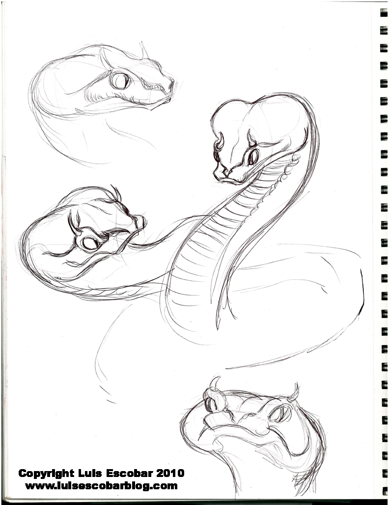
As you can see in the drawing above, I was really trying to push the head shape in orders to have the viper’s face be all the way at the end of it’s head.
As cartoony as the drawings above are, they aren’t too cartoony. Why? Well, because I’m not familiar enough with the viper to push it further yet. Thing is, like the gorilla from last week, I first need to see what the animal I’m drawing really looks like. I also need to get familiar with their anatomy and how it’s put together. I can push only so far because I’m trying to figure out how to draw them to begin with. What shapes to use, what features go where and how they fit together. Only after drawing the animal, more or less, realistic, do I have a foundation to work on. How can you exaggerate reality if you haven’t studied what reality looks like? It’s also not enough to just see what it looks like but you have to understand it. This is why figure drawing is so important. When you understand the structure, anatomy, construction, and rhythms of the human form, you are able to re-translate them to the anatomy of other animals (which generally share the same anatomy but in a different configuration). Understanding how to draw something, does NOT require rendering. If you can draw something without having to render it and it still looks right, your doing something right. The point is to NOT use rendering as a crutch to cover up bad drawing. It doesn’t work. A bad drawing is a bad drawing no matter how much you render it. The best cartoonists are generally the guys that can also draw realistic (or semi-realistic) as well. That said, I’ve seen plenty of artists that can draw realistic and can’t draw cartoony (mostly because they don’t understand the principles of graphic design; or if they do, they don’t know how to apply it to creatures).
At this point, for me to TRULY be doing a deep study of both snakes and apes, I would need to start drawing them without skin to understand their muscle structure, as well as drawing their skeletons. I may still do this, but for now I just want to get this over with. I want to move on and finish the development stuff sometime this year. It feels like it’s taking forever. I only get to work on this stuff for an hour or so a day.
I thought, in the end, that the Viper (and all other snakes I looked at) just were not scary enough. In fact, MY drawings of the Viper made it almost look like a cat. It was too cute. I thought I needed something a bit scarier and creepier.
Before I tackled that problem though, I came across a photo of a gorilla that I just wanted to draw, so I did. I quickly drew a color pencil under drawing, exaggerating the features I saw on the photo as I went. Once I was done, I decided to ink the drawing. I also thought I’d use my Copic markers to add some tone to the drawing just for fun. What I ended up with was not exactly what I wanted but I learned a few things.
Then I went back to drawing the Snake monster:
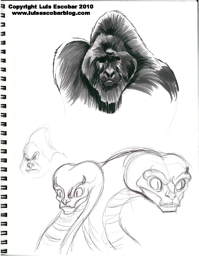
Both the Winged Ape and the Giant Snake are ideas I lifted from two different Robert E. Howard, CONAN short stories. In the story with the snake, the snake had a human like face. I thought that perhaps, I should go with that image. It definitely came out looking much creepier. It also helped that I had drawn the previous drawings of the Viper because I was able to use snake anatomy in combination with what I know of human anatomy and construction.
You’ll also notice that there’s a gorilla sketch in the page as well. One with a pointy head. That’s because I got an idea for a gorilla head shape I wanted to try out. This lead me to the next couple of drawings:
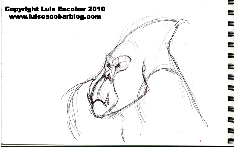
The idea was to not have it be a ‘real’ gorilla but some kind of gorilla type creature so, instead of a big hump why not make it pointy. This made the ape look a bit alien, which I liked. The idea I was going for with the face, was to try to make it look like a death’s head. More skull like. I thought it was working and it was going in the right direction, but there was something not quite right, so I continued on:
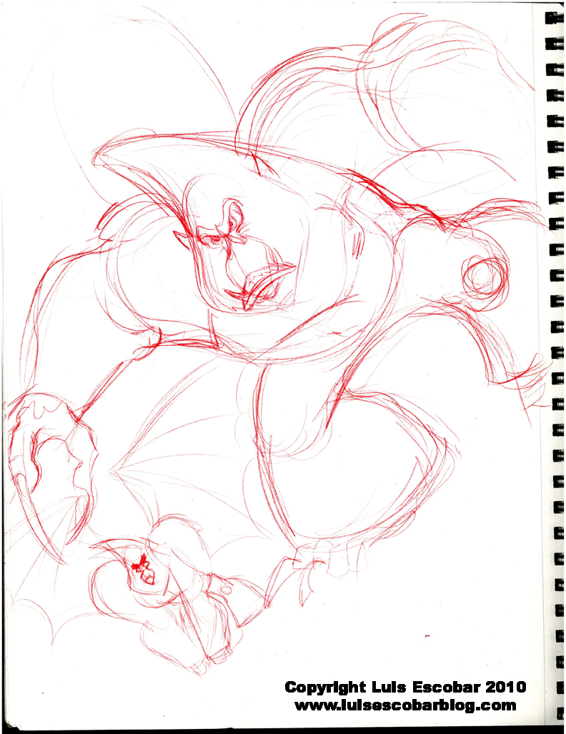
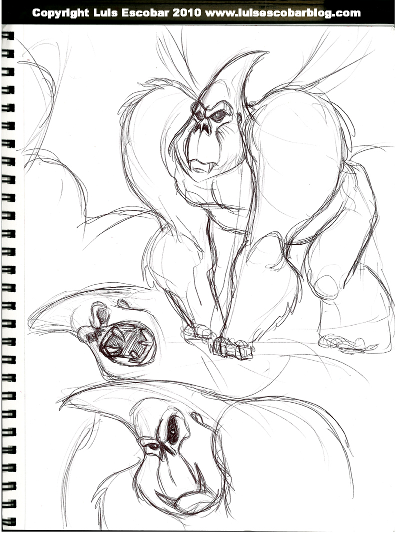
In the drawings above, I wanted the face to be small compared to the size of the head, like I had thought in the other drawings last week. I think I got what I wanted with that but somehow the body all looked to “even”. Everything was the same size, so I decided to do a little sketch at the bottom to get the size variations I wanted. It was much better but there was something missing.
A day later, I was looking through the THE ART OF KUNG FU PANDA
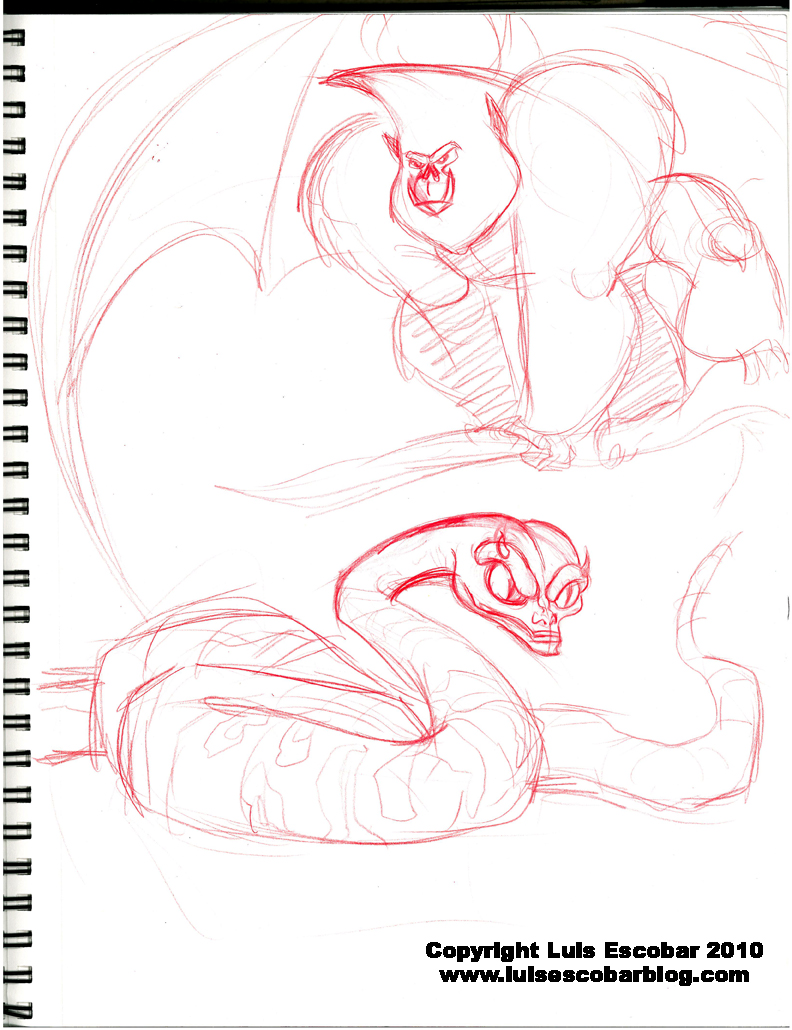
With the arms of the ape, I was definitely trying a clearer “straight versus curve” line contrast. I also made him generally thicker and shrunk his face a bit more, so it wouldn’t be so long.
Next I tried to give the snake another go. I was mostly trying to make sure to draw some of his body so that I could see how it grew bigger in the middle while it tapered more as it got to his head and tail. I also wanted to try to simplify the face so that there wasn’t so many lines. It needs to look as if it’s from the same design universe as the rest of the characters. Not there yet, but getting there. I think I might need to experiment more with the nose and head shape.
(EDIT: For a much BETTER article on the subjects I touched on above, read this one DRAFTMANSHIP: INCREASING YOUR VISUAL VOCABULARY by Aaron Diaz.)