V_Scarlotte_Rose

Posting Reviews Again. :) http://www.comicvine.com/forums/gen-discussion-1/i-review-the-lowest-selling-comic-of-the-month-feb-1550141/#0

6730 3765 157 155
Forum Posts Wiki Points Following Followers

I Review The Lowest Selling Comic Of The Month: December 2014.

Hi Everyone.

So we've finally reached the end of the 2014 comics I'm covering, unless I go back to stuff that I bought and never reviewed in the past. Let me know if you'd want to see that. :)

Anyway, the lowest selling comic of December 2014 (that wasn't basically a second print) (according to Comichron.com) selling 2,462 copies was Charmed Season 10 #3 - The Perks of Being A Whitelighter from Zenescope Entertainment.

No Caption Provided

As usual, I'm not familiar with the series, and didn't do any research into it before reading this issue, just to see if it's new reader friendly. There may be small spoilers, but I'llblockthem just in case. Let's start with the cover.

Cover:

First off, the cover I have is ever so slightly different from pictured here, as the one on this site is the digital edition. It's the same picture though, so it's fine.

The cover is quite subtle and stylish with it's minimal title and credits, really showcasing the artwork. I'd say this was a good decision, as the art itself, by David Seidman, is rather nice. I've never seen the Charmed T.V. show, but the person on the cover looks kind of familiar, so maybe I've seen them somewhere else, and they've been drawn well here?

I like the spooky cats, and they seem to reflect what I expect from the comic. I'm under the impression that Charmed is about witches, right? Either way, the cover overall looks good. It has quite a realistic look to it.

Art:

No Caption Provided

No Caption Provided

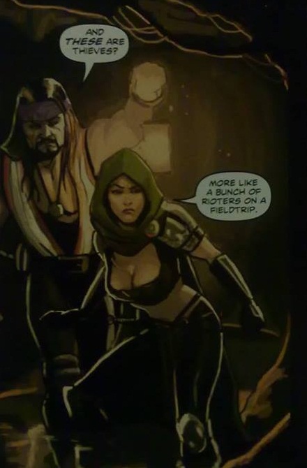
The art inside, by Elisa Feliz is quite different to the cover, with closer to a more normal comic book style to it. It generally follows usual human proportions and looks, with quite expressive facial expressions. Having not seen charmed, I can't tell if anyone looks like they're meant to. I'm pretty sure the red haired woman, Paige, is the one on the cover, and I can kind of see the resemblance, so maybe it's consistent to existing fans.

No Caption Provided

For the most part, the art looks pretty decent, but curiously, some of it looks like it wasn't inked, with colours being applied straight over pencils. A lot of it looks fine, but it looks a little sketchy or unfinished here and there. There are cats in the issue, like on the cover, that are drawn rather nicely.

The colours, by Valentina Cuomo, are bold and bright or muted and subtle where they need to be, with appropriate shading and highlights. There are a few awkward uses of patterns throughout though, on wallpaper, rugs etc. However, there's better use of tartan/plaid in this issue than I've seen in many other comics, as it actually curves to reflect the shape of material a little better. Not perfect, but better than things like Gotham Academy covers. Not much to say about the lettering, by Christy Sawyer. It's mostly normal speech bubbles, and a few simple sound effects, but they look fine.

No Caption Provided

Story/Writing:

The inside cover gives us a recap/basic description of the series, and how Piper, Paige and Phoebe Halliwell are "The Charmed Ones", with access to "the greatest source of pure magic the world has ever known, The Power Of Three." We're told of their recent adventures being hunted by demons called "The Old Ones".

We open with Cole Turner and Leo Wyatt in a waiting room, in a waiting room of Knox Academy, a "neutral alternative to magic school", whilst the Halliwell sisters reflect on the adventures mentioned in the recap page. Paige teleports to the house of someone called Aidel, only to find the house full of black cats. Cole and Leo meet with the schools headmaster to try and convince him to take a side in the Halliwells conflict with the Underworld, which he rejects, before saying he'll call on them later "for a favor". A crying blonde girl gets a message through her tattoo, that "One will die, one will rise".

Paige discovers that the cats are in fact Aidel, who accidentally turned himself into them when trying to reveal his true self with a spell, and Paige takes them to her sisters to combine their magic to bring Aidel back. Cole and Leo arrive at the sisters house to explain that Cole is being hunted, as his blood is needed to activate an ancient weapon. Elsewhere, a ghost called Faith has died in a car crash, and a guy who might be "Death" sends her off to the afterlife, when suddenly and possibly killed by... someone. I don't know who it is.

Written by Patrick Shand, I'm left kind of lost. The pacing seems O.K., but perhaps would work better being read with other issues, and not as a standalone. The dialogue seems fine, but I feel like there's a lot of it that I didn't understand, probably as a non-fan of Charmed.

Other Things Worth Mentioning:

22 Pages of comic content for $3.99. Pretty normal.

All the advertising is left to the end, so no interruptions.

Overall:

Overall, I'm not really into it. I get the feeling that this would have to be read as a Charmed fan, or at least as someone who has read previous issues of the comic. This issue probably isn't a good place to start reading. I don't think there's really anything bad about it, but it just doesn't work for me. I'll give it a low 3/5(7/15).

So has anyone on here read this issue? What did you think of it? This review is just my own opinion, so it could be good to hear some others.

For all my previous reviews, see here.

Look out for my double bill of Cullen Bunn lowest sellers, and what looks like a potentially rather raunchy comic(if I can track down a reasonably priced copy), hopefully coming soon. :)

Scarlotte.

11 Comments

I Review The Lowest Selling Comic Of The Month: November 2014.

Hi Everyone.

This review is a month after the last one. I'm still way behind, but starting to get more regular. Kind of. Thanks for your patience. :)

Anyway, the lowest selling comic of November 2014 (that wasn't a variant) (according to Comichron.com) selling 1,612 copies was Planet Gigantic #1 - Planetfall; The Eye of the Sun from Action Lab.

No Caption Provided

As usual, I'm not familiar with the series, and didn't do any research into it before reading this issue, just to see if it's new reader friendly. There may be small spoilers, but I'llblockthem just in case. Let's start with the cover.

Cover:

Looks like this might be a sci-fi comic. Not necessarily my favourite genre for comic books, but it could be alright.

Lots of writing on this cover, which makes it quite eye-catching. I like that it draws attention to the fact that there's a back-up story. Something that strikes me as a little odd is that there are no creator credits on tn the cover. I'm used to seeing at least the writer and main artist listed.

The art itself, by David Halvorson is quite nice to look at, with a mix of bold and sketchy lines, and an appealing colour palette, with a kind of textured pattern throughout. The character designs blend elements of realistic and stylised looks, in an exciting looking still from an action sequence.

Art:

No Caption Provided

No Caption Provided

The art in both stories is handled by David Halvorson, who drew the cover. It brings some of the same elements to the table, but expands upon them, perhaps unsurprisingly. The characters have a charming look, with their simple but expressive faces. They look quite different depending on how close up they are shown, but I'd say that it works.

No Caption Provided

Peaceful and action filled scenes are both shown, and displayed skilfully, with a wonderful range of effects and styles. Something that really stands out is the colouring. Boldness and subtlety, where seperate or combined, look great, and the choices of colours really make it rather pleasing to the eyes. Lighting and shading make it even better, and the lettering in bubbles and sound effects by writer Eric Grissom fit well.

No Caption Provided

Story/Writing:

In a place called Woodmere, a spaceship crashes down, and we see our protagonists, Valentina and Yuri, escape, using some kind of superpowers to blast through the hull and control gravity to protect from debris in order to escape. They find their new environment to be rather pretty and peaceful, but are soon interrupted by a fight between natives and a rock monster, and they decide to help. The queen of Woodmere, seemingly annoyed that they defeated the rock monster, uses magic to seize them with some kind of shadowy creatures, and they are taken prisoner. We end withIn the back-up story, a girl called Lyana, and her flying lion, Syd, are flying to the tomb of Zon The Betrayer, to find the Eye Of The Sun. Upon finding it, we discover that the eye wasn't metaphorical, but was an actual eye of a living dragon. The dragon is set free from it's chains, but upon flying into the light, disintegrates, leaving behind the eye with Lyana.

the Queen departing, and our heroes being taken away by the shadows. Cliffhanger!

Both of these stories are exciting and intriguing, and have me interested right away. They're paced well, with fitting dialogue, and create a lot of lore, and depth of this world in only one issue. It's quite impressive. It turned out that it's kind of a blend of fantasy and sci-fi, with protagonists that seem likable.

Other Things Worth Mentioning:

A 20 page story, and an 8 page back-up story for $3.99. I'd say that's rather good value.

Single page of advertising left to the end, so no interruptions to the story.

You can apparently send away for an official membership card and decoder if you're a fan of the series.

Overall:

Overall, I think this is a rather good first issue. The stories both have me interested, and the art is a great accompaniment. It's fun, intriguing, and good value for money. Only two people making the whole thing is cool too. I'm seriously thinking about getting caught up with later issues of this series. I'd recommend taking a look at this issue. I'll give it a high 4/5(12/15).

So has anyone on here read this issue? What did you think of it? This review is just my own opinion, so it could be good to hear some others.

For all my previous reviews, see here.

Scarlotte.

15 Comments

I Review The Lowest Selling Comic Of The Month: October 2014.

Hi Everyone.

I'm not even going to try and guarantee that I can get back into a regular schedule anymore as my free time is rather unpredictable. I have four review comics ready to be reviewed, and I'm trying out a new way of writing them, so we'll see what happens. Thank you for your patience. :)

Anyway, the lowest selling comic of October 2014 (that wasn't a second print) (according to Comichron.com) selling 2,959 copies was Atomic Robo: The Knights of the Golden Circle #5, from Red 5 Comics.

No Caption Provided

As usual, I'm not familiar with the series, and didn't do any research into it before reading this issue, just to see if it's new reader friendly. There may be small spoilers, but I'llblockthem just in case. Let's start with the cover.

Cover:

Well I guess Ironhide is dead... Spoiler alert?

Given the title, a western setting is a bit of a surprise, but it's nice to look at, with it's rich colours, and shading that you'd expect from a sunset(sunrise?). Turns out it suits the contents of the issue though. I like the rhymes on the gravestones.

I think it's pretty cool that the writer, artist, colourist and letterer all get credited on the cover. Seeing as it takes up just a little space at the bottom, I don't get why I don't see this more often. The top left corner tells us that this is "#5 of 5, Volume 9". I think this must mean that the series is released as mini-series' with an indicator of which one in the series they are. This seems like a good idea for a format, as it would surely give very clear jumping on points.

Art:

No Caption Provided

The art, handled by Scott Wegener, who also did the cover, is made of strong lines, and an often angular quality. It's a western setting with robots in it, but not in a kind of steampunk way. Steampunk is fine, but perhaps a tad overused, so some more traditional looking robots here is refreshing. The human faces are a little cartoony, but subtly so. Our lead character Robo has a fairly simple design, face-wise, but is drawn in such a way that expression is shown well through the eyes, kind of like how Deadpools mask eyes seem to work sometimes. There's a panel that has writing on it that probably should have been edited out, but it's not so noticeable.

No Caption Provided

There's not a whole lot of location changes throughout for Anthony Clark to show off colour palette changes, but when there are outdoor shots, they really contrast with the indoor shots. The colours and shading are a welcome accompaniment to the art throughout. There's quite a bit of fighting in the issue, which brings a need for sound effects/onomatopoeia, for which Jeff Powell provides a wide range of appropriate fonts and sizes.

No Caption Provided

Story/Writing:

The recap page at the start tells us that Robo, Doc Holliday and U.S. Marshal Bass Reeves are onboard the Zeppelin of Baron Heinrich Von Helsingard, who is poised to conquer the west.

Our heroes fight through a number of cowboy cyborg things, including one that used to be someone that Robo knew. Robo lures him into the engine room, and tricks him into firing upon equipment, causing significant damage to the ship. Helsingard, seeing his plans in ruins abandons ship in an escape pod. Holliday and Reeves find pods and escape, but before Robo can join them, Caldwell, one of the cyborgs apprehends him, and the ship explodes, destroying both of them.

Back on the ground, Reeves and Holliday, carry out Robos last wishes, and take his head in a box to the local post office, before going their seperate ways. The head arrives at the laboratory of Nikola Tesla, and we see the box kept safely for many years, until 2014, where we see it is being kept at the Tesladyne deep storage facility, which is where the story ends.

A lot of the story, by Brian Clevinger, is taken up by a fight scene at the start, which may be forgivable within a series. It may fit into the whole story better, but for a single issue, it takes up a lot of space. Apart from that, the pacing is good, and seems like a decent conclusion to an arc. The end creates some intrigue for what could come next, which is a great thing for a comic to do.

Other Things Worth Mentioning:

22 Pages of comic content for $3.50. Fairly normal.

All the advertising is left to the end, so no interruptions.

Overall:

Overall, I though it was pretty good. The writing and art fit together well, and it manages to make a conclusion of a series I don't read feel meaningful. I'd maybe consider reading more. I'll give it a low 4/5(10/15).

So has anyone on here read this issue? What did you think of it? This review is just my own opinion, so it could be good to hear some others.

For all my previous reviews, see here.

Scarlotte.

20 Comments

I Review The Lowest Selling Comic Of The Month: September 2014.

Hi Everyone.

Sorry for the delay, but I've had computer troubles and a lack of free time. Should be able to get back into a more regular schedule now though. :)

Anyway, the lowest selling comic of September 2014 (that wasn't a variant or second print) (according to Comichron.com) selling 1,680 copies was Gold Digger #213, from Antarctic Press.

No Caption Provided

I'm usually completely unfamiliar with review comics, but I did review a Gold Digger issue a while back. I don't remember it much though, so I can maybe still judge it's new-reader-friendliness O.K. There may be small spoilers, but I'llblockthem just in case. Let's start with the cover.

Cover:

The cover by Fred Perry shows the main characters from the issue clearly on honeymoon, which makes sense, but I'm not sure what the rest is about as these other characters and robot don't seem to appear within.

I think it's a nice enough cover though. It kind of sums up the contents of the story, and the drawing is nice, with a kind of cartoony manga style. The strong and contrasting colours make it nice and vibrant and eye catching, without being garish.

Art:

No Caption Provided

No Caption Provided

The interior is also handled by Fred Perry, and inevitably looks quite similar, though it is a little different, with some subtler colours and softer lines. It's quite nice looking mostly, with good character designs and facial expressions. There's no actual nudity, but there's plenty of skin on show, including a kind of unnecessary story choice to have Maya walking around without any trousers.

No Caption Provided

The lettering is handled well, with a range of large and small sound effects, with some good onomatopoeia choices. Little love hearts are added to speech bubbles to show affection, and there are a few moments where quiet dialogue is presented outside of a bubble which can be quite effective.

No Caption Provided

Story/Writing:

A newlywed couple, Kevin and Penny Koss are heading to a private island for their honeymoon by plane, whilst a pair of magicians/explorers, Maya and her "coach" are going the same way by boat, with Coach telling tales of old adventures with Mayas sister Sara. In the night, Maya uses her powers to go exploring undersea. The morning after, Kevin and Penny are sitting down to breakfast when a huge statue rises from the sea, and Maya is ejected from atop if by a tentacle.

Maya recognises Penny as "Doctor Penelope Pincer, The Super-Genius, Big-Shot Explorer!", and immediately develops a feeling of rivalry. They go to explore the statue, with Maya explaining that she met an octopus called Poindexter, and accidentally cast a spell that evolved him into a giant that shoots lasers, and got stuck inside. Within the statue, they find Poindexter in distress over the fact that his "Tentajunk" was being squashed by a mechanism inside the statue as a result of his sudden gigantism. They set him free, shrink him down, and they depart on good terms.

The issue has a kind of humourous tone that goes well with the art style. It's rather "lusty" throughout, with the honeymooning couple, and Maya showing obvious attraction to both of them. It successfully tells a whole story though. It could be that there's lots that preceeds and follows this issue, but I'd say it could be read without prior knowledge of the series.

Other Things Worth Mentioning:

24 Pages of comic content for $3.99. A little bit more than some comics.

All the advertising is left to the end, so no interruptions on the story.

There's a QR code, and web address that advertise that you can catch up by reading 199 issues of the series for free, which is kind of cool.

Overall:

Overall it's a fairly enjoyable short but complete story. It's not necessarily the sort of thing that I'd follow monthly, but I imagine I could appreciate reading it. There will be people out there who'd really like it I imagine. I'll give it a low 4/5(10/15).

So has anyone on here read this issue? What did you think of it? This review is just my own opinion, so it could be good to hear some others.

Any feedback is appreciated, and please let me know if you'd like to see more reviews in future. I have my October comic already, and I should be getting Novembers this week, so there should be more reviews soon. :)

For all my previous reviews, see here.

Scarlotte.

17 Comments

I Review The Lowest Selling Comic Of The Month: August 2014.

Hi Everyone.

Been a while since I've done one of these. Sometimes it's hard to get a copy of the lowest seller, or sometimes it's an Archie comic, so I end up not doing that month. I'll maybe tweak my rules to try and make this more regular, if you want. :)

Anyway, the lowest selling comic of August 2014(according to Comichron.com) selling 1,439 copies was, Southern Dog #1, from Action Lab.

No Caption Provided

As usual, I'm not familiar with the series, and didn't do any research into it before reading this issue, just to see if it's new reader friendly. There may be small spoilers, but I'llblockthem just in case. Let's start with the cover.

Cover:

Well it seems like it fits the title. Southern? Check. Dog? Check. I'm not American, so I don't know the exact implications of the Confederate flag, but it's considered a Southern thing right? Apologies if I'm wrong.

The cover, by Riley Rossmo is a good representation of the contents of the issue, whilst not strictly portraying scenes from it. A chaotic nature is displayed in it's wild sketchy lines suggesting we've got some violence and darkness to come in this series, which is somewhat true of this first issue. It certainly tells children to keep away from it, with two "Mature Readers" warnings, and an ominous suggestion to "Stay Alert!"

Art:

No Caption Provided
No Caption Provided

Brought to us by Alex Diotto, Southern Dog presents a generally realistically designed world, and displays a good variety of environments and a decent eye for detail. The drawing itself is pretty good, with thin, sketchy lines here and there, which I can't quite appreciate throughout, though for the most part I think it works well enough with the story. I think the panels with animals are the best in this issue.

No Caption Provided

The colouring by Adam Metcalfe is good in terms of choice of palette, particularly in the first scene which takes place at night. Some of the colouring looks a little blocky in some places when colours aren't seperated by a line. I'm not a big fan of the way that camoflage is used, as it kind of looks like it doesn't change when it comes to a crease in the clothing. The lettering by Ed Brisson is good, with some nice sound effects.

Story/Writing:

The issue starts out with what I think is a werewolf being abused, and transported to a gathering of what I believe is either the Ku Klux Klan, or some kind of equivalent. The werewolf is hanged, which I'm guessing establishes an important aspect of this series. Flashback to six weeks ago and a father and sons are out hunting and subsequently eating dinner, and we're introduced to our main character, youngest Jasper, who's going through adolescence, and learning about the Civil War at school, where he attends, along with a girl he likes called Zoe.

On a later hunt, he's bitten by a wolf and the next day in school he starts to feel some peculiar symptoms, causing him to flee class to a bathroom. He's interrupted by some fellow students who attack him for expressing interest in Zoe, as they don't think Jasper, who is white, should be around Zoe, who is black, as she's one of "their women". Upon returning home, Jaspers dad has a way to get back at the bullies. He takes him Jasper to his study for the first time in his life, revealing a gun, and a KKK hood.

I'd say that the issue, written by Jeremy Holt, has appropriate pacing, and the dialogue seems quite natural. There is some swearing and racist language used, but I wouldn't call it excessive. Racial tension is a big part of this, and it is for mature readers, so I'd say it fits. The scene at the beginning taking place in the near future, and the reveal at the end creates some intrigue, which I imagine could tempt people back for #2.

Other Things Worth Mentioning:

22 Pages of comic content for $3.99. Pretty normal.

All the advertising is left to the end, so no interruptions.

There's a pin-up page at then end.

There's also a page of notes and thank yous from the write.

Overall:

Overall, I think it's pretty good. The art and story fit together well, and it does give me a feeling of "I wonder where they're going with this". Personally it hasn't quite wowed me enough to continue buying, but I get the feeling this could be an interesting series for other people. I'd maybe get a TPB if I had some spare money. I'll give it a high 3/5 (9/15).

So has anyone on here read this issue? What did you think of it? This review is just my own opinion, so it could be good to hear some others.

Any feedback is appreciated, and please let me know if you'd like to see more reviews in future. I haven't bought any runner-up issues for August, but I may if there's interest for it. :)

For all my previous reviews, see here.

Scarlotte.

32 Comments

I Review The Lowest Selling Comic Of The Month: February 2014.

Hi Everyone.

Well I think I'll give this reviewing thing a go again. I was unable to do reviews for December and January, but hopefully I can get back to making this a monthly thing, if you want me to that is. :)

Anyway, The lowest selling comic of February 2014(according to Comichron.com) selling 1,285 copies, was Fubar: Guts and Glory #1 - All Roads Lead..., from Alterna Comics.

No Caption Provided

As usual, I'm not familiar with the series, and didn't do any research into it before reading this issue, just to see if it's new reader friendly. There may be small spoilers, but I'llblockthem just in case. Let's start with the cover.

Cover:

I think this is a pretty good quality drawing. The armour is very nicely detailed, and the skin bones and hair are good. The style of the background is a little different to this soldier in the foreground, but they fit each other O.K.

The cover made me think this would be an exclusively Roman zombie comics, but there are other kinds of people covered too, though with the main focus being Romans.

Art: This is anthology comic, with five short stories, so I'll give a brief description of each one.

No Caption Provided

All Roads Lead... drawn by Steve Becker is the most realsitic looking in the issue, and probably my favourite of the five. It's well detailed and the animals and fur textures are good. It's coloured in a good range of greys by Becker and Jeff McComsey, to an extent that it almost looks like a black and white copy of a well coloured comic.

No Caption Provided

I Am, drawn by John Broglia, is perhaps the simplest art style in the issue, but still looks pretty good, despite being a little less detailed. The grey colouring is handled by Jeff McComsey on his own this time, and it's a bit less impressive, but this could be down to the simpler art to colour.

No Caption Provided

The Blind King Of Bohemia is probably the cartooniest story in the comic, drawn by Chad Lambert, but it does suit the tone of the story, even though it's not exactly light-hearted. The colouring is pretty good.

No Caption Provided

The Last Ship, with art by Jonathan Brandon Sawyer for some reason has better quality drawing on the zombies than on the humans, perhaps the best drawing in the issue outside of All Roads Lead... Sawyer also handles the colours, using a lighter grey pallete than much of the rest of the comic.

No Caption Provided

The Gift, art handled by Glen Ostrander, is generally decent, with a slightly unusual mix of realistic and exaggerated characters. The colours are done in a pointillist style which I'm not sure if it works here.

Altogether, the issue is generally decent art-wise.

Story/Writing:

In All Roads Lead... , by Steve Becker, A Roman wagon is travelling through a forest in Germania, when they are attacked by Germanians(Germans?). After killing the crew, they take possession of the cargo of wine, and take prisoner the daughter of the Praetor Legatus. Upon hearing the news of this encounter, Legatus is delighted, as it seems that his plan has worked, having poisoned the wine that the Germanians would inevitably drink, and he reveals that the daughter was really a slave girl decoy. The story ends with the poison taking effect, turning the Germanians to zombies.

I Am, by Jeff McClelland begins with Spartacus hanging on a cross, thinking back to a time two years ago where he freed a horde of zombies, and using his ability to control them, attempts to lead an uprising against the Roman empire. However, when it comes to an important battle, a character called Crassus reveals he also has the ability to control the zombies, and takes charge of them, quashing the rebellion. Flashing forward, we see Spartacus falling from his cross, and rising as a zombie.

In The Blind King Of Bohemia, by Chad Lambert, King John of France is preparing to go into battle against the English, with assistance of two of his closest knights, keeping him up to date as to what is happening that he can't see. He puts up a good fight, with him and his army defeating many of the English, when a horde of zombies gets involved, eventually defeating the last few knights, and finally the king. He is later shown rising from his tomb, as a zombie

The Last Ship, by Magnus Aspli shows us a scene of Vikings attempting to finish off a zombie in a Viking funeral style, setting him off on a burning ship, but this takes many attempts, all the while, a young warrior rushes to the site. Upon finally arriving, he warns the Vikings that a horde of zombies is approaching, but they have no way to escape, having burned all of their nearby ships. The zombie on the burning boat laughs on at the defeat of the Vikings.

The Gift, by Chuck Dixon begins at the city of Troy, where the Greeks have departed, leaving a large wooden horse behind(guess where this is going). A woman named Cassandra advises that they don't take it inside, as she has visions that tell her it would be a bad idea, but no-one listens. In the night, the city is attacked by zombies emerging from the horse. The story ends with the city in flames with a few ships getting away, while Cassandra is eaten, her husband saying her death was worth it to leave the zombies burning in the city.

In general, the stories are pretty well written with decent dialogue, though perhaps with a little overused swearing in All Roads Lead... However the stories all feel a little same-y, perhaps just because they all have zombies in them. Not fantastic, but not really bad.

Other Things Worth Mentioning:

40 Pages of comic content for $3.99, which is pretty much double what you'd usually get from a lot of comics.

All the advertising is left to the end, and it's all just for other FUBAR comics.

There's a two page quiz section at the end, asking questions about zombies in well known historical situations.

Overall:

Overall, it was O.K. Decent storytelling and art, with a good cover, and as it's just short unrelated stories, I think it must be quite new reader friendly. Personally I'm not a big fan of zombie things, but it was a little better than expected. I get the feeling there will be people out there who would appreciate this much more than me. I'm not interested in reading more, so I'll give it a medium 3/5(8/15).

So has anyone on here read this issue? What did you think of it?

I've not done this in a couple of months, so any feedback is appreciated. I have two more comics for February Runner-Up Reviews, so look out for those in the next few weeks. :)

For all my previous reviews, see here.

Scarlotte.

10 Comments

I Review Low Seller Runners-Up: November 2013(Part 2).

Hi Everyone.

Sorry for the slight delay. I had to wait for this issue coming in the post, and it's generally been a bit late recently due to Christmas and New Year.

Anyway, The 379th best selling comic(18th lowest) of November 2013(according to Comichron.com) selling 2,231 copies was All Crime Comics #2, from Art of Fiction.

No Caption Provided

As usual, I'm not familiar with the series, and didn't do any research into it before reading this issue, just to see if it's new reader friendly. There may be small spoilers, but I'll block them just in case. Let's start with the cover.

Cover:

The cover by Bruce Timm, who we all know from DC cartoons, is quite nice in drawing and colouring. This womans pose looks a little odd, but I may put that down to the retro style.

The cover is designed in a more old-fashioned style than we often see nowadays, and has a distressed look added to reflect age. The comic seems to be set in the past, and has a retro flashback, so it compliments the interior pretty well, despite not being handled by the same artist, and the cover not quite reflecting the story.

Art:

No Caption Provided

In the main parts of the issue, the art is by Steven E. Gordon, and generally looks good, with nice use of shadowing. The colours, by Tom Neely are quite simple, often rendering characters in a single colour. It doesn't look bad though, fitting the art and tone of the story.

No Caption Provided

There's a flashback scene handled by Vince Musacchia, which has a more retro look to it, which is a nice touch for a flashback. The colours by Kristina Collantes are presented in the old dotted style, and is done better than I'm used to seeing. It's more like seeing the colour dots that make up the colour than the dots looking like a pattern.

No Caption Provided

Story/Writing:

Dodger is thinking about all the crimes he's committed this week, and whilst him and Carly are pulling on pilot and flight attendant uniforms we see an unclothed man and woman, and Dodger thinking of how tonight it's assault, kidnapping, and soon hijacking. They're shown earlier that day heading to a bar to meet the corrupt Agent Knoblauch to pick up some passports and information from him, in exchange for Carlys car, and the location of some money. Dodger mentions that they'll need to arrange some transport, and they sit down to chat with a pilot and flight attendant. Posing as airline staff, Dodger, Carly, her daughter Tracy and an associate of Dodger get on a private plane, and set off. Carly asks Dodger where he learned to fly a plane.

Dodger tells a story of when we was young, on the day of the F.A. Cup final between Swansea and West Ham. Upon hearing of a talented West Ham player, Santiago not attending the match, Dodgers dad Freddie goes looking for him, barging into his home, finding him passed out amongst cocaine and nude women. He takes him to his van, meeting Dodger, who had gone looking for his dad, and they drive to a plane, to get Santiago to the match(I think). During the flight, whilst Freddie is telling Dodger how the controls work, Santiago wakes up and gets into a fight with Freddie, leading to Freddie being stabbed in the stomach with a screwdriver, and Santiago being hit in the head with a hammer. In his wounded state, Freddie crashes the plane, killing him, while Dodger walks away unharmed. Following this, we see Dodger and his mother leaving England for America.

Back in the present, Knoblauch and an associate go to pick up the money promised by Dodger, when they're ambushed by some people waiting for Dodger. A gun fight ensues, and they are all left dead apart from Knoblauch, when suddenly Dodgers nephew Maddy appears. Seeing that nothing stands between him and the money, he kills him Knoblauch and takes the money for himself.The passengers are tricked into getting off the plane, and the team, head for Johannesburg. Upon arrival they get a message to say that the money is safe, and Maddy is on his way to meet them. The issue ends with Dodger looking out the hotel window onto a football pitch, saying his day would have loved it there, apart from all the ☠☠☠☠ Nazis.

The issue is written and paced well, giving enough information to understand what was going on. I imagine some previous reading would have been helpful, but I didn't feel lost reading this, so it worked out O.K. There's a scene where football commentary is placed over an action sequence, and it fits nicely.

Other Things Worth Mentioning:

It's a prestige format comic, so could perhaps be put on a shelf with graphic novels. It's a little bigger than a normal comic, but just fits in a comic bag.

Not advertised as for mature reader, but contains the strongest possible language(that I know of anyway).

36 Pages of comic content for $3.95, which is a good bit more than you usually get for that price.

All advertising left to the end.

Printed on thick paper.

Overall:

Overall, I thought it was pretty good. Not the sort of thing I usually go for, but a decent read. I'll give it a high 3/5(9/15).

So has anyone on here read this issue? What did you think of it?

For this months main review, see here.

For this months first runner-up review, see here.

For a list of other comics I've reviewed, see here.

Thanks for reading. I'll hopefully have some December reviews up after the sales figures become available. :)

Scarlotte.

3 Comments

I Review Low Seller Runners-Up: November 2013(Part 1).

Hi Everyone.

Before I begin, I was going to be reviewing a different comic today, but I don't feel I could politely word a run down of the plot, so I'm reviewing what would have been next weeks comic. I'll try and find another low seller to make up for it next week.

Anyway, The seventh lowest selling comic of November 2013(according to Comichron.com) selling 1,230 copies was Rogues! #5 - The Cleansing III; Lumpur & Flea II, from Amigo Comics.

No Caption Provided

As usual, I'm not familiar with the series, and didn't do any research into it before reading this issue, just to see if it's new reader friendly. There may be small spoilers, but I'llblockthem just in case. Let's start with the cover.

Cover:

The cover, by Ruiz Burgos is quite nicely drawn, showing the team from the comic. Well drawn faces, and good colouring. Not sure why there isn't a background, but if it's just to show off the team, then I suppose it's not a big deal.

We're faced with the question, "Do we look familiar to you?", which makes me think, are these characters suppose to look like characters from other comics? I can maybe see elements of Wolverine(back left), Ra's Al Ghul(back centre), Conan The Barbarian(middle, second from left) and Rogue(front centre), but I'm not sure about the others. Maybe I'm wrong and it means something else though.

Art:

No Caption Provided

No Caption Provided

The art is handled by Diego Galindo, and is a bit different to the cover. It's generally quite good throughout, and the characters all look quite distinctive, with facial expressions being displayed well, and slightly humourously when called for.

No Caption Provided

The colours are good, and blend nicely with the drawings. It looks a little blotchy in places, but as it looks like it's going for a slightly painted look, it works for the most part

No Caption Provided

The art in the back-up story by Ivan Sarnago is much more cartoony, but it fits the story well, as it's a bit more light hearted. The colour palette by Mario Larra is appropriate, but there's some overuse of pointillism that doesn't quite work.

Story/Writing:

Bram and The Weasel are hired by The Grandmaster to lead a team of rogues on a mission. They were recently the only survivors of a voyage through underground tunnels, so their expertise are required as this mission goes through those same tunnels. We learn that the plan is to assassinate Magistrate Monzon(or are they?). After some loud arguing and infighting in the tunnels, the team are attacked by some giant worms, leading tothe death of Galon The Savage. Suddenly running out of oil to light the way, Brother Drumm casts a spell to light the way, beforeimmediately falling from a cliff and being eaten by a crocodile, in a slightly humourous fashion. The Weasel tries to ask Sudden Death a question, only to findhe has suddenly died. They find their way through the tunnels and to the Magistrates home. Doctor Han and Monyan The Barbarian kill some guards, and Night Cat picks the lock of a door, which opens to reveal the Magistrates wife and children.The three remaining rogues say that they will kill them to send a warning to the Magistrate, and we see Bram and The Weasel exchange "Is now the time?", "You bet."

In the back-up story, a burglary teacher called Lumpur O'Grady, who has been turned into a Koala(get it?), has been kidnapped in order to harvest his energy to create a device that will cause world peace by killing almost everyone. His energy is taken and he is seen as dead, when his assistant Flea arrives. She use harnesses to strap his body to hers to use like a weapon to fight off the guards. It ends with Lumpurs' consciousness being shown trapped inside a gem.

The writing is generally good throughout both stories, the main by El Torres, the back-up by Ivan Sarnago and Mario Larra, and seems to be pretty new-reader friendly, as I didn't feel lost reading either. The cover claims it's for mature readers, but there's no nudity, particularly bad language or strong violence(some decapitation).

Other Things Worth Mentioning:

20 Pages for the main story, 4 for the back-up, for $3.99.

All advertising left to the end.

Some black and white drawings of Bram and The Weasel.

Overall:

Overall, I thought it was pretty good. The art and story went together well, and I'd maybe consider getting more of the series. I'll give it alow 4/5(10/15).

So has anyone on here read this issue? What did you think of it?

For this months main review, see here.

Thanks for reading. I'll hopefully have another review up next week. :)

Scarlotte.

19 Comments

I Review The Lowest Selling Comic Of The Month: November 2013.

Hi Everyone.

The sales figures came in, I ordered my review comics, and they arrived today, so let's start looking at them.

The lowest selling comic of November 2013(according to Comichron.com) selling 1,057 copies, was Chronos Commandos: Dawn Patrol #5 - (of 5), from Titan Comics.

No Caption Provided

As usual, I'm not familiar with the series, and didn't do any research into it before reading this issue, just to see if it's new reader friendly. There may be small spoilers, but I'llblockthem just in case. Let's start with the cover.

Cover:

The first thing that strikes me is that this is kind of familiar. This is only my 8th review, and already it looks like I'm reviewing another comic with both Nazis and dinosaurs involved, the first being Fearless Dawn In Outer Space. Maybe comics with Nazis, dinosaurs and the word "Dawn" in the title just don't appeal to people.

Anyway, it's drawn and coloured fairly nicely. It's also designed pretty well, with the military and time travel aspects reflected in the dog tag numbers, stenciled signature, grenade and clock in the title. It's obvious to me what the title is, but would obscuring it with a Nazis arms make it tricky for someone seeing this comic on a shelf? Hard to say.

Art:

No Caption Provided

The art is nice enough. It's drawn pretty well, and suits the tone of the comic well. I don't know if it was intentional, but the Nazi officer looks to me like Arnold Schwarzenegger in most of the panels.

No Caption Provided

The colouring is good, perhaps higher in quality than the pencils/inks, but is kind of limited. The scenes with the Nazis are great to look at, but the laboratory scenes are pretty much just red or blue from panel to panel.

No Caption Provided

Story/Writing:

In a laboratory, two professors who are identical, I think because they're the same person from different times, are briefing a sergeant who is suiting in protective gear to fix a time machine called the Chronosphere. Meanwhile, what seems to be the same (American?)sergeant and his squad are in battle with some Nazis, and he talks of time travel with the commanding Nazi, Richter. The Americans are defeated and the last of them are about to be executed by flamethrower, when one of their previously thought to be dead squad shoots the fuel tank, setting the Nazis alight. In the ensuing chaos, some of the Nazis try to put out the flames in some nearby water, where they get savaged by crocodiles, including Richter, who has his arm bitten off whilst holding a piece of time travel equipment. The Americans kill the crocodile and retrieve the equipment.

Back in the laboratory, the sergeant is shown struggling to get to the valve he must turn to stop the time machine exploding, eventually managing, and then time traveling away somewhere, where he shoots a person who tries to shoot his pod just arriving, or something. He speaks to a version of the professors from before, about the Chronosphere being close to exploding, and then it does, I think. The issue ends with some Nazis gathered sending a coded message seemingly through some kind of device that links minds. A shadowy figure is told to report to the fuhrer that someone wishes to begin communication, and he's revealed to be Richter, now featuring a robotic arm and faceplate and calling himself Ironfist.

Most of the story was fine, but it got confusing near the end. I can't quite tell how the laboratory scenes relate to each other, but I'm pretty sure it's the same sergeant in both, though he isn't given a name anywhere through, simply being referred to as "sergeant" or "sarge"(23 times). The dialogue is mostly O.K., but the Nazis are written with German accents, like V's for W''s etc. I'm not sure what to make of this. Also, maybe I'm reading too much into it, but Richter having his arm bitten off whilst holding time travel equipment reminded me of Captain Hook having his arm bitten off by the crocodile that swallowed a clock. If this was written in as some kind of reference, I have no idea why. It doesn't come across as a new reader friendly issue, but then it is the last issue of the arc, so maybe that's understandable.

Other Things Worth Mentioning:

24 Pages of comic content for $3.99.

All advertising left to the end.

Chronosphere blueprints, guides on how to recognise dinosaurs and a pin-up of a woman in her underwear are included at the end.

No dinosaurs in the issue, despite the cover, and cover of the advertised TPB.

Overall:

Overall it was O.K., but nothing special. The art was decent enough, but the story was a bit confusing in places. I don't think I'd be interested in more. I'll give it a high 2/5(6/15).

So has anyone on here read this issue? What did you think of it?

There'll be at least 2 runner up reviews for this month, so look out for them in the next few weeks. :)

Scarlotte.

9 Comments

I Review Low Seller Runners-Up: October 2013(Part 2).

Hi Everyone.

This is the first October review that isn't looking at a comic from Titan. I wasn't blown away by either of them, so let's see how this one goes.

The 478th best selling(2nd lowest) comic of October 2013(according to Comichron.com) with 1,919 issues sold was Ursa Minor #1, from Big Dog Ink.

No Caption Provided

Cover:

The cover is pretty nicely drawn. I like how these flames are drawn, and the way they're coloured, and light up Naomis' face is very well done. Kind of unfortunate that it looks like it's teasing an up skirt shot though.

The cover image doesn't directly reflect a scene from the comic, but after reading it, I wonder if the flames are there to represent some burning that is referenced. Naomi doesn't wear this outfit in the issue, but she's in disguise for most of it, so it kind of makes sense for her to not be in her regular costume.

Art:

No Caption Provided

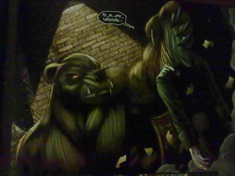
The art by Ian Snyder, with Vic Moya and Steve Sprayson inking, is rather good throughout. Having the same interior artist as the one who drew the cover adds a nice bit of consistency to the issue. It makes judging a book by it's cover a little easier(though my reviews would be a little short if I did that). It's generally neat and nice to look at. There's some violent scenes that do give off a real sense of pain, and the werewolves(and bear) are great looking, and are a real contrast to their human forms.

No Caption Provided

The colours by Nei Ruffino are handled well, with distinctive colour palettes for each source of light, be it moonlight, candlelight or disco light.

No Caption Provided

I don't usually talk about lettering, but I feel I should mention it for this issue. Humans are given ordinary white speech bubbles with black text, vampires have black bubbles with a more jagged font, and werewolves have wiggly orange bubbles a thicker font. Handled by HDE, It's a nice system for showing whose side everyone is on. There's even an instance of the bubble changing halfway through a transformation, which is a nice touch.

No Caption Provided

Story/Writing:

The issue starts with a recap of a previous mini-series presented as a news report, telling us that around the world, vampires have been spontaneously bursting into flames, which leads to the internet being shut down, to try and stop news of the happenings spreading. A vampire press conference is in progress as a spokesman condemns humanitys' disrespect for the vampires, despite their sacrifices keeping America safe from werewolves. The scen turns to chaos as a pack of werewolves attacks. We then see Naomis' roommate April finding Naomi is nowhere to be found, and we cut to her out hunting vampires, leading them into an alley in her human form, before unleashing her savage were-bear form on them. Two vampires are shown discussing the recent burnings, and how the only way that they could have happened is a werebear has killed one of their creators, and is continuing to kill off vampires. Naomi arrives home and her and April discuss a recent battle with "Bathory" who Naomi killed, and the fact that their friend Angela was killed. It is revealed that Naomi was in love with Angela but couldn't get close to her for fear of her coming to harm. The issue ends with the revelation that someone called Onyx is still alive, and knows Naomis secret.

The issue is well paced and does a great job of giving enough information for new readers to understand the story, even using some of those little editors note boxes that you don't see very often nowadays. I didn't feel at all lost, and the issue seems to be a good first issue that sets up ideas for future issues.

Other Things Worth Mentioning:

22 Pages of comic content for $3.50. Fairly normal.

Printed on nice high quality paper. Kind of like DCs Forever Evil issues are printed on, but this is actually thicker, and feels a bit sturdier.

No bonus art, but the back cover shows a recoloured collage of scenes from the issue, plus there is a two page photograph of a Naomi cosplayer.

No advertising through, just four pages left to the end.

There are five other covers available.

Overall:

I liked it. The art and writing were good, and I felt fairly up to speed despite having missed the previous mini-series. I think I'm interested in looking into #2, but can't find a copy online. I'll have to keep an eye out for it next time I'm at a comic book shop. I'll give this a High 4/5(12/15).

So has anyone on here read this issue? What did you think of it?

For this months main review, see here.

For the first runner-up this month, see here.

For the list of all the comics I've reviewed, see here.

Thanks for reading this months reviews. I hope you enjoyed them. Look out for the first of the November reviews, in hopefully under two weeks from now. :)

Scarlotte.

10 Comments
  • 16 results
  • 1
  • 2