-
5 (310) 4 (573) 3 (390) 2 (109) 1 (38) 3.9 starsAverage score of 1424 user reviews
-

The Braddock Bunch 0
The first three covers for this series were brilliant tributes, varied, and gorgeous. The fourth cover was okay, but this one is just simplistic, lazy, and boring. Johnson's Kid Briton looks really dull, and he's all that's there, and just... there. There's nothing to this cover.Luckily, we have the amazing Kev Walker back on interior art after a no show last issue, although Vitti's fill-in artwork was plenty great. Even if you loath the concept of this series, I don't think anyone's been able t...
5 out of 5 found this review helpful. -
A Moloid's Guide to Love and Evil 0
Now that the whole surrogate team is all together, it's time to start exploring the characters more. Unlike the iconic main Fantastic Four, this FF is a new team. These characters have their history, but as a team they're completely new, and the Future Foundation is still a fairly recent group themselves. This issue really builds upon the various interactions between the characters, especially between the temporary FF and the Future Foundation.Ant-Man came up with a pretty drastic and massive sc...
4 out of 4 found this review helpful. -
Ninjas At the Rave 1
Regardless of what you think of the series, because I've seen very mixed opinions already, one thing everyone can agree on is that Ron Garney's artwork is great. The characters al look fantastic, the action flows smoothly, and the colors are absolutely stunning. This book looks great from beginning to end in every way.Only weeks before this series came out, I blew through the entire Remender run of Uncanny X-Force, and I have to say, Remender left things off in a really interesting place. Humphr...
5 out of 5 found this review helpful. -
WHAT? THIS ISSUE DOESN'T SUCK!? 5
This issue starts off in kind of an awkward place. It appears to be still in the midst of Rise of the Third Army, when three issues ago in this crossover the entire Third Army was eradicated and absorbed by the First Lantern. Atrocitus seems way out of the loop for being a part of this story, he doesn't even encounter Volthoom until the end. And yet in other ways he's ahead of the game, where nobody else has any idea of anything, Atrocitus has already arrived at The Great Heart, which is clearly...
4 out of 4 found this review helpful. -
On a Boat 2
This issue actually has a really cool cover, it's just a bit misleading. It's got a very somber and dejected Red Robin, while the Red Robin we have in this issue is probably the least like that since the New 52 began. However, the whole day and night, light and dark motif behind him, with Raven and Dr. Light with arms outstretched, is damn beautiful, and actually a good representation of the story arc being set into motion. Also interesting to note the 'In the Wake of Death of the Family" banner...
5 out of 5 found this review helpful. -
Tea Dreams of Wonderland Days 0
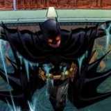
Once again, Ethan Van Sciver just NAILS the cover. The previous cover had a strong horror tone to it mixed with Mad Hatter imagery, this one focuses a lot more on surreal 'Alice in Wonderland' imagery, balanced out in a very strange and unnerving atmosphere. Batman's taking up a bit too much space, but the concept is so excellent.This issue is a MUCH stronger one than the previous issue, probably due to the increased focus on Mad Hatter, his backstory, and his particular brand of insanity. It's ...
2 out of 2 found this review helpful. -
Weak Formidophobia 0
After some pretty good recent covers, this one is way too close up, super generic, and all around just confusing. Where are they falling into and what does it have to do with anything?Finch's art just doesn't seem as ragged and harrowed as it did in recent issues. The lines are thicker and more defined, and the colors are a bight brighter and also more defined. The opening fight scene is made up of a lot of very crowded panels with a seriously confusing flow. I have no idea where Batman was stab...
1 out of 1 found this review helpful. -
Terrifying Trauma 0
Batman's face is excessively squarish and boxy, and he appears to have no skin beneath the cowl, just more black costume, but I kind of really like this cover. It's like the pillars are support beams for the cover itself, and Batman is breaking free from the image. The best part of this cover has to be the way the image peels with his cape, with blank white underneath.Ok, this little girl's levels of compassion and innocence are a bit ridiculous. Scarecrow's tortured the hell out of her mind, an...
1 out of 1 found this review helpful. -
The Empty Conspiracy 0
I'm not sure if it was intentional or not, but the use of two artists actually works very well in this issue on a pretty deep level. For one, the art duties are divided down the middle, not spattered back and forth alternating at random intervals. But really, the division separates the two halves of the story, childhood and manhood.Expanding upon the small flashback in The Court of Owls, we see a young Bruce Wayne, parents freshly murdered, and he's convinced there's a conspiracy. Young Bruce do...
1 out of 1 found this review helpful. -
We're All Just Little Children 0
The cover for this issue is utterly boring, and it doesn't capture the same rough and scraggily tone of the interior art. The cover is incredibly generic, and while nothing about it is genuinely 'bad,' nothing about it is particularly good or noteworthy. However, like last issue, Finch has really stepped up the stylism of his artwork to perfectly suit the arc. Particularly, anything fabric looks AMAZING.This issue clears up a lot of the confusion and concerns of the previous issue. It now makes ...
1 out of 1 found this review helpful. -
Heavy Is the Hand That Holds the Trident 0
Paul Pelletier just about fully earns his spot as Ivan Reis' replacement on this series with his gorgeous underwater sequences, most notably a BEAUTIFUL two-page spread towards the end as Aquaman psychically bellows out his remorse across the oceans of the world. My only complaint is that some of the character work is a little off, Aquaman's face especially tends to be a it awkward fairly frequently. But overall I'm ok with Pelletier's art here. He excelled at the underwater scenes, and no serie...
5 out of 5 found this review helpful. -
P.R. Problems 0
It's a shame, the middle of the previous arc generated some excellent covers, but this one's back to the first Jurgens cover, generic action scene. The water actually looks pretty dynamic, but the energy blasts are anything but. But mostly I'm wondering why Red Robin's rocking that wild 80's hairdo.This story comes at an opportune time for Firestorm, he's gotten a pretty bad rep lately due to the actions of the rogue Firestorms and Megala when he possessed Firestorm. Not to mention that his powe...
1 out of 1 found this review helpful. -
Why? To the Power of Ten 0
After drawing out the buildup for this arc for so long, the final conclusion actually feels very rushed. There are a bunch of conflicts that have been in progress for just about this entire arc, not really going anywhere, just happening, and in this issue they all pretty much wrap up with a bizarre efficiency. It just feels like a lot of these battles could've wrapped up at any time to give more room for the final battle, but they're all crammed into here, shortening the scale of each. The Rogue...
2 out of 2 found this review helpful. -
The First and The White 0
Unlike the changes from the solicit to the Green Lantern Corps cover, the change from Kyle's black outline to a rainbow one actually improves this cover. Kyle is a fracturing multicolored outline, threatening to break and fade completely into the white as he resembles Volthoom. It's intense and gorgeous and beautifully simple, and a fantastic representation of the similarities Volthoom draws between the White Lantern and the First Lantern.Volthoom takes a different approach with Kyle than he did...
4 out of 4 found this review helpful. -
It's A Wonderful Lantern 0
This review is going to be a bit biased, I have to admit. I should be more professional in stating that this series should be more about the CORPS and not just about Guy Gardner. At some point I stated that this series has lately felt more like a continuation of Emerald Warriors than Green Lantern Corps. Peter J. Tomasi was on Green Lantern Corps until Brightest Day, when he jumped onto the new Emerald Warriors, and Fernando Pasarin was his artist, and Guy Gardner was THE main character of Emera...
1 out of 1 found this review helpful. -
The End Calls to the Beginning 0
This cover is kind of apt as the kickoff for the big finale of Geoff Johns' Green Lantern saga, but it's a bit crowded. The combo pack cover has it better, as the lightning appearance of the ring energy on the regular cover just muddles things, and the unnecessary Arrow banner crunches things together even more.The prologue sequence is intriguing, especially for someone who's been following Geoff Johns' saga from the beginning. We thought we'd seen all there was to see from Krona's witnessing of...
2 out of 2 found this review helpful. -
For the Love of Worlds and Els 0
Oh my god, I love this cover. The green is a powerful color choice, in fact a lot of the recent covers have had strongly color-dominated backgrounds, but this one stand out even more due to the unique perspective. The titular Supergirl is seen only by her arms, as we see the 'enemy' Wonder Woman from Supergirl's point of view. It's a very delicate balance between us as readers seeing Wonder Woman in danger, and us through Supergirl seeing her as a powerful threat. Her legs look a little off, but...
4 out of 4 found this review helpful. -
Through Daredevil's "Eyes" 0
This isn't the most amazing Daredevil cover, but that's a ridiculously hard competition. What it is, is a damn fine cover for the first Marvel Now labeled issue of Daredevil, and a good jumping on point. It's an overall good Daredevil cover without anything tied to it, and a perfect representation of the character.This issue begins in a brilliant balance of catching up new readers, and beginning the next big story. Daredevil recaps his origin story, seeing things from his perspective, but after ...
5 out of 5 found this review helpful. -
Superior Stilt-Man 0
When you have a character like Daredevil, it's always nice to see an issue starting out with a look into his daily life and struggles. He has a variety of methods to keep track of his money, but very little can protect him from swindlers no matter how much he tries. But using a debit card isn't an option now because, with the dissolution of the offices of Nelson & Murdock, Matt is effectively broke. He has some amusing methods of subverting that in an emergency, Mark Waid still taking advant...
1 out of 1 found this review helpful. -
Straight Outta Bannerville 0
Last issue was a little flat, and this one's better, but it does feel like this series is already starting to get formulaic. We start out with Banner being Banner, and the second half of the issue has The Hulk smashing. Mark Waid's been building Hulk's status quo, but he's going to need to start crafting an ongoing plotline and some recurring villains with personal touches if he wants to keep things going strong. Hopefully this is the end of the setup, and once this story is resolved, we can sta...
3 out of 3 found this review helpful. -
2013: A Deadpool Odyssey 0
This cover's honestly really boring compared to the others. There's really nothing going on, it's just Deadpool floating in space with a severely oversized..... jetpack thing? And gatling guns, sure, but he's just... there. Nobody else is there, Deadpool's not really doing anything... it's boring, especially compared to what's come before.This issue's a little odd. The whole arc has been a variety of Presidential battles, but the previous issue had a whole bunch of them in a montage instead of o...
2 out of 2 found this review helpful. -
Alpha's Beta Test 0
Alpha was a great story for Spider-Man, going full circle with Spider-Man's origin story, but with Peter Parker in place of the scientist doing the experiment and a new hero getting powers. A new hero who is socially the same status as Peter was, but never had the 'Great Responsibility' instilled in him to counter his 'Great Power.' And his great power was on a scale beyond anything else. His celebrity status got to his head, and Peter actually let me down as a character by taking the easy way o...
2 out of 2 found this review helpful. -
Fading Colors 0
Last issue was a bit of a disappointment, but this one seem to be getting things back on track. Amethyst is back in Gemworld, and it appears she may have gained the ability to create portals between worlds at will when the energies of the portal crystal flow into her body. But the energy is turquoise, prompting the bolder Amethyst to drill her mother about her father. As much as the previous issue slowed things down, Amethyst's Earth adventure with the Justice League Dark was ultimately a positi...
2 out of 2 found this review helpful. -
For America! 1
With Justice League being so hit or miss lately, and the hits rarely being super great, I had forgotten Geoff Johns can be such a great writer outside of Green Lantern. Sure he tends to rely on a lot of the same tropes, especially when it comes to keeping a villain a mystery, but dammit this issue was great. It was pretty much exactly what you'd expect from the first issue here, although with an unexpected subplot. The entire issue was building the team, which made it a bit slow, but that kind o...
5 out of 6 found this review helpful. -
Earning His Name 1
Ryan Sook has continuously been nailing it with these DC Universe Presents covers. I mean, Ryan Sook always nails it on covers, but it's even more impressive to continuously do so well with such a variety of protagonists and themes across one series. Even during a crappy story I could always enjoy the gorgeous covers. And of course Ryan Sook is one of the few artists who could make a cover with such a focused and action pose cover actually work. Awesome.The artwork is excellent for this story. I...
1 out of 2 found this review helpful. -
Friends and Family 1
Hands down the best Red Hood and the Outlaws cover yet. Deeply intense with the callback to the classic Death in the Family; which of course this arc's title was a reference to. The reflection in the pool of blood as Batman repeats one of the worst moments of his life, and the extra detailed artwork of Mico Suayan.... just incredible.There's only one real problem with this issue, and that's the inconsistent artwork. This issue has three different artists coming and going at random; none of them ...
2 out of 2 found this review helpful. -
The Other Duo 5
Ok, right off the bat I have to say that I like this cover, but I'm wondering why it doesn't have a 'Death of the Family Aftermath' label if Red Hood and the Outlaws has one. This issue is entirely focused on Nightwing dealing with the fallout of The Joker's attack, so what's the deal with that?This is really an issue for those who've been reading since before the New 52. Kyle Higgins works closely with Scott Snyder, we know, and he's been continuing some of the Dick Grayson-centric plot element...
2 out of 2 found this review helpful. -
Brothers, Sons, and Kings 0
The view's a little close, but overall this cover is excellent. Ocean Master looms in the background of the deep ocean, clutching his trophies of victory. Aquaman's trident, Superman's cape, Wonder Woman's lasso, Batman's batarang, and bits of Cyborg's machinery. It's a very intense cover for a finale to this arc, with the ultimate expression of defeat looming on the surface, begging you to gaze within and find the truth.For the most part, Ivan Reis' artwork is amazing. It's what I've come to ex...
2 out of 3 found this review helpful. -
Screech 0
I miss Trevor McCarthy's covers, because Romano Molenaar's covers are really boring. He gives us very standard action poses a bit too close up. The design just feels very uninspired and thrown together. However, Molenaar's interior art is really nice, probably my favorite on the series thus far. He especially captures Strix's movements well as she fights Black Canary and flying robots. She moves so different than the rest and you can really feel it without it being overdone.The story in this iss...
1 out of 1 found this review helpful. -
Let This Genre Book Live! 0
I am REALLY bummed that my budget for comic extras got slashed right before this issue came out because I absolutely LOVE the variant cover for this issue so damn much. It's a representation of my complete and utter joy at Larfleeze getting the closest thing to a solo ongoing series that makes sense. An ongoing co-feature. Frankly, that's good enough for me. The fact that the cover is totally awesome is just gravy. The main cover's pretty good too, but it's hard for me to muster up positive feel...
2 out of 2 found this review helpful. -
The Series That Makes You Want to Hug Every Character Involved 2
This is the first Avengers Arena cover that isn't a tribute, as far as I can tell, and I just don't like. It's just so basic and one-note, especially compared to the first few covers. I mean, I can appreciate the attempt to emulate old school fight flyers with the faded colors and artificial folding damage, but it's just not doing it for me. But more than that, it has NOTHING to do with the issue. This issue probably has LESS fighting than the last two, and nowhere does a brawl between X-23 and ...
1 out of 2 found this review helpful. -
Reverie 0
First of all this is a brilliantly unique cover. Secret Avengers could mean all kinds of things, I've seen some people suggest the current Illuminati-focused New Avengers should be called Secret Avengers. But this cover shows you exactly what kind of 'secret' tone we're getting with these Secret Avengers. And the way its laid out like a set of files, the main picture is the characters we get in this issue, but if you look at the little bits of files sticking out, you can see things that are prom...
2 out of 2 found this review helpful. -
Love Like Science 0
This issue is REALLY different than I expected, and while the approach was probably more original than the one the solicit suggested, the pacing just didn't capture it quite right. I get that it's February and that means Valentine's Day, but you don't HAVE to do a Valentine's Day story, especially when the series' action packed third issue was a welcome momentum after a slowly built up first two issues. This ISN'T the kind of series that can get by by being heavily dialogue driven. I mean, SOMET...
2 out of 2 found this review helpful. -
Cyclops and the X-Men 0
I'm not saying I agree with him, but I can honestly say that this is the first time I've ever thought Cyclops was truly cool. Magneto's new costume is a little much, but Cyclops' new look perfectly represents his expanded unstable powers and his new m.o. as the face of the Mutant Revolution. And not just his X-Visor, but his entire attitude, everything about him. His surprisingly gentle tone to mutants combined with his intimidating mannerisms in motivation and battle create a very unpredictable...
1 out of 1 found this review helpful. -
The Dynamic Dream 0
Patrick Gleason's artwork is just perfect for this issue. 95% of this issue is a series of incredibly intense dream sequences that have a surprising level of grounding to the surreality. These dreams are not totally trippy Dali paintings or something, but rather the kind of dreams where some things are clearly wrong, but you can be 100% convinced that you're not dreaming until something drastic happens. And in the wake of Death of the Family, it is the strong connection between two fathers and t...
2 out of 2 found this review helpful. -
Gordon Family Reunion 0
That..... is a hideous cover. FAR too many lines make this overly fussy, the close perspective REALLY doesn't help, it just makes the whole thing look more flat and generic. But the worst part of it is the AWFUL characterization of James Gordon Jr. implies by the cover. That is not even close to any sort of facial expression James would EVER make. He's the creepy calm and collected foe, in in desperation; and this is the beginning of his arc, so even less reason for that.... awful face. Just... ...
2 out of 2 found this review helpful. -
Warblade and Friends 0
You know, this cover looked like it was probably really good in concept, but bets really cluttered in execution. The desert-like background with Fairchild alone is decent, but standing amidst the bones of her teammates? Creepy in a great way, Ridge's tail looks cool, but the rest kind of blob together into a shapeless mass and loses the emotional impact. Also.... it really has nothing to do with the issue. Fairchild's far from alone, and most of the team's not in any serious danger. I mean, they...
0 out of 0 found this review helpful. -
That One Robot Totally Looks Like the Rabbit From We3 0
Is Caitlin Fairchild trying to dodge something in the cover, or are her legs severely broken. Her position just looks horrendously painful and makes no sense. The rest of the cover's not terrible, but not all that great. Fairchild's bizarre positioning steals a lot of the focus, so it's hard to not just see her weirdness dragging the overall composition down.This issue has two artists, but it actually uses it for a purpose. Jesus Merino illustrates the present day framing story, while Pascal Ali...
1 out of 2 found this review helpful. -
Some Fun 0
With this issue, I think I'm starting to appreciate Suicide Squad for what it is a little bit more. I still don't think it's that good, even if I judge it from the lower standards, but I was able to actually shut my brain off for a bit and actually kind of enjoy myself despite the MANY flaws. The team actually functioned somewhat smoothly, and not just on the surface, but in literary terms. Yo-Yo provided most of the banter, with Harley on fire additionally; the two of them driving the morale an...
1 out of 1 found this review helpful. -
Everything vs. Nothing 1
The real meaning of this cover won't become apparent until the end of the issue, but hot damn... Jock is just... absolutely dominating the cover game with these New Avengers covers. Such brilliant minimalism in design, and three issues in we've barely seen people's faces on the covers; appropriate for The Illuminati who manipulate in secret from deep in the shadows just out of view. Yet giving us just enough for readers to be able to recognize the characters.Once again, Steve Epting's artwork is...
3 out of 3 found this review helpful.
Use your keyboard!
- ESC
Log in to comment