Scoping Out Solicits: Volume 1-Zero Month (Under Construction)
By The Mighty Monarch 8 Comments
So for whatever the hell reason just because; Zero Month seems like the perfect time to begin this monthly feature. Certainly I talk about covers in my reviews quite frequently, but sometimes it's interesting to do some analysis from the solicits. And yes, some things certainly change from solicit release to issue release, but that's part of the fun. To mix things up from time to time, I'm going to try and round up fellow comic readers to bounce thoughts off of in some of these, as alternate perspectives can definitely make things more interesting. But I'm beginning fresh with myself alone.
Also, for now at least, I'm only going with DC. The New 52 makes things easier, then some side stuff. And Marvel's site is a bitch to navigate. And frankly, I buy so few Marvel or other comics, just DC's easier.
Also, I might have to do a second one for this month, since what we've been shown is apparently just PROMO ART. I admire the effort put in on some, while I subsequently wonder what the point was of cranking out all these 'not-covers.' A few are genuinely awesome enough to work as an actual cover, and will be a bummer to not have as them. Most though are really half-assed. Which are disheartening to see, but actually.... it makes sense. I'm conflicted.
Action Comics #0

This actually makes me appreciate the lame first cover of this series. It always annoyed me that this cover was substituted for the original promo, which was a nod to the original Action Comics #1. I wondered why Morrison would've passed up the opportunity to have a tribute cover like that, instead having such a generic bland cover such as we did. This image works because of the way it uses the specific energy/movement of the first cover, keeping Superman on the same pace. Ben Oliver's art gives us an interesting 'dirty' appearance, though for a '0' issue, he seems older than the Supes we've seen lately. It's ironic that there's a 'Zero Issue' for a series that's already exploring the past, but it's actually quite clever since it felt like we were coming in right AFTER the VERY beginning.
All-Star Western #0

See, Olivetti's artwork is much better in covers like this. Ok, it's not as good as Ladronn, but that's DAMN hard to do. Ladronn managed to have some insane detail without being as stiff as Alex Ross. Ladronn is PERFECT for covers, and his style balanced somehow well with Moritat's interiors. Olivetti gets that a bit, but doesn't go all the way. Maybe the lack of a background is hurting this one, it certainly doesn't use the first issue cover or the rip to any effect, but it's better that the previous cover. And delving into the origin of Hex's scar? Normally I'd be hesitant for a story about that, but I REALLY trust Gray/Palmiotti to deliver on something as delicate as that.
Animal Man #0

THE WINGS. THE WINGS SELL THIS ONE. Nice job with a standard idea on this one, but then the wings make this one work so well.
Aquaman #0

See, this one suffers from typical 'Aquaman' cover problems. It's just not compelling. Oh sure it's 'cool' but it relies too much on Aquaman 'looking cool' and ends up being rather boring in execution. Cover should be unique images, like movie posters. The kind of thing that wouldn't cut it as interior art. The latest few solicited covers have been outstanding transcenders of this trend, but this one goes right back to the lazy. I DO Like that this one actually USES the 'breaking out,' leaving water in its wake, but this isn't anything special.
Batgirl #0

Are we going to find out what happened to Stephanie Brown in here? Probably not. Sigh. Also the solicit says it's going to try to tell Barabara's original Batgirl origin AND her Oracle origin? WAY too crowded. As for the cover, in addition to being boring; what's going on with her super wide hips? Why does everything have that weird dark pink tint? Her cape is kind of funky, and just... blah.
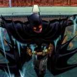
Batman #0

I'm a little disappointed in this one, it's really bland for Capullo. But again, maybe he just expended more talent on the actual cover. This issue has great timing, coming right after a one-shot story after The Court of Owls wraps up. I can't wait to see what Snyder and Capullo's combined atmospheric talents will add to this retelling of that tragic day. Also interesting to see that different parts of Batman's origins were 'assigned' to different series', and Snyder has been given, arguably, the most integral and the one most suited to his talents.
Batman and Robin #0

"SCREW YOU DAD! You got to be on the Batman cover, THIS ONE'S MINE!"
"NO SON. Your body is oddly proportioned AND YOUR SHOES ARE UNTIED!!!!"
"ALFREEEEEEEEEEEEEEEEEED!"
Batman, Incorporated #0

I don't necessarily know how much input the writer has on the cover, but I know from notes that Morrison generally sketches out designs beforehand. This one definitely uses a lot of the same sense of energy flow and balance that the Action Comics one had, plus it utilizes the 'breaking out' feel better than nearly all the others. Disappointing to not see Nightrunner there.
Batman: The Dark Knight #0

Pretty generic, but that's standard for David Finch lately. It's also got this grainy gritty effect to it that kind of seems like Finch just didn't clean it up. As for the story, it mentions 'Investigating Joe Chill' and 'a conspiracy to destroy the Waynes.' Granted, I originally wrote this before I read Batman #10, but I'm still concerned Hurwitz is going to create a connection there; which would be DUMB and TERRIBLE. But I also just realized he shares the same last name is Mitchell Hurwitz, amazing creator of Arrested Development.
Batwing #0

Another pretty ordinary one. Nothing more to say here really.
Batwoman #10

Ok see THIS? This is fantastic. Something about the way this one's done makes it stand out so much. Sure Robin was kicking outwards, but the way its done here pulls focus in a very unique direction. J.H. Williams III has managed to do SO much with so little here, proving that he is arguably the best artist in the business. Is it wrong that I want that boot now?
Birds of Prey #0

Stanley 'Artgem' Lau usually delivers some nice smooth work, but this one's just not doing it for me. Black Canary's muscles look super awkward and bulbousy. Of course her hair looks STUNNING and Starling is in a pretty cool pose. Too bad I've lost pretty much all interest in this series over the past few issues.
Blue Beetle #0

Oh my god yes! THIS cover is compelling. Not the most interesting setup, but the fact that we don't just have the main character we're used to on here... I mean who IS that!? Well ok, we kind of know, it's a previous Scarab host, but still! It's NOT just our titular character there, plus I LOVE the whole tribal look going on here.
It's extremely sad though, that this is pretty much the best cover on the series thus far.
Captain Atom #0

About a month ago if you told me this series was getting cancelled I'd say good riddance, but a few weeks ago I read #5-9 and after the conclusion of the first arc this series got EXCELLENT. WAAAAAAAY too late though, I don't blame anybody for not sticking it out through the weak first six issues. And this cover... yawn. 'Artgem' Lau's covers were usually nice or simple, Mike Choi's covers were GORGEOUS but these last few Freddie Williams II covers have bee really weak. Plus, and I'll never stop saying it, I LOATHE the sort of 'crayon' look Atom has in this series, especially when EVERYTHING ELSE looks great.
Catwoman #0
8 Comments