

@DMC said:
it looks like it was inspired a bit from the Fraction/Meinerding redesign from 2010 (the tight fit) but incorporates more of the male muscle anatomy in it's design.
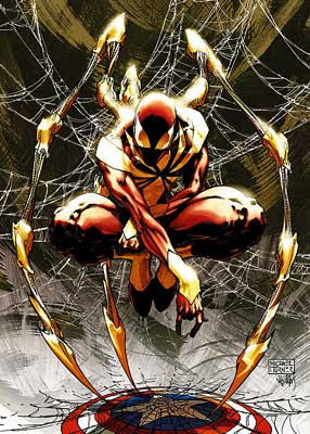
No it doesn't. At all. I don't even know where you are getting that from. It's not a "tight fit". The color scheme is inverted. While the 2010 armor has various tiny glow spots, this one has only one glow spot at the center.
@DMC said:
One could argue that the armor would look better if they flipped where the red and yellow was placed, but since his faceplate is yellow they kinda had no choice
Why would they have no choice? Because the face plate is golden, the dominant color of the armor has to be Golden? What?
I mean seriously, gold is the dominant color and that isn't even gold it's like fucking beige and it sucks. It doesn't look like anything I've ever seen him wear in the comics. Out of all the armors Tony Stark has had the one that most resembles this one is probably the golden one from the 1960s and that still looks nothing like this one.
Log in to comment