
Favourite Covers
Covers that look really great and/or interest you in what could be happening in the issue
Covers that look really great and/or interest you in what could be happening in the issue

A nice shot of Wolverine's claws emerging for the very first time. The "cracks" make it look painful and intriguing

A nice way to show what the Initiative is really about these days; showing a promotional of a happy Speedball with the Initiative promo caption, but with the current, moody Penance opposite it.

This is an example of a cover with speech bubbles that I like. Normally they can clutter up a cover and add useless information, but here they add extra drama and suspense. The title "The Goblin's Last Stand" is also a nice indication of what's going to happen.

This one I basically like because of the two captions. Saying that the Mad Thinker knows everything the Warriors don't sounds dramatic, and I like the idea of the heroes being completely out of their depths in this issue.

Oh no! Moon Knight's about to be killed! Nah, not really, but what I like about this is that you don't notice the Slasher when you first glance at it, and when you do you just go "Look out MK!"

I love this cover because of the way it's been done. The way that Moon Knight's laughs are all over the place, plus his deranged smile, instantly tells you that he's gone crazy. This is what makes an interesting cover.

I like this one for the humour. Cap and Paladin are potentially about to be slaughtered, and all Paladin has time for is picking up women. Cap's blunt "Shut Up, Paladin!" is a nice touch.

Although this scene doesn't happen in the comic (no surprise there), I do like the way how Peter is shocked at what his best friend is doing, whilst Harry is just pleased for revenge. It's obvious that their friendship matters not to him, and that he's ready to lay down some serious hurt.

Another humorous cover. The idea that Deadpool just sat there whilst all these arrows were being shot at him always brings a smile to my face, along with his casual and blunt "You missed."

This cover is somewhat sad. Elektra's only been dead one issue, but Daredevil is clinging to her grave in the hope that she'll be there to hold onto him. Makes you think.

This is a nice cover that makes you want to buy it. Daredevil with a gun wouldn't be enough, but the "No More Mister Nice Guy" caption implies that he's actually going to shoot and kill someone. A clever way to make people pick the issue up.

This is one of my favourites of my favourite covers. Daredevil has finally belted the crap out of Bullseye. The dark shadow covering DD's face makes him look that much more evil, like he's gone over the edge once and for all. Epic.

If it weren't for that bloody "This Marvel Comic Could Be Worth $2500 To You!" ad at the top, this would look that much more compelling. Cyclops and Jean, holding each other, whilst the caption yells out "Phoenix Must Die!" It's their last stand, and the thing you have to wonder is: Will she survive?

The interesting thing that I like about this cover is that this scene does actually happen in the comic. It's not an exaggeration of the story (well, maybe a little bit), it's just showing a scene that really happens. If only more comics could be like this.

This is a classic example of using suspense to sell the issue. Kitty cornered, evil alien advancing on her to kill her- and this works. Her panicked look and the evil smile of the Brood really does make you think for a second: Is Kitty going to be killed?

This is one of the best 60's covers in my opinion. The Red Skull is triumphantly holding the Cosmic Cube, surrounded by its energies destroying the landscape around him, whilst Cap can only cower (that is what he's doing, right?) in helplessness.

This is a nice cover in terms of humour. Colossus, one of the toughest X-Men, is looking panicky about aliens, and all Wolverine cares about is his jacket. Funny thing is, it's probably not even meant to be humorous.....

I love the way how Spider-Man is weighed down with all of the guns and accessories so typical of the comics of the 90's, and Deadpool has nothing but approval. Insane madness.

The Slingers covers are mostly standard 90's stuff. However, I do rather like this one, and the way how most of the cover is taken up with debris. This successfully creates the impression that Prodigy is struggling to hold it up, and it's a pretty cool image.

The camera angle is what makes this a great cover. It makes you feel as if you're in the grave yourself, being watched by your former enemies and allies. The neutral looks on their faces combined with the "Who Mourns the Hellions?" caption also makes this cover take on an emotional side.

Much as I hate the Deadpool overhype, I do think that the variant for this issue is really funny. The regular cover by itself is okay, but Deadpool's line makes the variant cover better.

The Deadpool variant for this issue is great. Here the Fantastic Four are, all freezing to death, and Deadpool is his usual insane self, ready to go surfing.

This cover is clever and deceptive. To someone unaware of whom Beta Ray Bill is, it appears as if Thor has turned into some sort of mutant or something similar. Plus, I love the way Bill smashes through the series title!

I'm a big fan of John Byrne's work, particularly his artwork, and this cover is a good example of it. The pure blank space and Snowbird's lost look creates a sense of isolation and loneliness perfectly. Sometimes simple covers are better.

Most of the covers for Annihilation are pretty awesome, but for me, this just takes the cake. You can almost feel the impact of Nova's fist slamming into Drax's face, and the way in which Nova's other fist is obviously prepared to deliver a second hit is also very nice. Gotta love the knife in Nova's leg, too.

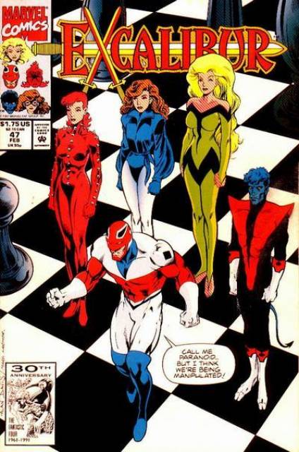
This is a pretty decent cover, I think, because of the way it manages to remain humorous whilst still showing that Juggernaut is a plausible threat. The shocked look on Captain Britain's face combined with the way Juggernaut is casually walking off really makes this one work for me.

The clever thing about this cover is the way in which it subverts the expectations of what should be on a cover. The way it describes (and exaggerates) most covers is brilliant too, and I like this one for being creative if nothing else.
Another humorous cover, I like this one because really, you can't help but laugh at Captain Britain's expression (and words), whilst he's completely oblivious to everything around him. Again, like with the Juggernaut issue, it lets you see that there's danger, whilst still making you laugh. Not every cover can do that, so I take my hat off to Alan Davis.

Let's face it, pretty much every issue of Punisher MAX has an absolutely amazing cover which manages to both be stunning and beautiful. But out of them all, I'd have to say that this is my favourite. Why? Because that one image manages to tell the entire story. Just from looking at it, you instantly know that Frank is going to kill and/or interrogate this guy, and it works so well because of that.

Aside from the great artwork, I also like this cover due to some other reasons. Firstly, the angles and composition all work quite well- nothing is confusing. By the way that the camera has been placed, you can clearly see outside the window, instantly telling you where exactly Flash is. Secondly, the way in which the symbiote has spread out around the room and on the walls looks quite creepy, yet cool at the same time. Finally, and the thing which I like most about this cover, is the fact that from this one character, you instantly know that Flash is a recovering alcoholic, and that he is tormented by the thought of one more drink. Even if you have never read a comic book before, never heard of Venom, this cover communicates this quite simply, and at the same time, brilliantly.
6 Comments