

Judging comics by their cover because its the only way to save Mary Jane!
Five Worst Covers
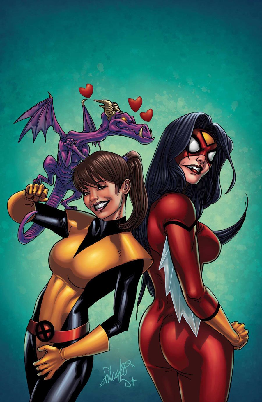
A+X- From the expressions to Jessica’s absurd proportions and pose, this cover unfortunately falls past cartoonish and into ugly.
Savage Wolverine- What the hell?! Seriously, what is going on with Logan’s face here? Did he get further mutated like Beast? Coupled that with the fact that the artist screwed up the Superior Spider-Man Costume? Yeah this is a really crappy cover.
Secret Avengers- This one reminds me of the Fearless Defenders’ cover from last month… in that these characters all look like paper cutouts. I get no feeling that this was drawn as a cohesive whole, instead it looks like our characters were just pasted together in a semblance of action posing. Natasha looks so similar to her appearance on cover one that its distracting and Hulk looks really, really crappy.
Thanos Rising- Okay lets get it out of the way before the more serious issues, Thanos’s crotch is the foreground of this due to the position and layout. I would normally take that as an unfortunate side effect of bad layout, but I can’t help but see it as on purpose due to the loving detail put into the Mad Titan’s codpiece. Okay, now the big problem here is that this piece doesn’t flow at all. There are elements all over the place that could have been unified into a cover but are just shoved onto there and it makes the entire thing chaotic and unappealing.
Wolverine & The X-Men- Logan has a teenage girl on his shoulders and has the creepiest expression…. Okay So there are a lot of problems here, but I am going to keep this simple… LOOK AT JUBILEE’S FEET!
_________________________________________________________
Ten Best Covers
Fearless Defenders- This is so clever that I kind of hate it. Seriously, this is the kind of thing that makes me want to punch myself for not coming up with it myself. The artwork itself is gorgeous and even our floating heads in the character select look amazing. Couple that with showcasing female heroes that aren’t obvious choices? This one is a winner.
Captain America- Even with myself not being a JRJR hater, his covers for this series have been hit and miss. This cover however looks like something iconic. The composition is simple but very strong and this is a really great image that sums up the entire arc of Captain America.
Cable and The X-Force- This one surprised me with how effective I found it. I really like the simple choices made here that seem like a throwback to older comic covers. The Uncanny Avengers look incredibly foreboding with their silhouettes despite being heroes. Hope running away with what I assume is the Phoenix icon below her feet is very cool and this reminds me I would see as a cover during The Days of Future Past run. This one definitely loses points on the artist’s signatures… I realize that its a necessary evil but come on, blank ink on the brightest spot just makes it glaring and they mar an otherwise solid cover.
Age of Ultron- HOLY SHIT! This is an awesome cover and the best Pym image I have seen in years. I would be questioning why he looks human as last time I saw him he was turned into a Dethlok… but then again Age of Ultron is severely messing with the timestream so I will just have to see what happens.
Guardians of the Galaxy- This picture really made me want to start a caption contest in the comments, “What is Gamora yelling?” Anyway, this is again a really damn cool GotG cover coming off of Rocket last month. Gamora is looking badass and the warm background offsets her skin tone really well. I also really like her new suit as opposed to her old stripperific uniform, I however do really dislike the change of her makeup from red to yellow as its too faint and just makes her look almost sickly.
Hawkeye- Oh, look, Hawkeye has an amazing cover! I am shocked. Okay, this is really cool and while more complex than most Hawkguy covers it really sticks with iconography in a cool way, I especially like the two longbows making a window through which we see Clint, very subtle.
The Indestructible Hulk- This one made me laugh. I really like the Hulk’s body here, the proportions are very well done. Matt Murdock and Daredevil is a fun twist on the angel and devil on shoulders symbolism. Simple concept, solid execution, other artists should be taking notes.
Thor: God of Thunder- Seriously, did they somehow resurrect Frank Frazetta to draw Thor covers?! This is incredible work and although I realize the word is terribly overused I feel it is appropriate here. This image is epic. It also is another cover which sums up what is going on in the story arc quite nicely. You have Thor from different points in his life fighting side by side. It’s Dr. Who by way of a heavy metal album, and that is just groovy with me.
Uncanny X-Men- Giving Thor a run for its money for “Most Metal Marvel Cover” We have Magik, I believe, standing here amongst Limbo…. I have no idea what the hell is going on but I sure as hell going to read it and find out. This thing drips menace while also being a just ridiculously impressive piece of art. Bravo.
X-Factor- I have not read this series and I have no idea what is going on here but damn does it look cool. It can be really hard to make a one-man portrait into an effective cover but this is just perfect. The red background pops, and the figure with his hunched stance and spike creates a well balanced but interesting negative space. Really cool looking character, really cool looking cover.
X-Men Legacy- I almost didn’t pick this one because at first glance it seems too simple. However that is when comparing it to other Legacy covers, whereas it still shines bright enough compared to the rest of the Marvel solicits, to earn a spot here. The main gimmick here is the X from the logo instead of a swastika which in turn, turns into the logo. It is a very simple idea but is really well done here, besides that Red Skull himself is really creepily done and I love the little details and nuance in the jacket and face.


Log in to comment