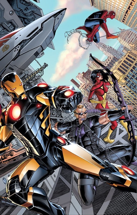
Out of boredom and a bit of spare time, I have returned with the GS 5 (remember my awesome battle blogs?) to do a random blog on some of my opinions of the new Marvel NOW outfits. I also realize some of these outfits have not debuted yet.
I will say so far the relaunch has been great. I am liking ANXM so far. Deadpool is funny and has some awesome references. Thor is just all kinds of awesome so far. I liked the first issue of Hulk (which for me is a big deal since he isn't exactly my favorite and was never a loyal follower), Uncanny Avengers I am still on the fence about. And some of the new solos have been fun as I have been thoroughly enjoying Hawkeye and Gambit. I am also looking forward to give Savage Wolverine a shot and see how the new Uncanny X-Men turns out.
1: Captain America


Ok, so Marvel. Have you decided on whether to just make him movie/ultimate verse Cap or not? This is what is bugging me about this one. On 90% of every cover and variant we have seen for this outfit we get movie/ultimate Cap. The boots and gloves are a little more mechanical looking vs the pirate boots. The famous wingtips are painted on the side of the helmet in most of the covers almost completely resembling the movie/ultimate cap. Yet in his books with JrJr and Cassaday, both artists have the necessarily same look. They give him the classic chainmail with some minor modifications and the lower half is more sleek and militaristic. He even has the weird kneepads (courtesy of Cassaday) which I find kind of ridiculous looking and the wingtips are similar to his classic look but on a more militaristic helmet vs a regular cowl. It just looks kind of....off. I like the overall new design but there are a few things just off setting about it like the knee pads in UA or the chin strap with classic wingtips. In time I expect to get used to it. I am at least glad they didn't go full movie/ultimate-esque Cap on his outfit and left some distinguishing features similar to his classic look. I just kind of wish they settle on scheme though. Make him like most of the covers or don't.
2. Iron Man

I love the new black and gold coloring. I find this one of the better Marvel costume redesigns and I wonder how long they will keep the color scheme? Iron Man goes through different armors for every few years but they were majority red and gold. So who knows how long this one will last? I do hope it does though, but Marvel could always just pull the trigger on it and go back to red and gold.
3. Thor

Another one of my favorite redesigns. I'll be honest. I hate classic Thor's outfit. I never liked it. The chainmail blew it away when Coipel debuted it. The new outfit at first kind of brought me back to his classic look. Then going through the first issue I loved it. To me the new look gives a modernized take on Thor's classic look IMO. I like the style being simple and with good uses of the red and black. I still think they were trying to go too Avengers movie Thor on it though. My hopes for this is similar to the movie when the going got tough, Thor was able "armor" up which I like the concept. Thor is naturally very durable and his armor often goes long before he does. And I have seen some of the Avengers covers for Marvel NOW and Thor does have his full armor on so it just gives me further hope they use the concept.
4. Cyclops

The Bachalo redesign. At first glance I thought this was a terrible choice. I find the overall outfit great but the X visor is for what? At first glance though. As more information was released we get that there is to be some function to this outfit. The former Phoenix 5 are supposed to get some kind of power adjustment and Cyclops for whatever reason has decided to wear an X shaped visor which I still cannot for the life of me figure out its purpose. BUT, after seeing the outfit for so many times I have grown accustomed. The suit itself is cool and Bachalo makes it work. But the function for the visor is what is screwing with my head. Will Cyclops no wear ruby quartz eyepatches and one up Nick Fury? Will his sunglasses even keep back his powers? What will his back up visor look like? Say he is out in street clothes or something and he has to switch to his visor, will it be an X? Or will he forever have to wear the cowl to keep his powers in check? The outfit is cool but the visor for now is meh and I can say I will get better to me as long as I see the function being worth while.
5. Deadpool

I love this one too. It is a very simple redesign with some added gauntlets and boots. Not much more to say about it lol.
There you have it. Another GS 5 series and me picking and forming an opinion on some of the new redesigns. Tell me what your take is and what costumes you love or hate in the comment section below.
Log in to comment