For Parts 1 and 2 (Which deals with the story as an Harry Potter antithesis.) CLICK HERE
For Part 3 (Which is about thinking about what style to use) CLICK HERE
For Part 4 and 5 (Which is the about how to begin designing urban sorcerers) CLICK HERE
For Parts 6, 7, 8 (In which I'm just refining the characters from Part 4 and 5) CLICK HERE
For Part 9 (In which I design a Raven, begin designing the location and attempt to color the main character) CLICK HERE
For Part 10 (Where I finish the final design of the main character) CLICK HERE
For Part 11 (Where I work out the design of the location) CLICK HERE
Four months ago I started blogging about my process for a personal project I'm working on on my site (luisescobarblog.com). It's going to be done in a Motion Comic style. I thought you might be interested so I'm going to be posting up the process here too.
PART 12
It feels now like I’m just drawing for the sake of drawing and I’m not getting anywhere with my project. I just want to get on with finishing it at this point. It feels to me, as if I’ve solved everything and I’m ready to start with the “good stuff”. I know this is just me being impatient though. The last time I worked on a personal project, jumped right in and started working without solving everything, I got myself in trouble. Halfway through my project, I realized there were some art issues I hadn’t resolved and it ended up causing problems. Had I taken the time to work them out earlier, it would have been a smoother process.
For my own sake, I might as well write down what I still need to do.
- Decide on a final look for the cartoon by drawing a clean concept piece.
- Design monsters.
- Tighten up the story a bit more in order to know what monsters to design.
- Come up with a color scheme for the cartoon and characters (see 1.).
- Finalize all the Sorcerer designs.
- Once the final look is decided, do an animation test.
(Sigh) It kinda sounds like a lot to do before I can even begin storyboarding.
I’ve been trying to complete task No. 1. It’s tricky because I want to draw a finished piece that incorporates some of the “fun” things I want to draw in the cartoon. I decided that the thumbnail sketches I had been drawing depicted a scene that didn’t have much action in it. I’ve decided to see if I could, maybe, draw a picture with something exciting going on. This is what I’ve got so far:
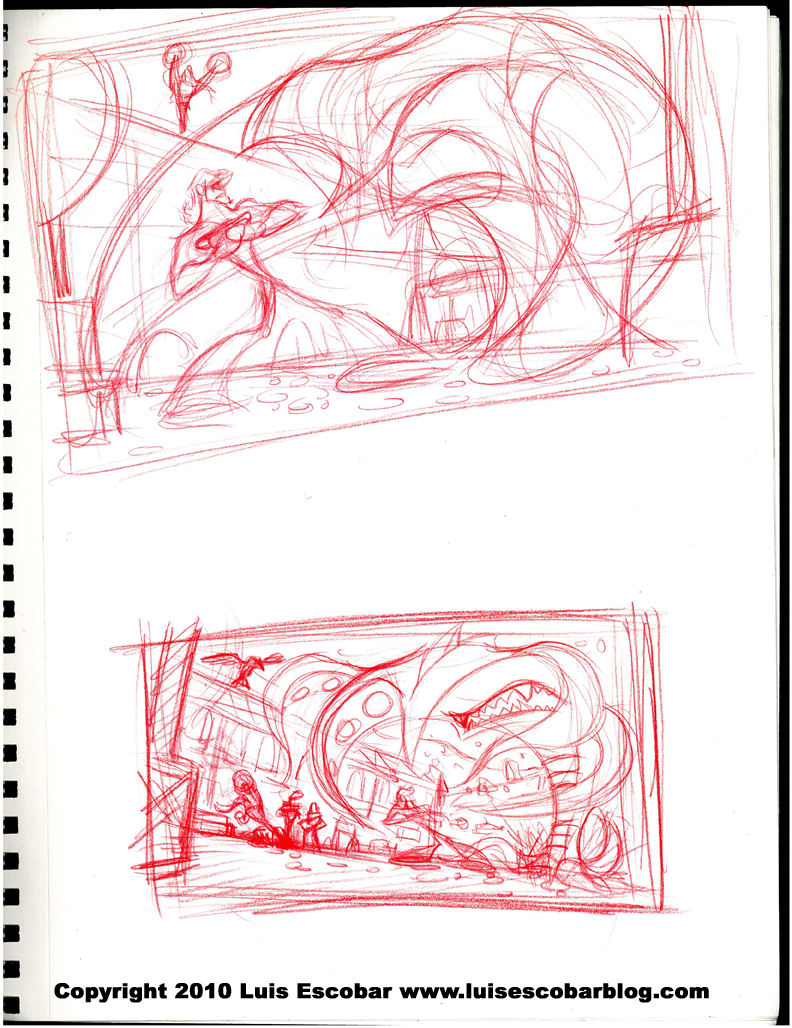
I’m still going to need do a few more thumbnails though. I think I want to, at least, show the Sorcerers more. I want the drawing to say, “Danger and excitement” all in one drawing while allowing me to work on the color and style of the cartoon.
PART 13
I’ve come to the realization that I’m not really writing out all my process. Some of the thinking behind the drawings I do are simply not written out. From now on I’m going to try to put this info in.
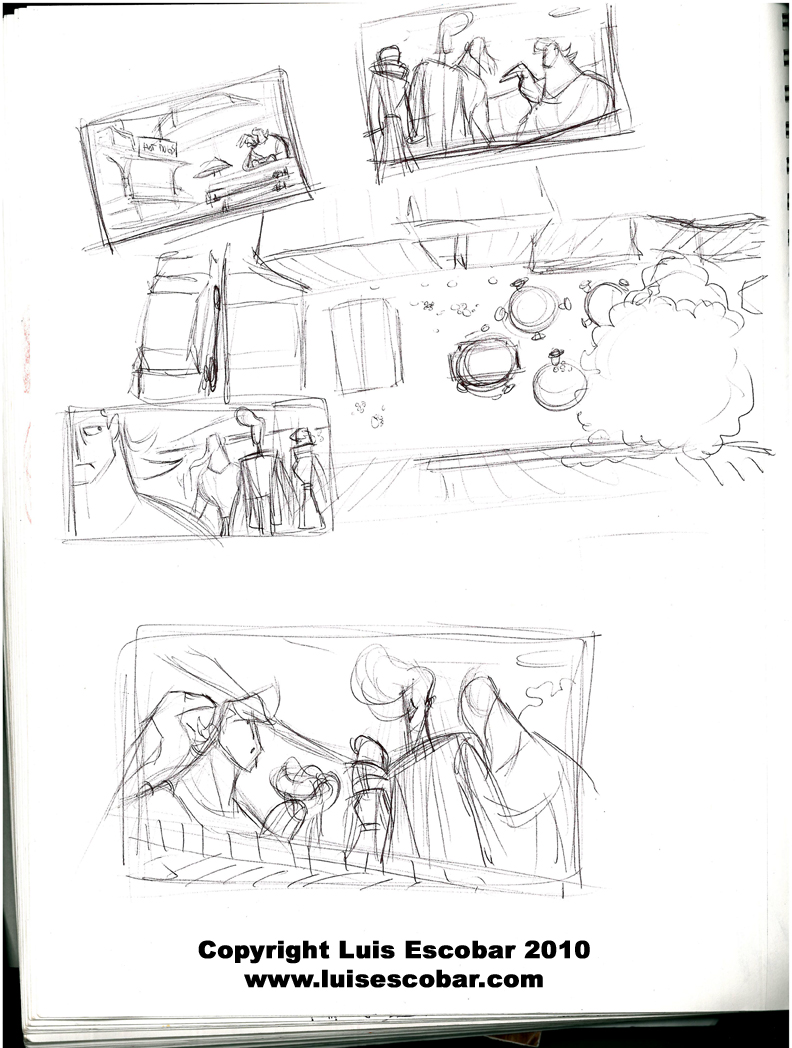
Okay, so here I go. Why do I keep making so many thumbnails of the same scene and stuff? Well, I’m looking for the right “storytelling composition”. If you notice in the sketches below as well as some of my previous blog “composition thumbnails” (feel free to look at earlier posts), I’ve attempted to split the comps into three layers; foreground, middle ground, background. What I’ve chosen to PUT in does positions, depends on what I want to say and how I want to frame the composition. Also, if I wish to finish one of these thumbnails, I hope to give each “ground” it’s own tonal value between darkest dark, mid tone and lightest light (more on that some other time, as I get to a more finished state. Even though there’s already a small indication of this in previous thumbnails).
I’ve been mostly trying to get the main character Rob, to look vulnerable. I’ve chosen to do this by trying to make him look small in contrast to something much bigger in the picture. Either by, making one object bigger or by grouping multiple objects into a larger bigger shape. Only once did I break this theme in a thumbnail and it actually made him look a bit too heroic so I’ve chosen not to try that again.
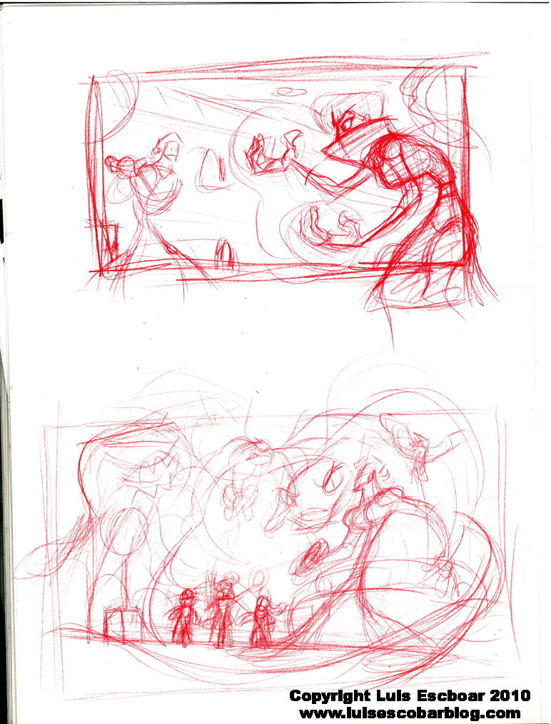
For example, in the first thumbnail below, I drew the Sorceress in the extreme foreground. Making her look bigger than Rob. I didn’t like it though because I didn’t want her to be the only bad guy in the drawing and her pose was kinda ugly too. In the second thumbnail below I chose to have Rob be in the middle ground being dwarfed by the enormous shape the monsters create when they are grouped together in the background. In the foreground I put a tentacle or the end of the giant snake, threatening to grab him. It also points to Rob compositionally. In fact, you can see how all the lines in the drawing are all curved to point to Rob who is the center of interest. Even the way Rob is standing follows the rhythm of the composition. Although if I was to finish the drawing, I would probably push his pose a bit more, in order to better emphasize this. Below the monsters, I have The Sorcerers directing their them to attack. If anything, The Sorcerers’ size bothers me because they seem small and non threatening.
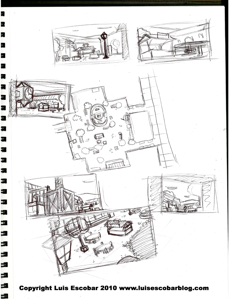
When designing the backgrounds (in previous posts), I was very aware of trying to include shapes within the design that could be used as good “framing” foreground elements ( CLICK HERE for a page of examples of what I’m taking about). I was also taught to try to avoid having any lines parallel to the picture frame when designing a background or a composition. The exception to that rule being when you want to draw something more “iconic” or intentionally dull. Also, most comedic staging, will often be very flat since the joke is the most important thing.
If you have any questions about anything I’ve written above, please feel free to ask.
Below, I will write a little about character design.
The sketch with the monsters above, threw me on a small tangent. It seems I had forgotten what monsters I was going to use in my cartoon, so I reread my outline. Realizing I had written a flying ape monster, I suddenly got excited about drawing one. I immediately Googled “gorillas” . Below is what I ended up drawing:
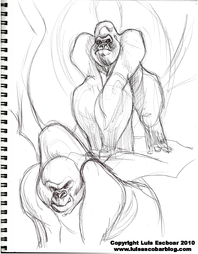
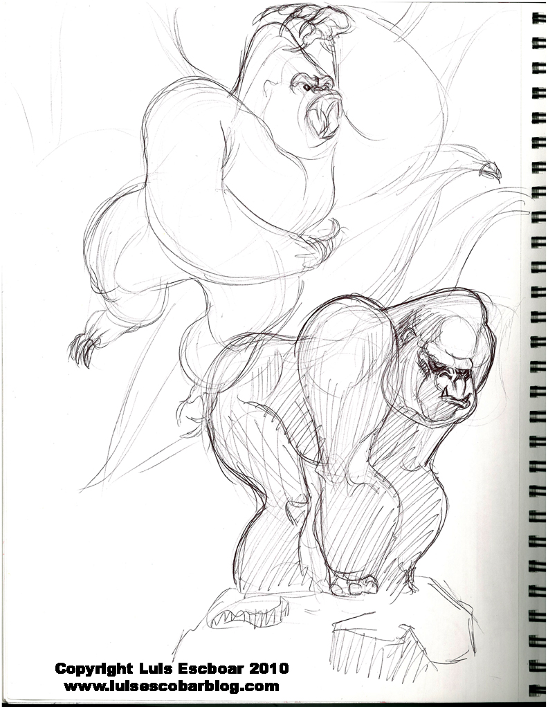
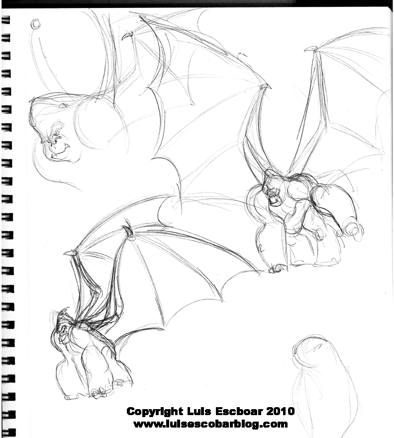
When I try out designs, I’m looking for interesting shapes. I’m also looking for contrasting sizes within those shapes. When I look at a photo, I don’t try to copy the photo so much as try to push the shapes I see in order to come up with a unique design. Sometimes it works, other times it needs different variations. The trick is to not have everything be even. For example, in the case of the ape above, I wanted the forearms to be longer and bigger than the upper arm in the first and last pages. In the middle page I experimented with the forearm being shorter. I was also working on the contrast of having an enormous pointy head and a tiny face for interest. When it came to the torso, I tried to make sure it was either longer or shorter than the hind legs. In order to avoid line monotony, I also try putting straight lines across from curved line. Even if the straights and curved lines are “complex”. I also attempt to avoid parallel line in favor of tapered ones. Parallel lines in a character are often considered boring and unnatural.
It’s NOT about how well rendered a character is or how many doodads you put on the character. Shape and “well balanced” shape CONTRAST is key to good character designs. Rhythmically putting these things together makes a design sing.
Once you have that, make sure you give your character personality instead of just having it standing there like a robot. I recommend taking a good look at character designs in THE INCREDIBLES.
These are the things I look for in design AS I design. It’s the reason why I sometimes have the same figure on a page over and over. I’m just working on slight variations of shape contrasts and balances. If you look at some of my previous sketches of characters, you might be able to see what I’m trying to working out. Not everything I put on the page “works”, which is the point of the exploration. To find what DOES.
I recommend looking at some “art of” books to see how other artist approach these things. You’ll see them using the same principles. If you have any questions of what I was taught about character design, please feel free to ask.
Log in to comment