For Parts 1 and 2 (Which deals with the story as an Harry Potter antithesis.) CLICK HERE
For Part 3 (Which is about thinking about what style to use) CLICK HERE
For Part 4 and 5 (Which is the about how to begin designing urban sorcerers) CLICK HERE
For Parts 6, 7, 8 (In which I'm just refining the characters from Part 4 and 5) CLICK HERE
For Part 9 (In which I design a Raven, begin designing the location and attempt to color the main character) CLICK HERE
For Part 10 (Where I finish the final design of the main character) CLICK HERE
For Part 11 (Where I work out the design of the location) CLICK HERE
For Parts 12 and 13 (Where I write about design principals, among other things) CLICK HERE
For Part 14 (Where I go into why you need to study the real before you can really do cartoons well) CLICK HERE
For Part 15 (Where I design a viper with a human face and do some tonal thumbnail studies) CLICK HERE
For Parts 16 - 18 (Where I rough out the drawing below) CLICK HERE
For Parts 19 & 20 (Which deals with perspective cheats, shading and adding tone) CLICK HERE
For Parts 21 & 22 (Where I experiment with final lines and looks) CLICK HERE
For Part 23 & 24 (Where I finish a color rendering of my concept drawing) CLICK HERE
For Part 25 (Where I start sketching out the "motion test) CLICK HERE
Five months ago I started blogging about my process for a personal project I'm working on on my site (luisescobarblog.com). It's going to be done in a Motion Comic style. I thought you might be interested so I'm going to be posting up the process here too.
PART 26
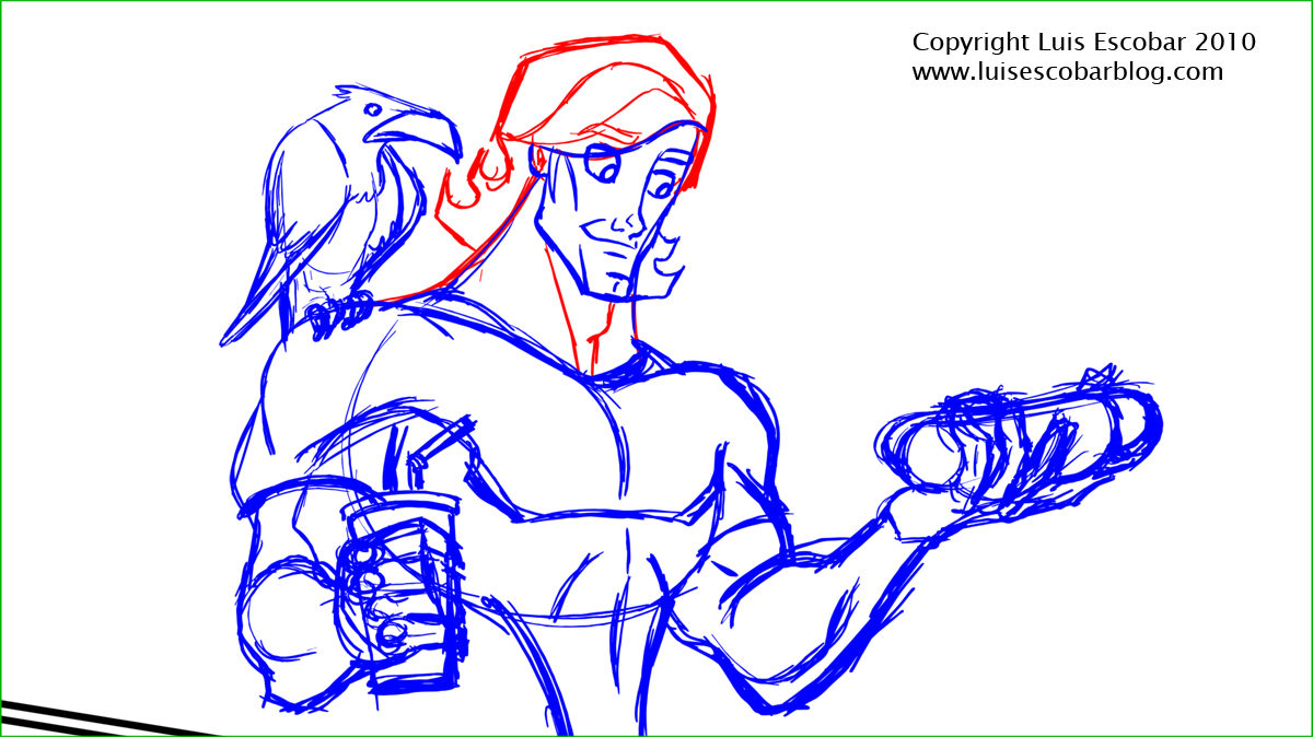
Do to circumstances beyond my control, I wasn’t able to do very much this week on my project. I did manage to fix the expression on the first pose so it’s not so crazed:
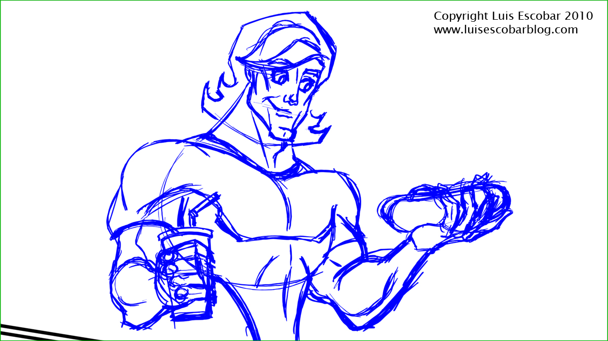
I think it looks better. I also tried fixing the second pose and I think it’s an improvement from the last one. Here’s the rough:
Notice how I tend to just search around for the drawing. I’m not the kind of artist that can just project the drawing from my head and just draw it on the paper.
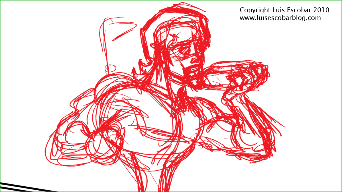
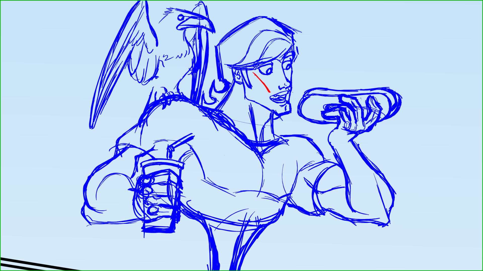
Here’s the more cleaned up version:
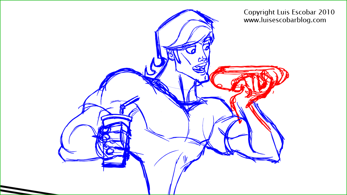
I’m still not sure if it’s right though. I wasn’t happy with the hand and hot dog so I redrew it in red, but it still wasn’t right, so I moved it (it was on another layer) to a better position. Once I get it where it works best, I’ll combine the drawings together. Something I was making sure I did in the drawing above was to make the irises in the eyes look like they’re actually on the ball of the eyeballs. I wanted to make sure I wasn’t just putting circles there but the they worked with the correct natural perceptive of the eyeball. It’s harder to do than you’d think.
Something I didn’t show was, when I looked at both drawings as a whole, I thought that the heads seemed too big so I shrank the heads a bit. I’m trying to make sure that these two drawings match the proportions of the last colored drawing. I’m still working out the design as I go. I just can’t seem to make him look just the way I want. Perhaps because I don’t have a clear picture in my head as to what it’s supposed to look like. My hope is to solve these issues as I go rather than make a model sheet. I might still need to make one. What I mostly think about when I draw these is, structure, silhouette, rhythm, and whether it all looks natural.
What bothers me most, is that it’s taking me a long time to draw each pose. If it’s taking me this long to draw FOUR poses, how long will it take to draw a multiple scenes with multiple pose?
PART 27
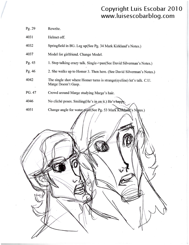
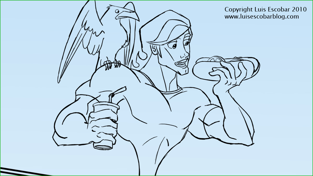
Since I just wasn’t happy with what Rob’s design looked like (still), I tried doodling a version on the first piece of paper I had on hand. It so happened to be the last page of revision notes I had for the show I was working on a week ago. The notes are cryptic if read out of the context of the episode.
I liked the doodles and I used them as a model sheet:
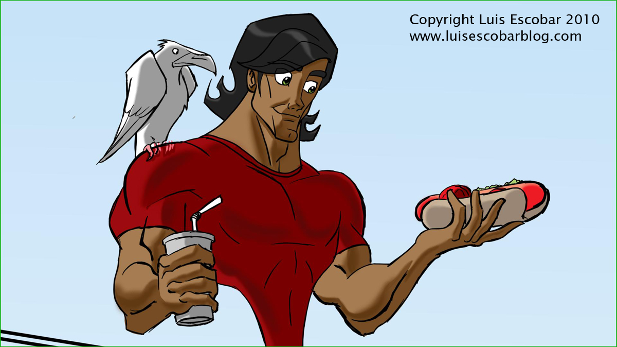
I changed the model of Rob’s face from last week. I also added the raven on Rob’s shoulder:
I then began to clean up the drawings, and as usual, have lost something of the “life” from the roughs.
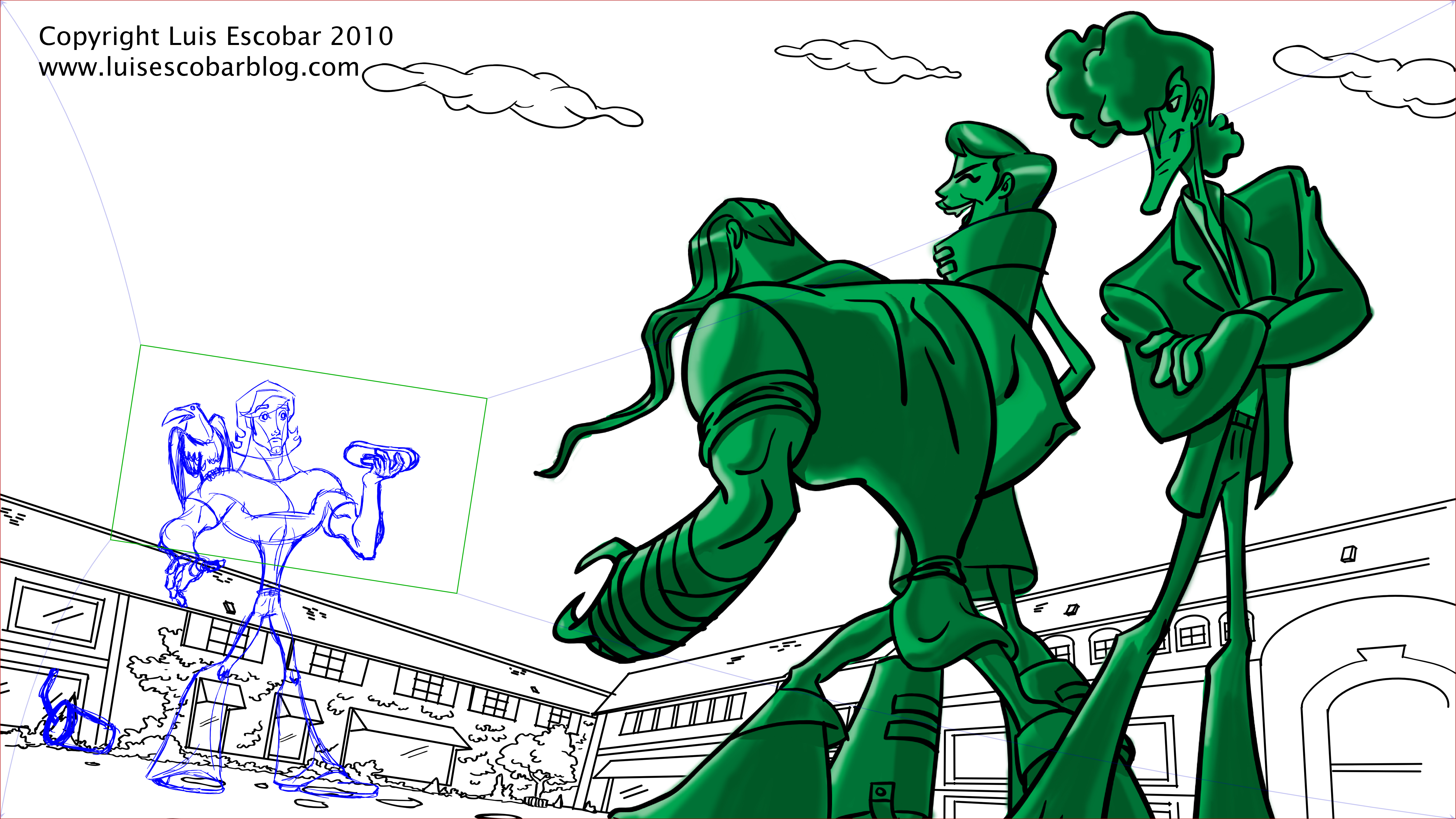
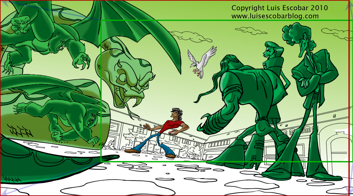
If you notice, the background is blue in some of the drawings. Why? Because that will be the color of the sky BEFORE the bad guys show up.
I’m going to give myself permission to mess around with these drawings a bit more. Especially the raven’s wings in the first shot. Still, they are just about ready to be colored.
Before I even began to do a clean up line, I experimented with timing out the scene, just to make sure it would work. I even thought of roughing out some “anticipation poses” and an “overshoot” pose but I’m not sure it’s what I want. It may plays just as clear without them. So far, it looks like it’s going to look good. Once I’m done cleaning up the last pose, I’ll begin coloring. Doing that will give me a guide as to how long it will REALLY take to finish my “Illustrated Film”. At that point I’ll make the decision whether or not to render out all the drawings or not.PART 28
Okay, so here’s the deal with these drawings. I’m not convinced that these are the best drawings I could do. I kind of want to keep noodling around with them. On the other hand, I want to get this done, since it’s just a test, so I have to say, “good enough” and keep going.
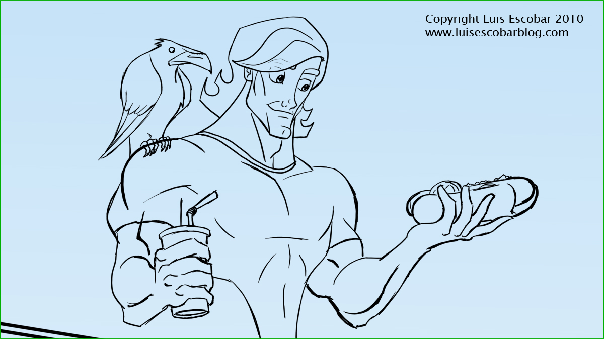
I started coloring the drawings as you can see:
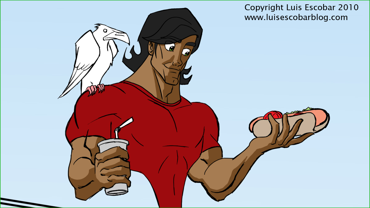
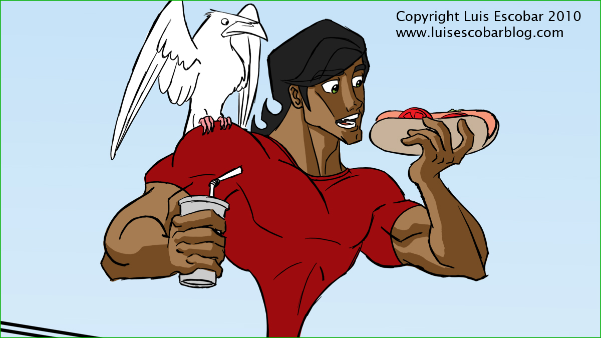
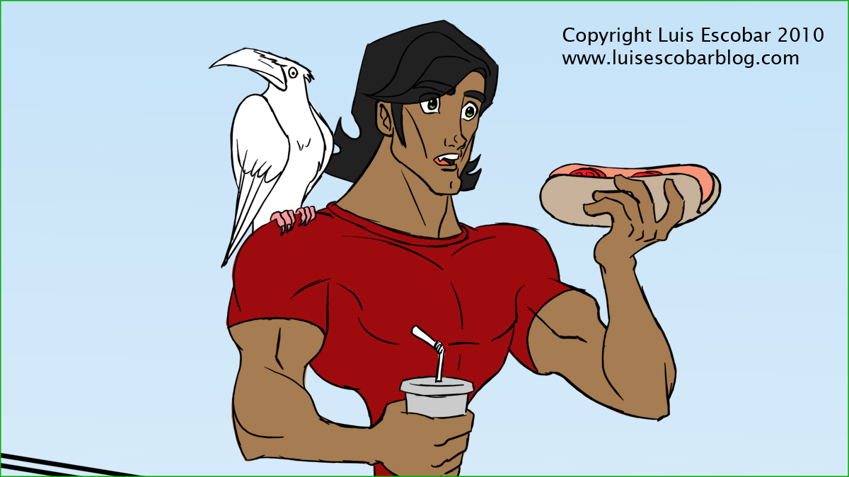
I started drawing shadows on the drawings above but I didn’t get to the other ones yet. As you can see, I just colored in the “flat” colors on everything. I’m planning to find a fast way to make these drawings look more “rendered” without it taking forever to do. My plan is to add the shadow and lighter tones using a hard edge like I’ve done above. I’ve found, trying to find the right “planes” of the figure to darken, very tricky. Once I’m done, I’ll use the texture brushes to put in the firm, soft and lost edges. I hope that speeds things up. This is really going to show me how long it’s going to take to do this.
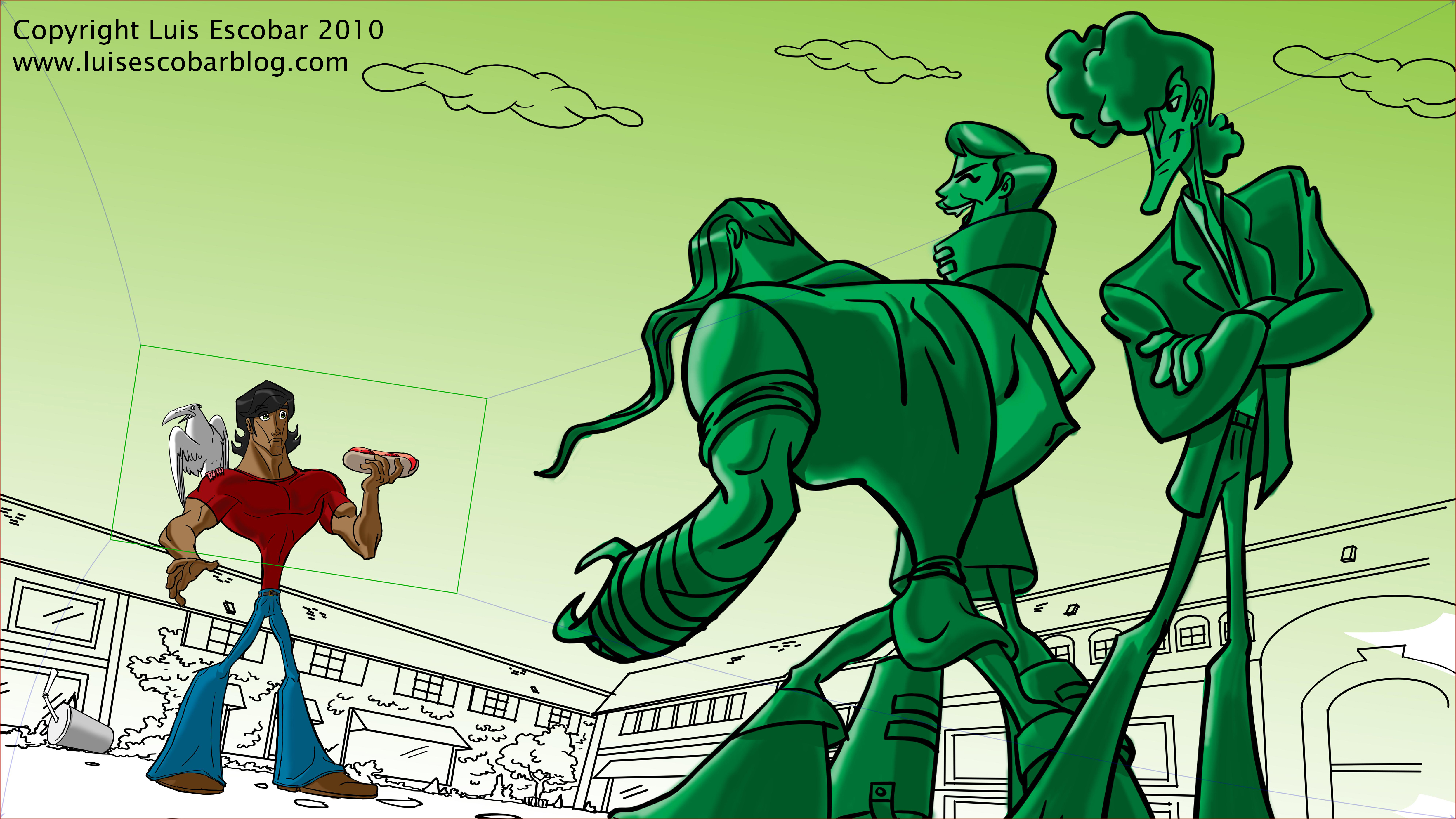
I put in the correct colored sky in the drawing below, just to see how it will look.
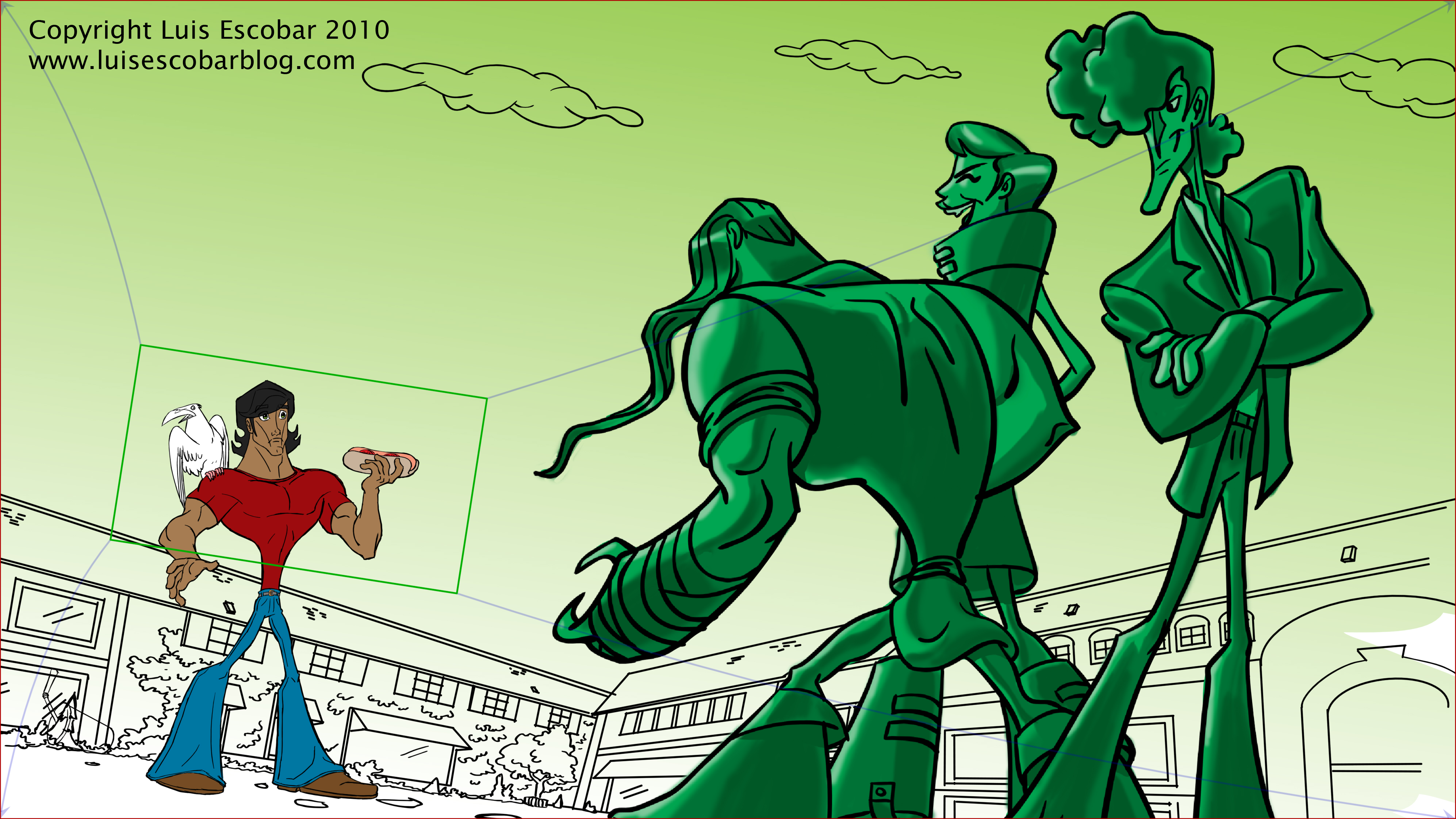
I decided to put the drawing below here so you can see the final pull out camera move.
I’ve been thinking a lot about how long it’s taking me to do this. I’m trying to figure out a faster way to do this so that I can work on it when I’m not on the computer. It would speed things up, so much more. I may have to come up with a system where I draw some of my roughs on paper, scan them in and clean them up on the computer. That way, I can also work on this when I have some free time at home instead of just working on this during lunch time at work. Even so, I think in the end, the coloring process might be the longest and most laborious part of this project. I hope it doesn’t bore me. This is suppose to be fun.
PART 29
This is taking a long time and I apologize if you’re getting tired of basically seeing the same drawing over and over. That said, this IS the process. Granted, only doing this in 30 minute chunks everyday, does make the process go at crawl. Believe me, I’m feeling it. I want it to be over so I can get to the next step. Which leads me to think that I’m being too precious about all this and I might be going about it all wrong. Perhaps I should just be rougher with the final product. That way I can finish it sooner than later. I’ll really have to think about it this.
Okay, so here’s what I’ve done this week:
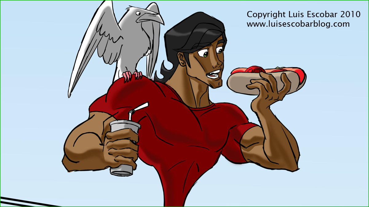

I’ve added shadows to all the drawings and began changing up the edges on them a bit. I’ve also added some core shadows to parts of the drawings. My plan is to continue adding core shadows where needed and then I’m going to add a few slight highlights or lighter areas to places that might need it. I hope to have that all done by next week. Once I do, it will basically be done. The tricky part once I’m done doing it though, is figuring out a way to show you what the finished product looks like. I’ll figure that out, once I get there.
Log in to comment